
Case studySports nutrition
Lime on black for a supplement brand that sells on quick-commerce apps
FitFuel sells protein and supplements through Amazon, Zepto, Blinkit, Swiggy Instamart and Flipkart. The wordmark is chunky and stencil-cut, with a drop of cyan in the U, in lime on near-black. We made the identity, a whey tub, cards, posts and a mobile site, then filled out the range.
The idea
On a quick-commerce app a tub is a thumbnail among dozens. So the mark is chunky and cut like a stencil, lime on near-black, and it still reads at the size of a fingernail.
The identity
First shown as a six-slide carousel: the wordmark, its lime tile, the mark on photographs, a post, the whey tub and a card.
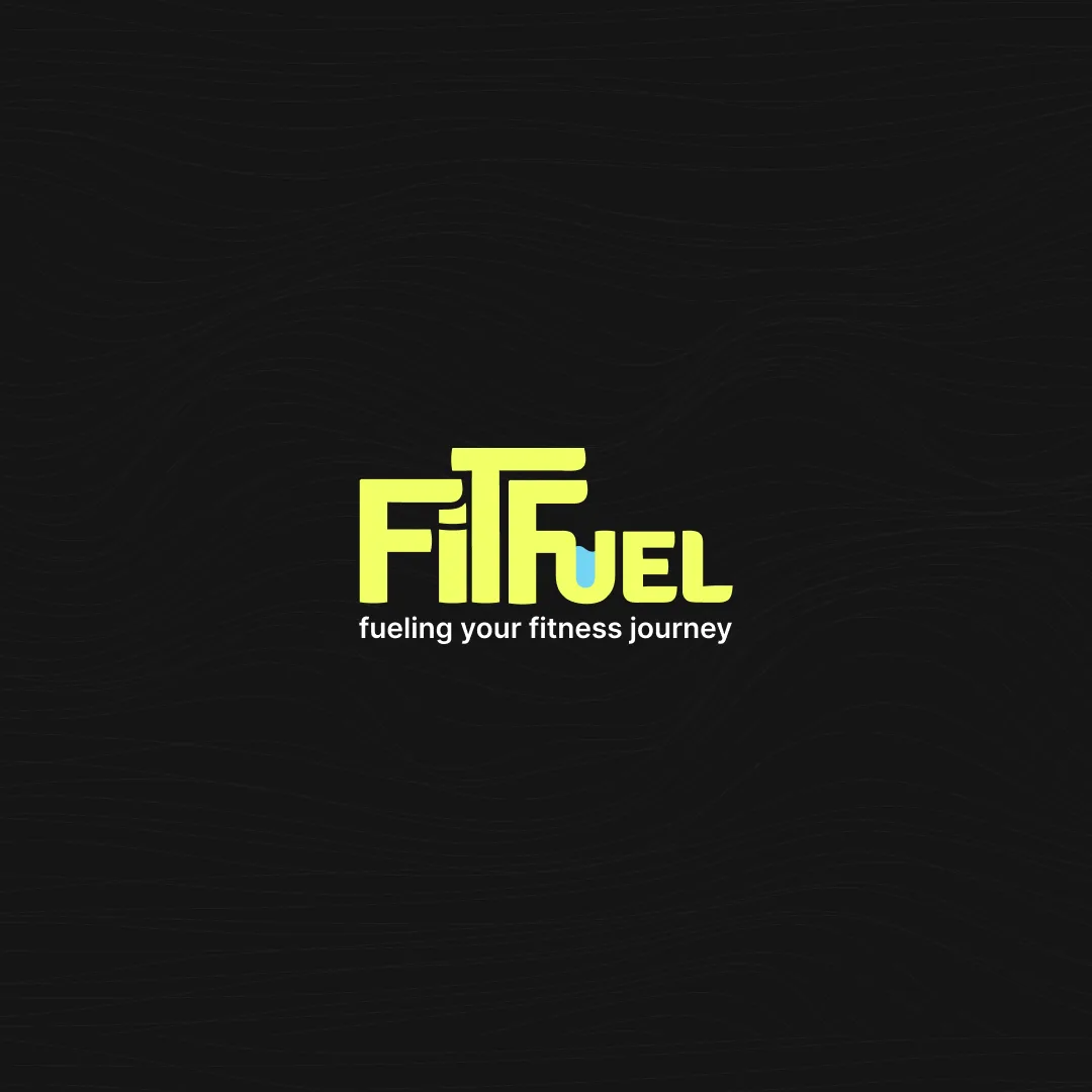
01 The wordmark 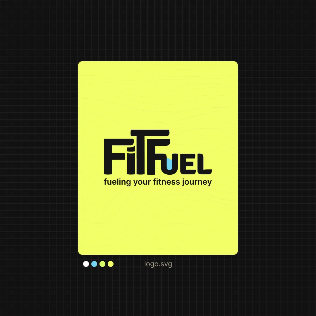
02 The lime tile 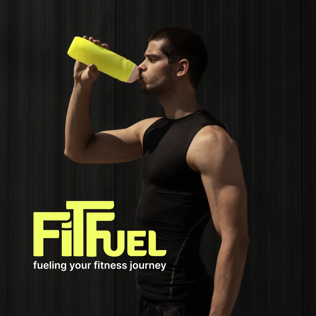
03 On a photograph 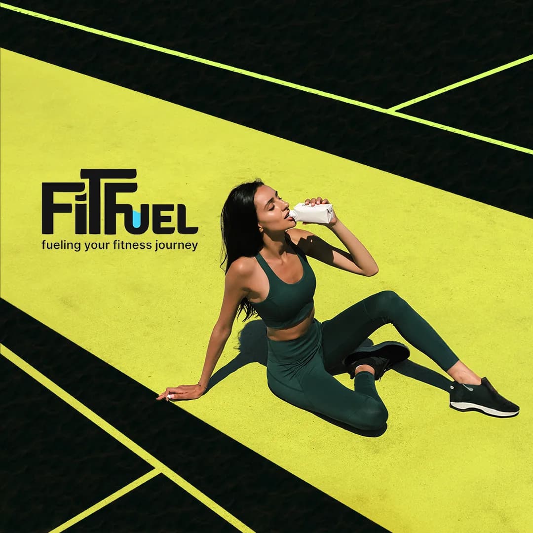
04 A post 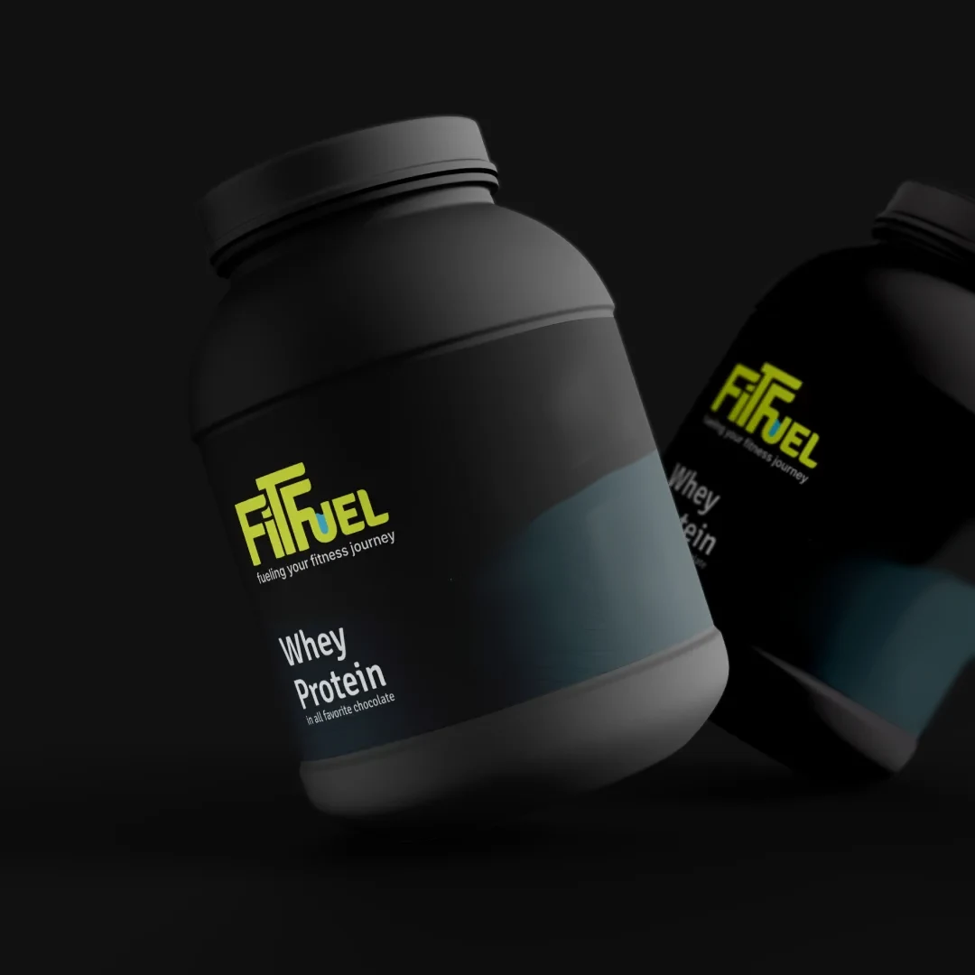
05 The whey tub 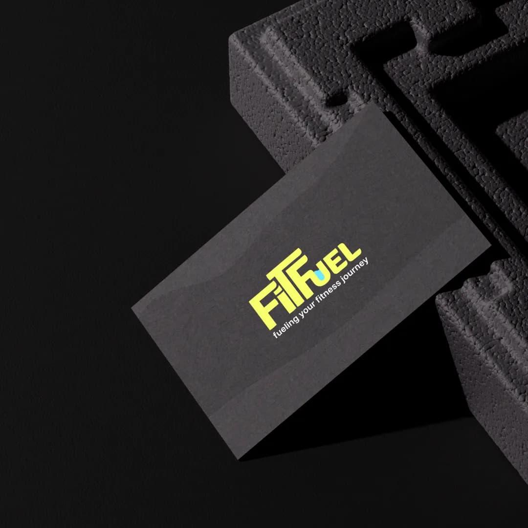
06 The card
Colour and type
Lime and near-black do the work. Cyan appears once, as the drop in the U, and white is for type.
- LimeThe ground and the mark
- Near-blackEverything else
- CyanOnly the drop
- WhiteType
- Space Grotesk
- Pack names and headings, set tight.
- Fira Sans
- Everything read up close: directions, the net weight, the site.
The range
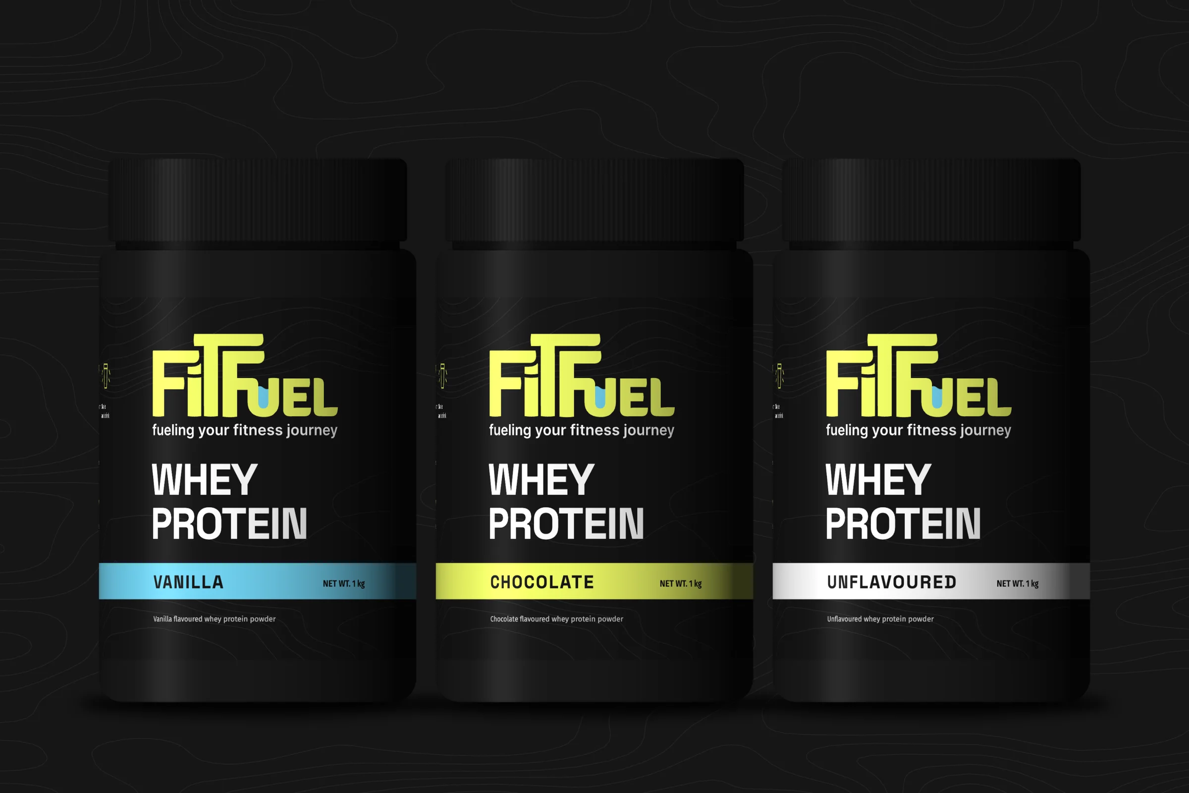
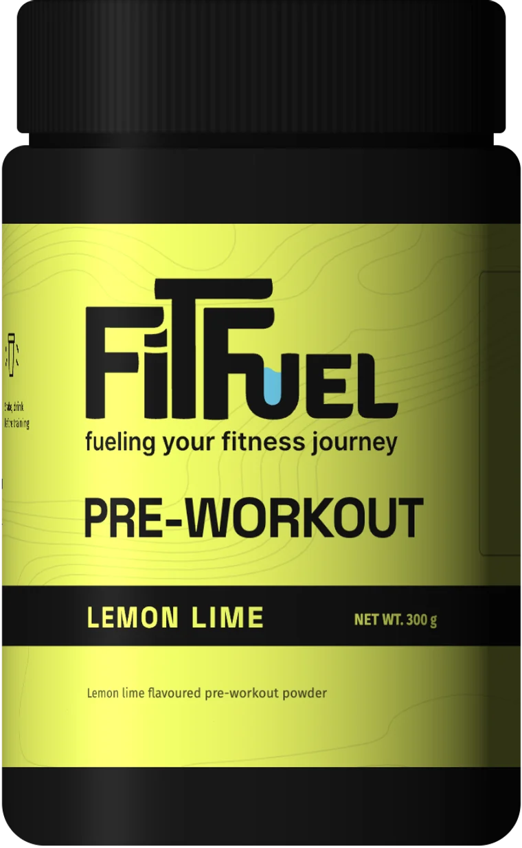
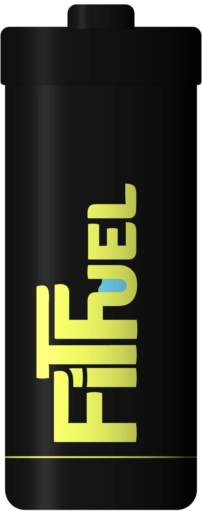
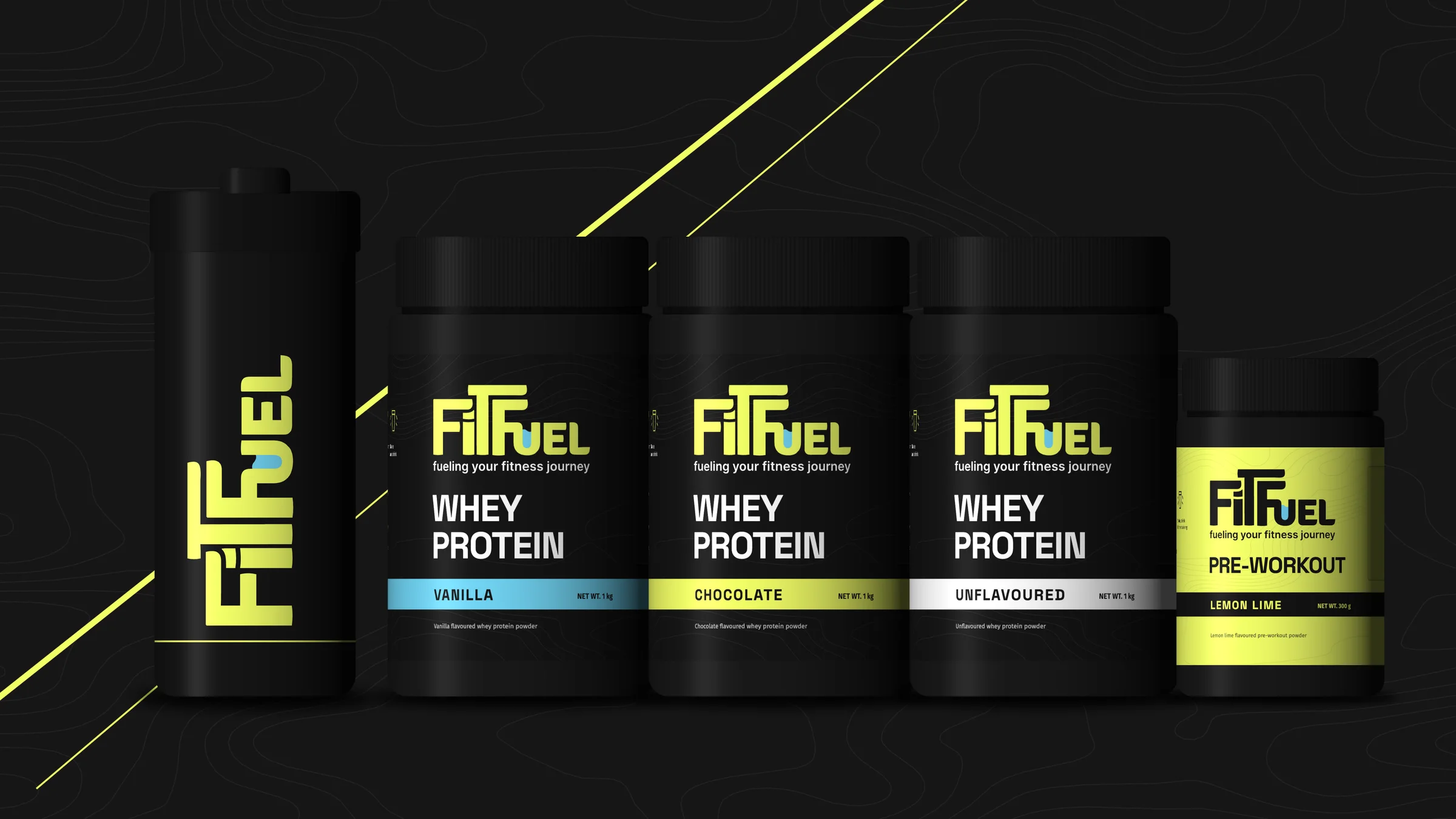
The whey tub came with the identity. We carried it across a range: three flavours told apart by a band of colour, a lime pre-workout that turns the whey inside out, and a shaker.
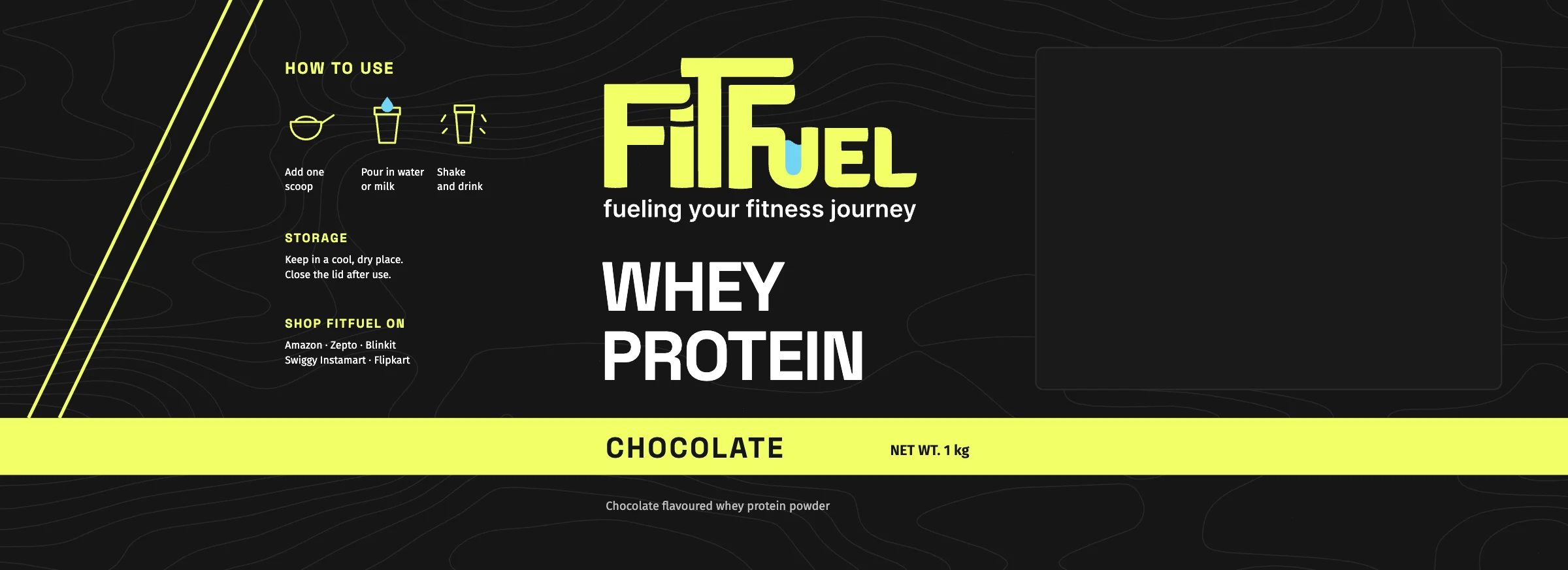
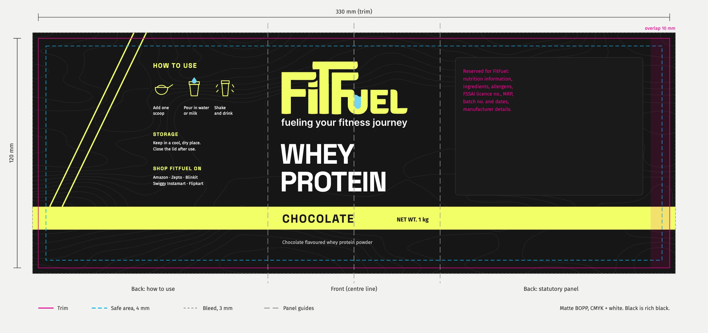
Flavour names on the new packs are proposals. Each label keeps its back panel clear for FitFuel’s nutrition, FSSAI, MRP and batch details.
The labels, flat
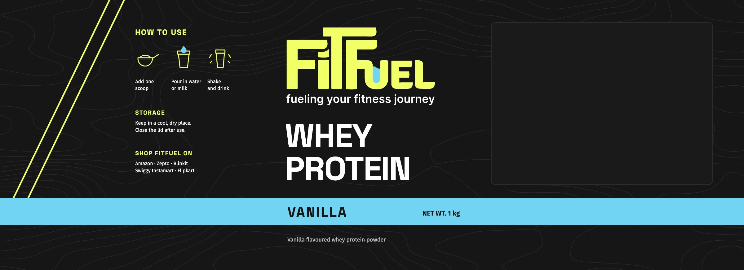
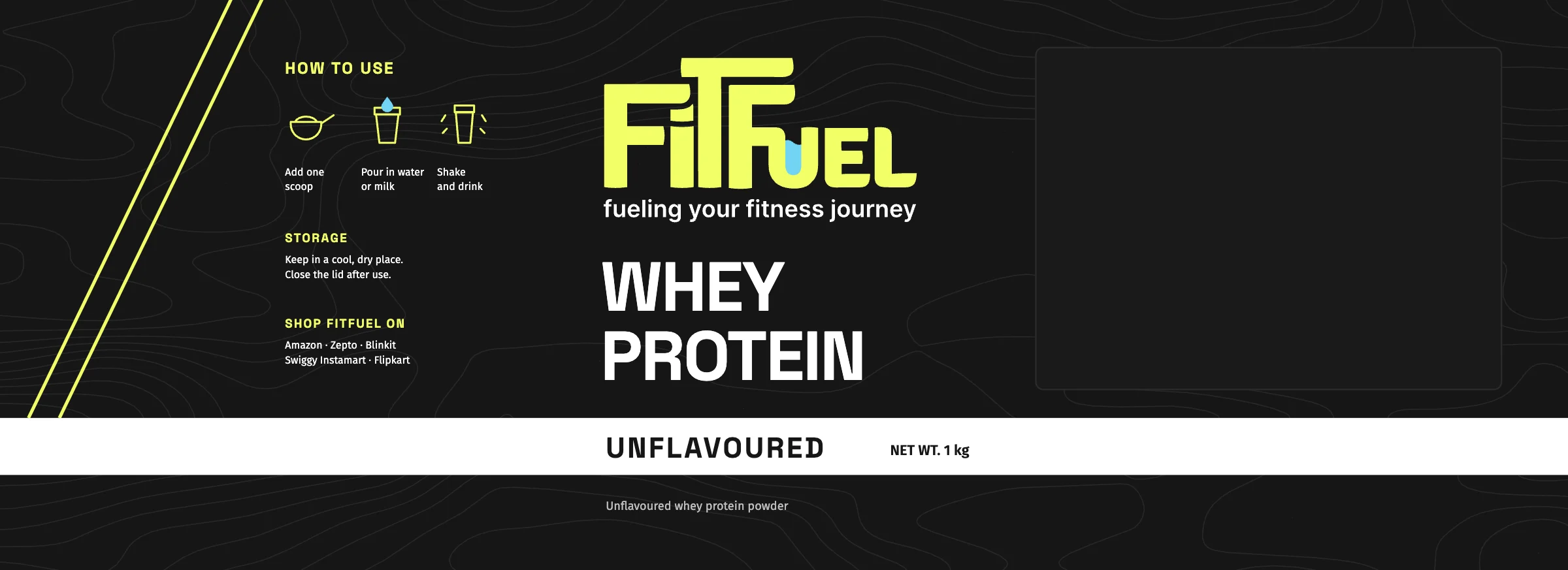
Chocolate, vanilla and unflavoured: one layout, three bands.
The website
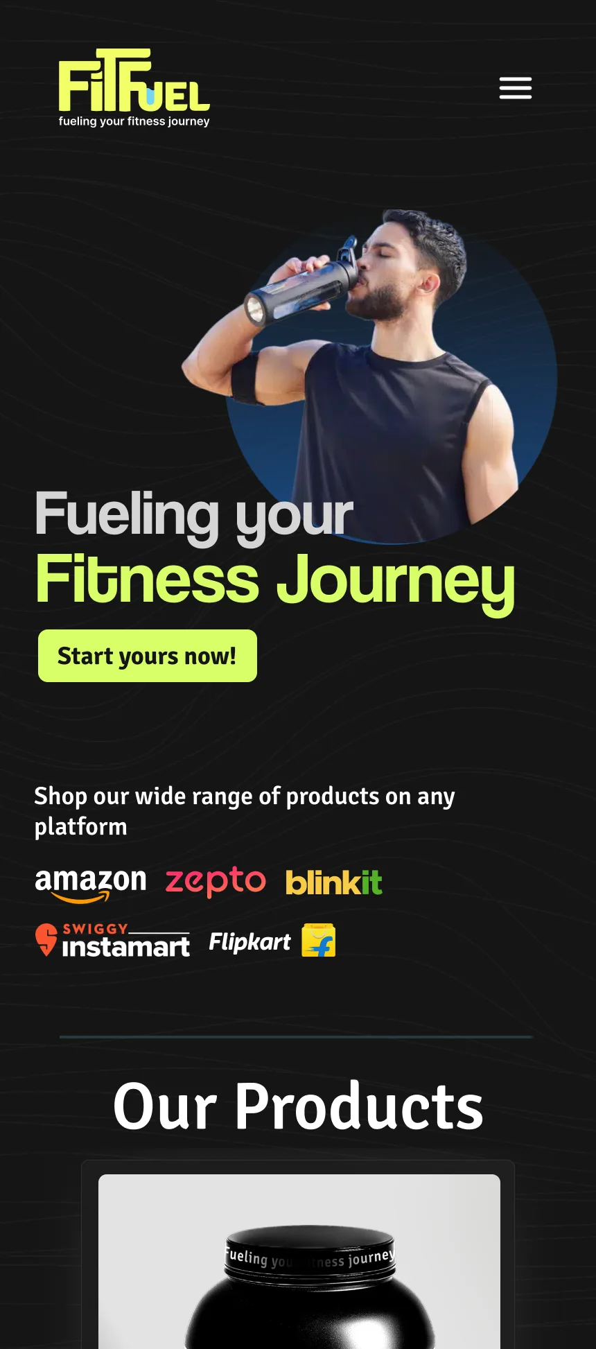
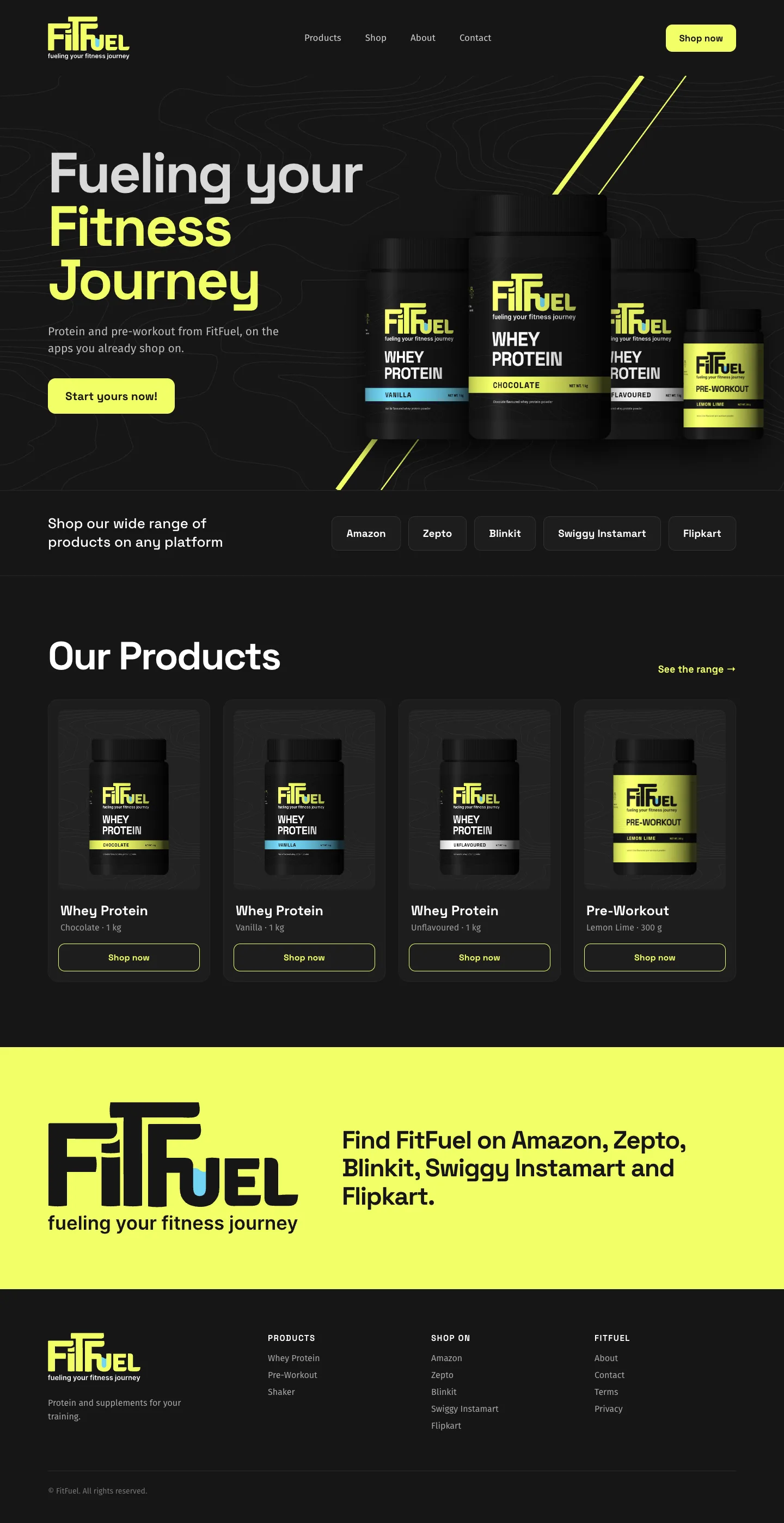
The site sends people straight to the app they already use, then shows the range. Scroll to read down each page.
Credits
- Client
- FitFuel
- Industry
- Sports nutrition
- What we did
- Identity design
- Packaging design
- UI/UX design
- Social media design
The flavour range, pre-workout, shaker and desktop page extend the identity; flavour names are proposals.