How Rivant Media looks, moves and speaks: the logo, colour, type and shapes, the Typst kit behind all 27 of our documents, and an MCP server that hands all of it to Claude or ChatGPT.
The full logo holds up down to 120px wide on screen and 30mm in print. Any smaller and the tagline closes up. Drag it down and watch.
min
At or above the minimum: it reads.
Actual size, 120 × 26px. The dashed box is the minimum.As a standard screen draws it, enlarged 1×.
Doas supplied
The files are right as they are. Use them in their own colours, on a ground they stand out from, with room around them.
Use the files as supplied, in paper on dark grounds or void on light grounds.
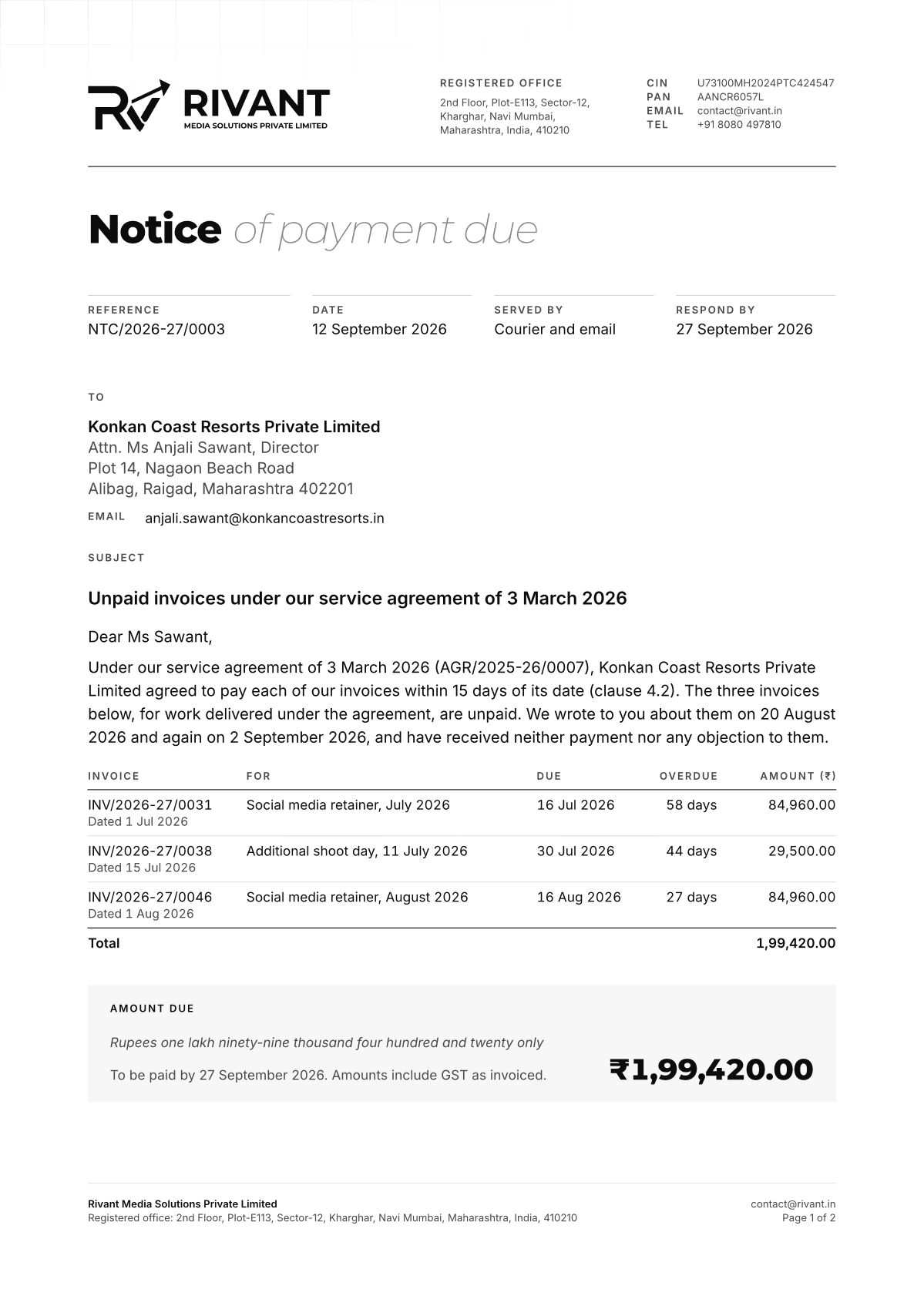
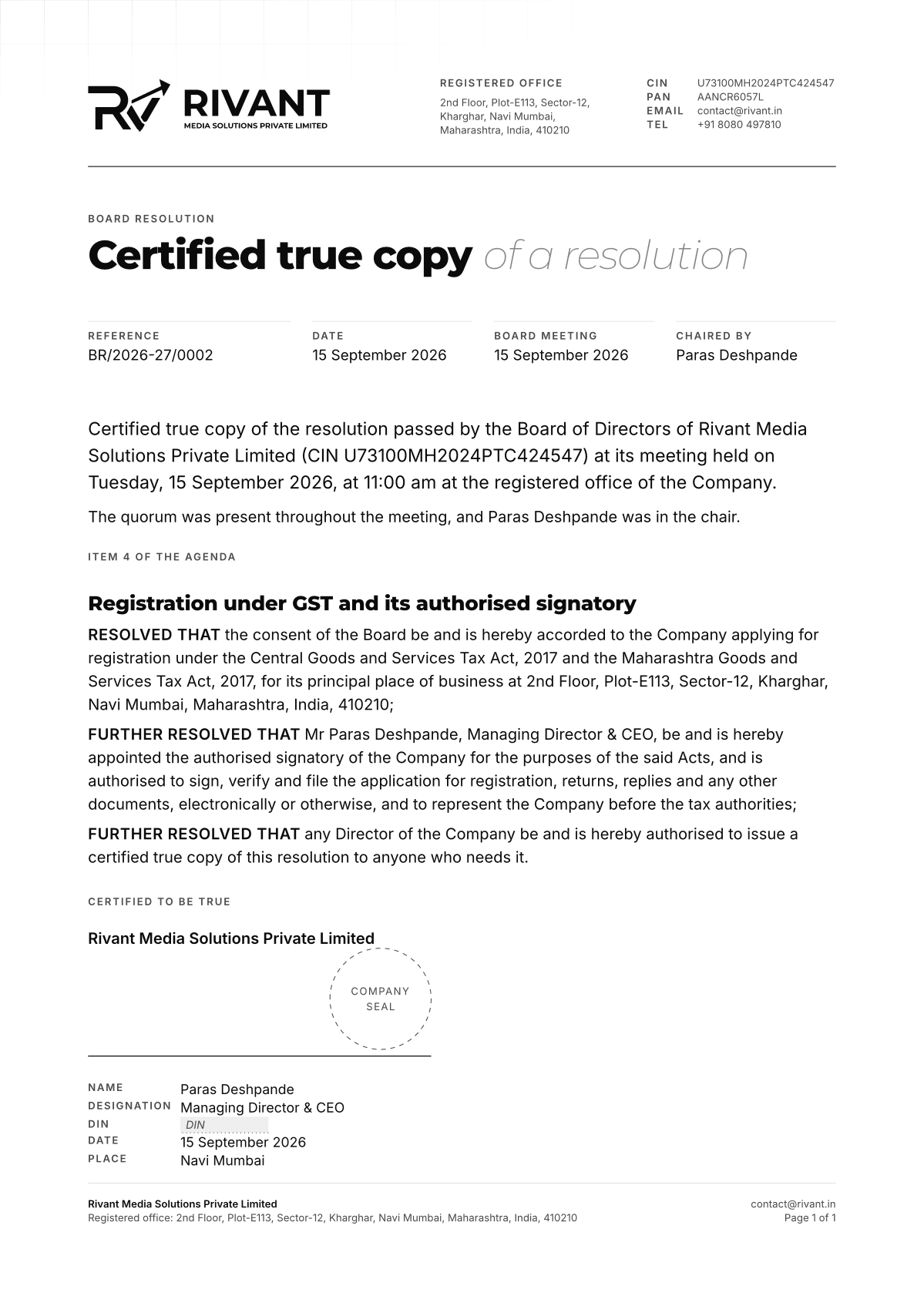
INV/2026-27/0001
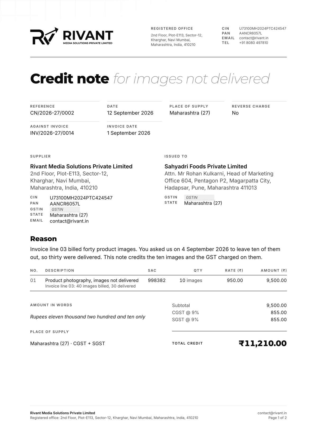
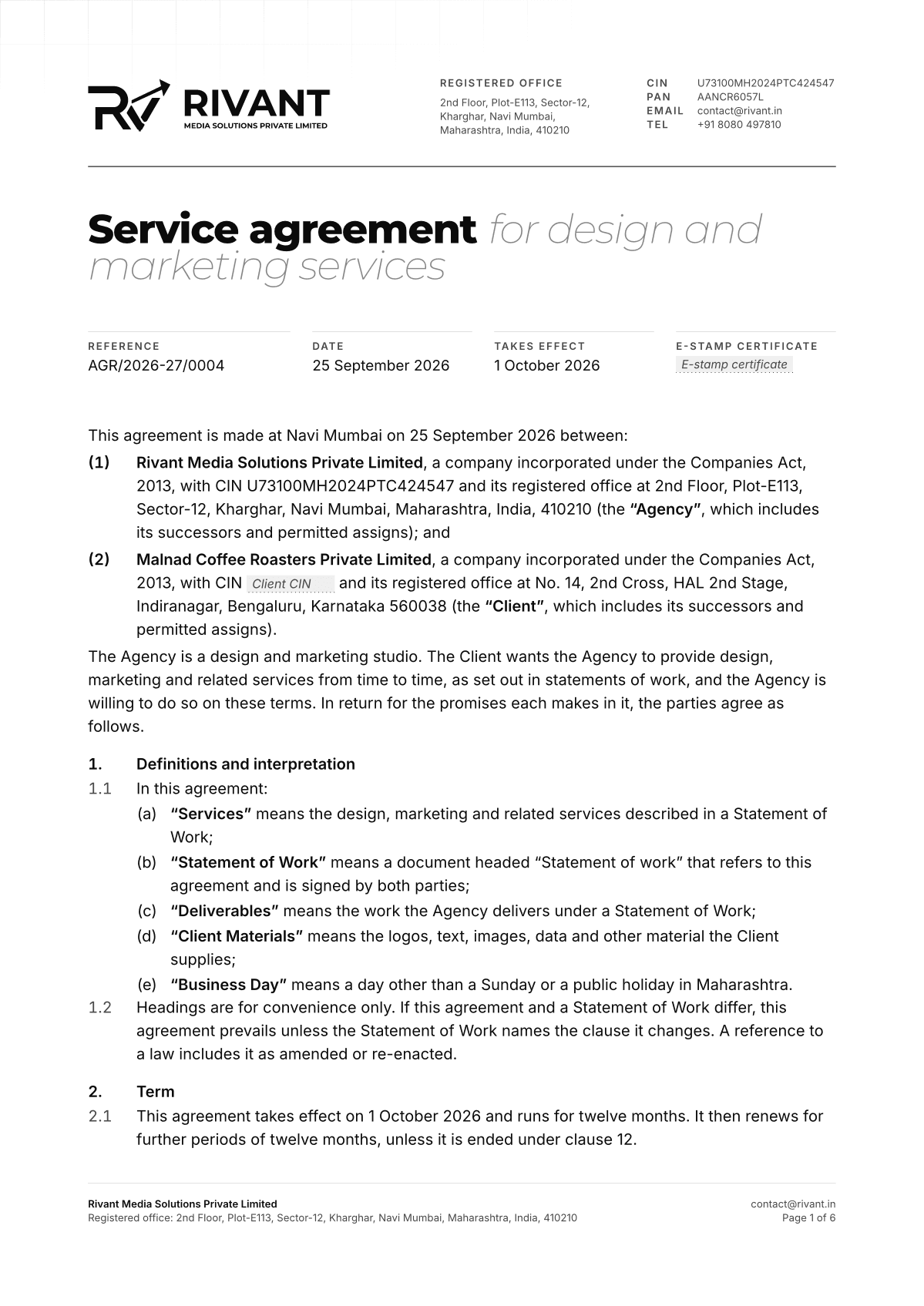
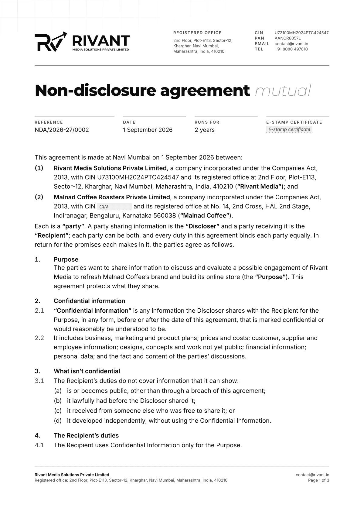
Use the legal logos on anything with legal or financial weight: letterheads, invoices, agreements, seals.
Give the logo its clear space and keep it above its minimum size.
Don’tchange it
Each example breaks one rule. Hover over one, or tap it, to see it put right.
Don't stretch, squash, rotate or skew it.
Don't recolour it, add gradients, or put it in any colour but paper or void.
Don't add shadows, glows, outlines or other effects.
Don't rebuild the wordmark in another font or move the arrow.
Don't set it on busy imagery without a dark or light scrim.
Profilepictures
Use the square full logo for profile pictures, name and tagline included, so the mark builds recognition. Don't crop it, or let it overflow a profile picture's circle.
Do: Square full logo, paper on void
Don't: The logomark alone
Don't: Inverted
Don't: Cropped
Don't: Overflowing the circle
Use the square full logo, name and tagline included, in paper on a void circle. Not the logomark alone, not inverted, not cropped or overflowing the circle.
02
Colourin greys
The palette is monochrome by design: nine greys from void to paper. Contrast comes from weight and light, never from hue.
Greys
Copy as
Press a grey to copy it. Its spec, in every format, opens below.
09 / 09
Paper#F7F7F7
Primary text, the logo on dark grounds, and light grounds.
Hex
RGB
HSL
CMYK, for print
OKLCH
CSS variable
Tailwind classes
As type on void18.4:1AAA for body text
As type on paper1.00:1Too faint for type
Contrastfor every pair
Type needs 4.5:1 against its ground, or 3:1 when it's large. Every grey against every other, measured to WCAG 2.2.
TextMist #A7A7A7
GroundVoid #0B0B0B
Pairs in use
WCAG 2.2
AAA, body text 7:1Passes
AA, body text 4.5:1Passes
AAA, large text 4.5:1Passes
AA, large text and UI 3:1Passes
Mist on Void
8.18:1
We build brands, websites and campaigns.
Body text at 16px. Large text is 24px, or 18.66px bold; interface parts and graphics need 3:1.
Contrast ratio of each grey as text (rows) on each grey as ground (columns)
Text greyText ↓ Ground →
Void
Carbon
Graphite
Slate
Smoke
Ash
Mist
Bone
Paper
Void
1:1Same
1.0Fails
1.1Fails
1.3Fails
2.1Fails
5.7AA
8.2AAA
13.7AAA
18.4AAA
Carbon
1.0Fails
1:1Same
1.1Fails
1.2Fails
2.0Fails
5.5AA
7.8AAA
13.1AAA
17.6AAA
Graphite
1.1Fails
1.1Fails
1:1Same
1.1Fails
1.9Fails
5.2AA
7.5AAA
12.5AAA
16.7AAA
Slate
1.3Fails
1.2Fails
1.1Fails
1:1Same
1.7Fails
4.5AA
6.5AA
10.9AAA
14.7AAA
Smoke
2.1Fails
2.0Fails
1.9Fails
1.7Fails
1:1Same
2.7Fails
3.9Large
6.5AA
8.7AAA
Ash
5.7AA
5.5AA
5.2AA
4.5AA
2.7Fails
1:1Same
1.4Fails
2.4Fails
3.2Large
Mist
8.2AAA
7.8AAA
7.5AAA
6.5AA
3.9Large
1.4Fails
1:1Same
1.7Fails
2.3Fails
Bone
13.7AAA
13.1AAA
12.5AAA
10.9AAA
6.5AA
2.4Fails
1.7Fails
1:1Same
1.3Fails
Paper
18.4AAA
17.6AAA
16.7AAA
14.7AAA
8.7AAA
3.2Large
2.3Fails
1.3Fails
1:1Same
Fifteen stepsfor illustration
Gradients in illustration and print need finer steps than the nine. These fifteen run from void to paper in even steps of perceived lightness.
#0B0B0B
#181818
#262626
#343434
#444444
#545454
#646464
#757575
#878787
#989898
#ABABAB
#BDBDBD
#D0D0D0
#E3E3E3
#F7F7F7
#0B0B0B to #F7F7F7, in even steps of lightness.
The palettein every format
Copy it into code, or download it as a file your design app opens as swatches.
Format
/* Rivant Media branding 2.0.0: the palette */
:root {
	--color-void: #0B0B0B; /* The page ground, and the ink of the logo on light grounds. */
	--color-carbon: #111111; /* Raised grounds: bands and panels one step off the page. */
	--color-graphite: #171717; /* Cards and the inner shell of framed media. */
	--color-slate: #232323; /* Hairlines, rules and the brand grid. */
	--color-smoke: #474747; /* Rings, underlines and quiet strokes. */
	--color-ash: #8A8A8A; /* Labels, numerals and meta text. */
	--color-mist: #A7A7A7; /* Secondary text and the light half of weight-contrast headings. */
	--color-bone: #D7D7D7; /* Body text on dark grounds. */
	--color-paper: #F7F7F7; /* Primary text, the logo on dark grounds, and light grounds. */
}
The watermark rows on the home page are drawn as if in chalk on a slate board: a fine tooth, streaks from the side of the stick, and patches where it went on lightly. It is the brand’s one texture, and it is made by hand, not by a filter over the finished type.
Chalk is a mask, not an overlay: the letters break up and the ground shows through them.
Use it on display type set large, 72px and up: the watermark rows, and headlines made as art.
Paper on a dark ground, solid or hollow. Never on text people have to read, never in colour, never with a glow.
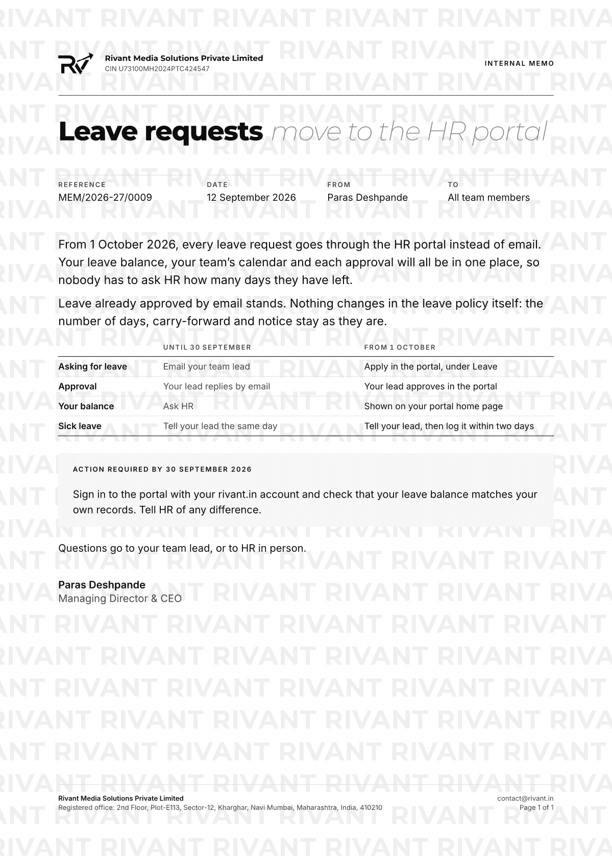
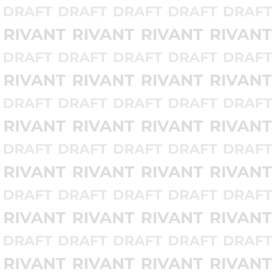
Laid over the whole piece, never a corner of it, so it can’t be cropped out. Draft goes on anything shared for review; internal on anything that stays in the studio.
Profile pictures, headers and the watermark every post carries, measured to the pixel.
Profilepicture
Use the square full logo, name and tagline included, in paper on a void circle. Not the logomark alone, not inverted, not cropped or overflowing the circle.
The name and tagline are hard to read at the smallest sizes. They stay anyway: seen beside the mark every time, they teach people what the mark means.
DoThe square full logo, in paper on a void circle.
Don’t: The logomark alone
Don’t: Inverted
Don’t: Cropped
Don’t: Overflowing the circle
Rivant MediaMumbai
1080 × 13501080
Watermarkon every post
The logomark sits in the top right corner of every post: 120 × 74px, 74px from the top and 60px from the right on content 1080px wide, whatever its height.
Two curves and a handful of durations. Everything that moves shows where something came from or what to look at.
07.1
Easingin two curves
Time runs left to right and position bottom to top; the dashed diagonal is linear. Both curves are slowed to the same pace here so the shape is all that differs.
ease-out-expocubic-bezier(0.16, 1, 0.3, 1)Entrances, reveals and anything arriving on screen.
TimePosition
TimePosition
ease-springcubic-bezier(0.32, 0.72, 0, 1)Interaction: hovers, presses, magnetic pulls.
TimePosition
TimePosition
07.2
Durationsfrom hover to stroke
Four lengths of time cover everything. The bars start together and each fills in exactly its own duration.
300msHover
500msInteraction
1100msReveal
1400msStroke
0500ms1000ms1400ms
07.3
Principleswith working examples
01
Every movement has a reason:it shows where something came from, what changed, or what to look at.
Whereitcamefrom
Each word rises from its own baseline, a beat after the one before, then the rule draws and the text settles.
02
Animate transform and opacity only,so motion stays smooth on phones.
Pulled by the pointer
Bring the pointer near. The dashed outline is its place in the layout, which never moves.With a mouse it leans toward the pointer; the dashed outline is its place in the layout, which never moves.
03
Scroll drives the page:type brightens as it is read, shapes drift in parallax, rules draw as sections arrive.
Typebrightenswordbywordasitisread.
Scrubbed type
Shapes drift in parallax
01Logo
02Colour
03Typography
04Shapes
Rules draw as sections arrive
04
Shapes keep their form.Nothing squashes, bounces or morphs.
Shapes may
drift, turn, fade
Never
squash, bounce, morph
05
With reduced motion on,everything is simply there.
Switch it on to see this chapter the way it looks with reduced motion.
Your device setting: no preference
Smooth scrolling hands back to the browser's own.
Parallax, drifting type and loops hold still.
Text is there from the start instead of rising in.
Demos show their final frame.
07.4
Tokensto copy
The curves and durations as code, for a stylesheet, a Tailwind theme or an animation library.
Plain, specific and calm. We say what we do in the words our clients use.
08.1
Threeprinciples
Plain.
Say what we do in the words a client would use. Short sentences, active voice.
Specific.
Name the work, the outcome and the number. Specifics are what make a claim believable.
Calm.
Confident, never loud. No exclamation marks, no hype.
08.2
Wordswe avoid
Each of these could describe any agency, so they tell a client nothing about us. Say what the work is instead.
nextbigleap /
elevate /
seamless /
unleash /
next-gen /
game-changer /
synergy /
cutting-edge /
world-class /
takeittonewheights
Checks against the list above, and for exclamation marks.
We elevate your brand to new heights with cutting-edge creativity.
Three phrases to cut: “elevate”, “take it to new heights”, “cutting-edge”.
“
08.3
Beforeand after
Each pair opens on the cliché and rewrites itself as it comes into view. Swap back to compare.
01
Instead of “We elevate your brand to new heights with cutting-edge creativity.”, write “We are the creative minds that take your campaign to the next level.”
Rupees one lakh forty-one thousand six hundred only
9VoidAshSlatePaper
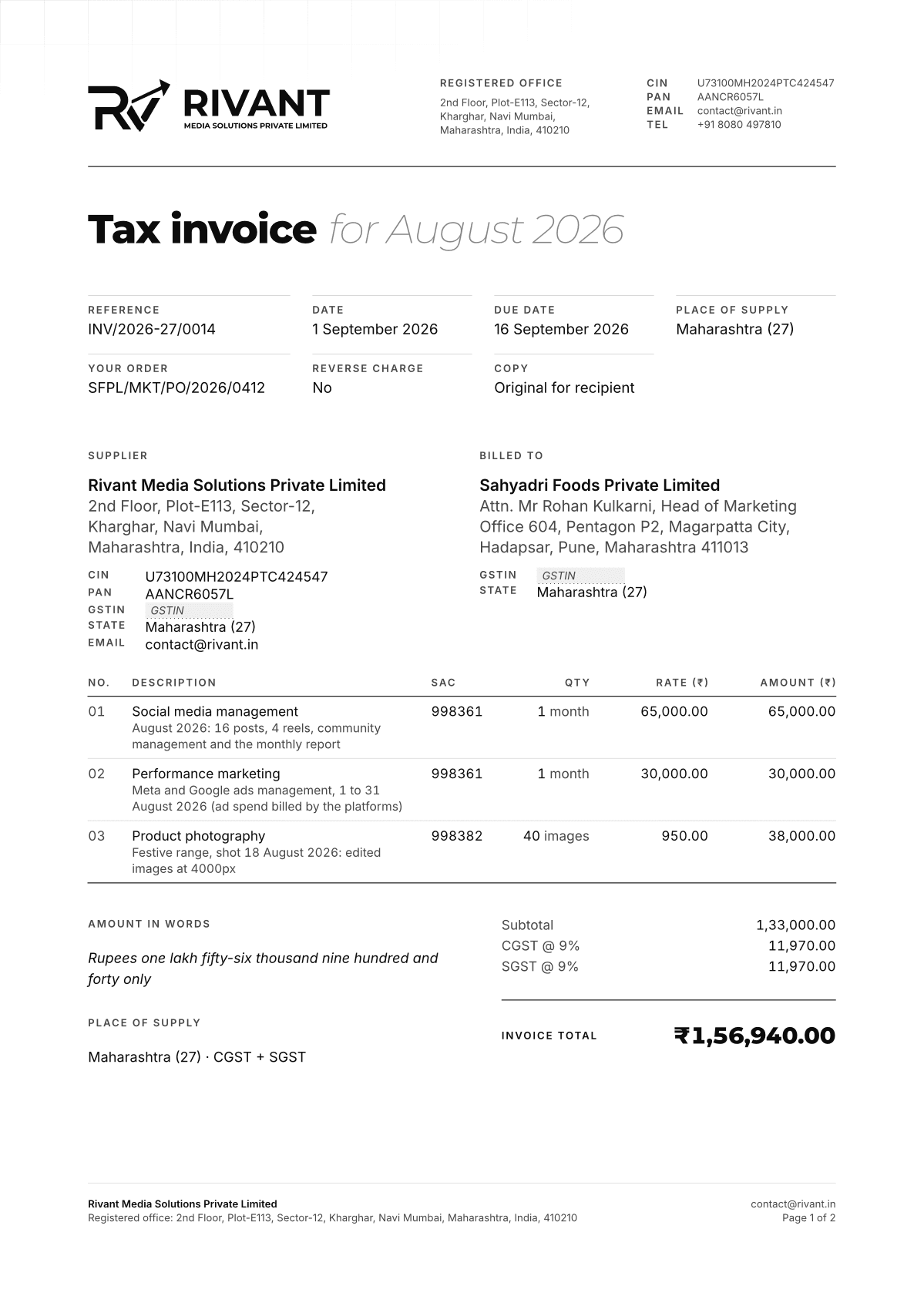
Tax invoiceINV/2026-27/0001
6
Terms
Bank details
Account from accounts
7
For and on behalf of Rivant Media Solutions Private Limited
Name, Director
9VoidAshSlatePaper
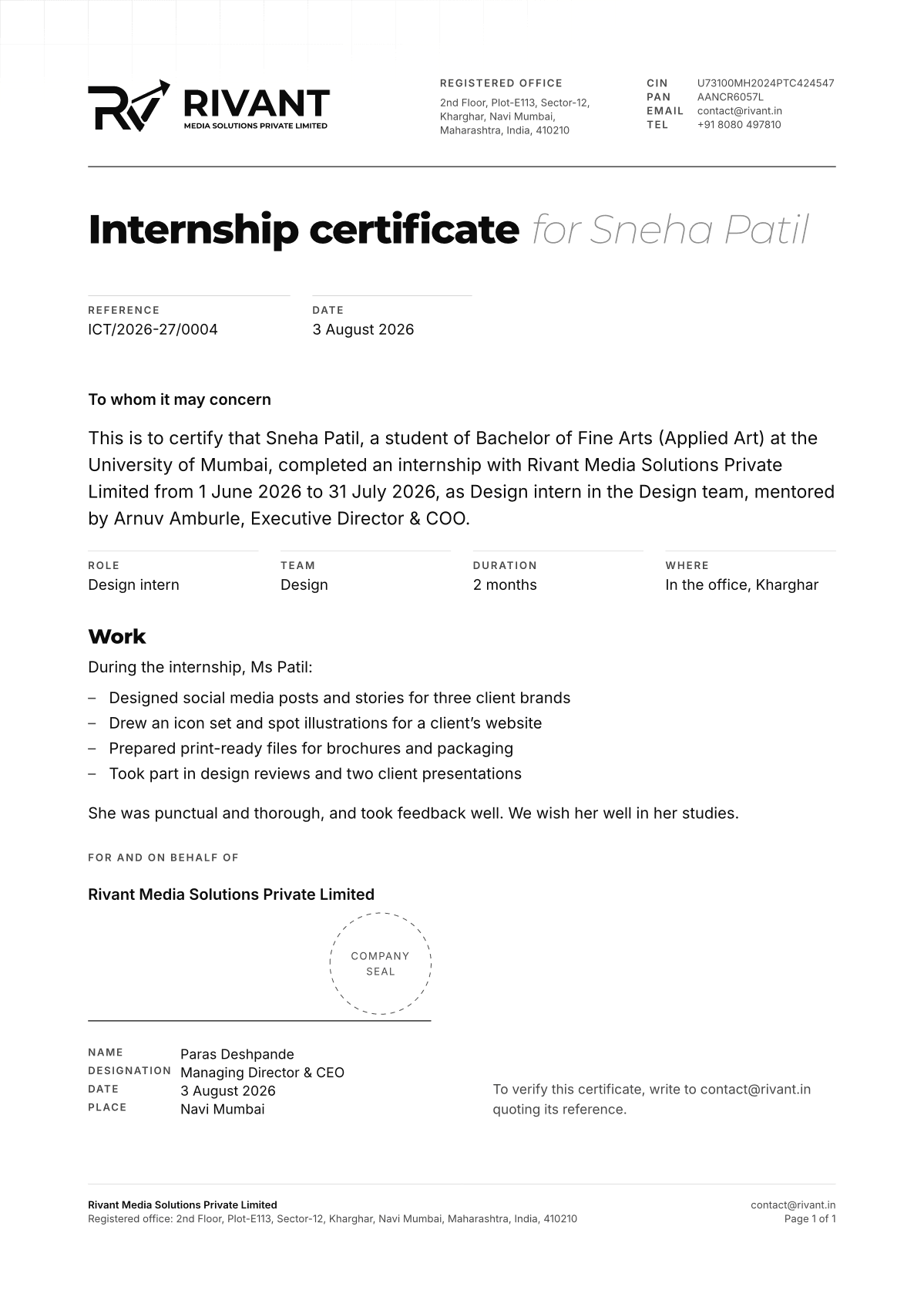
Sample tax invoice, page 1 of 2
1
Page
A4 portrait, 20mm margins at the sides, 18mm top and bottom.
2
Letterhead
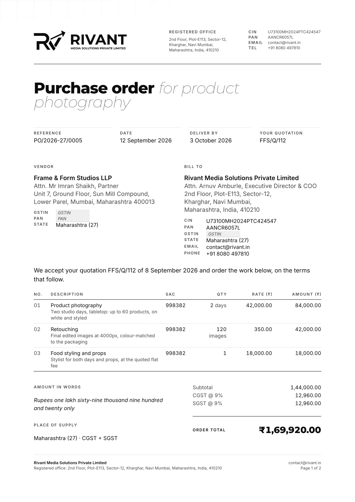
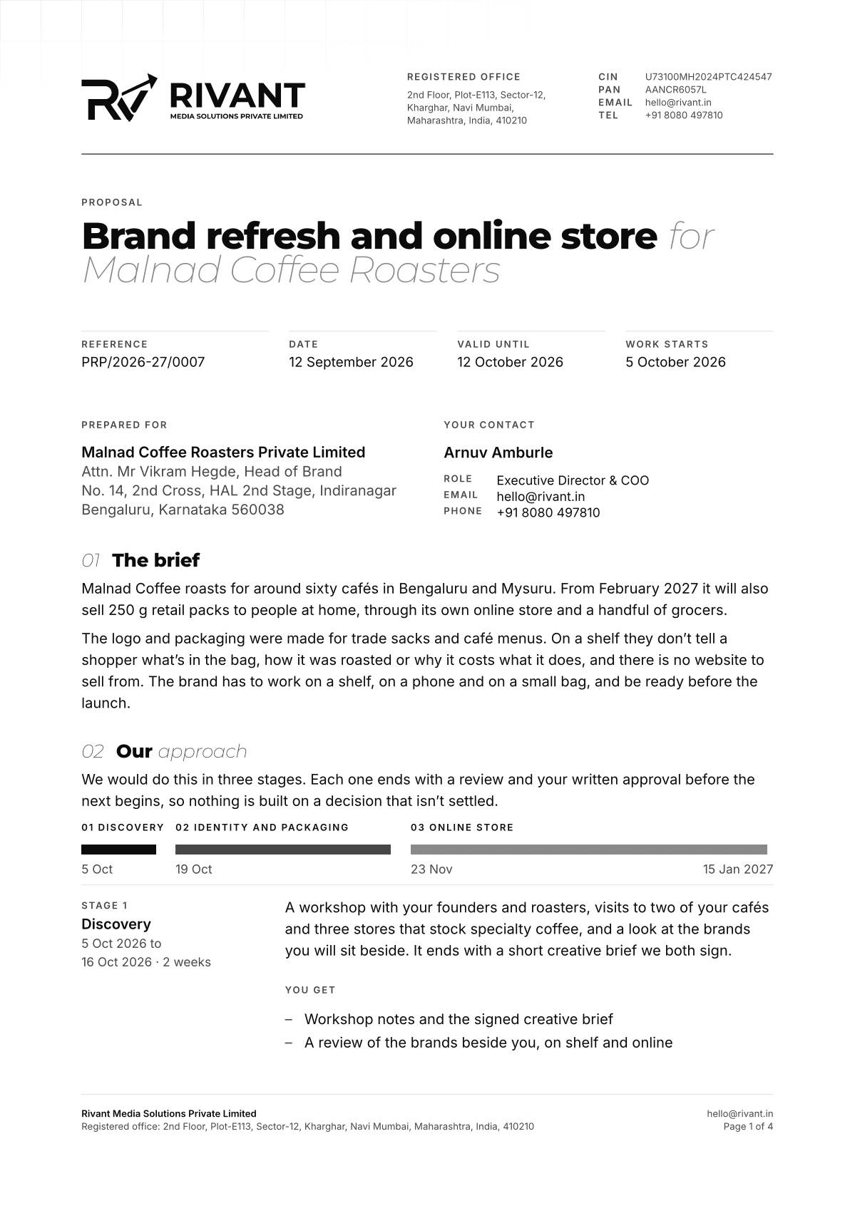
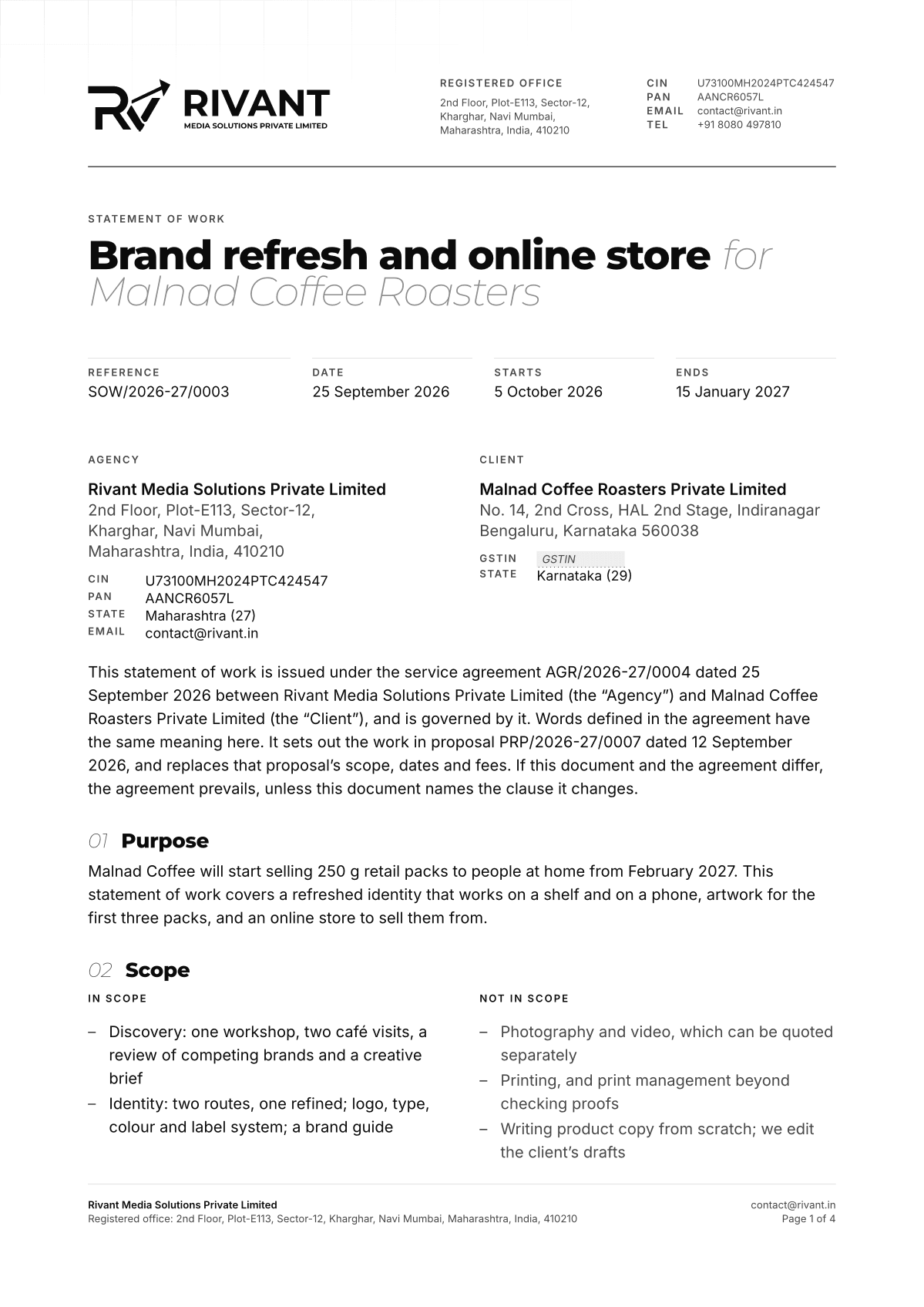
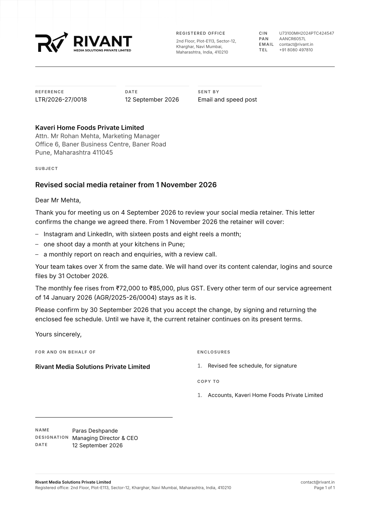
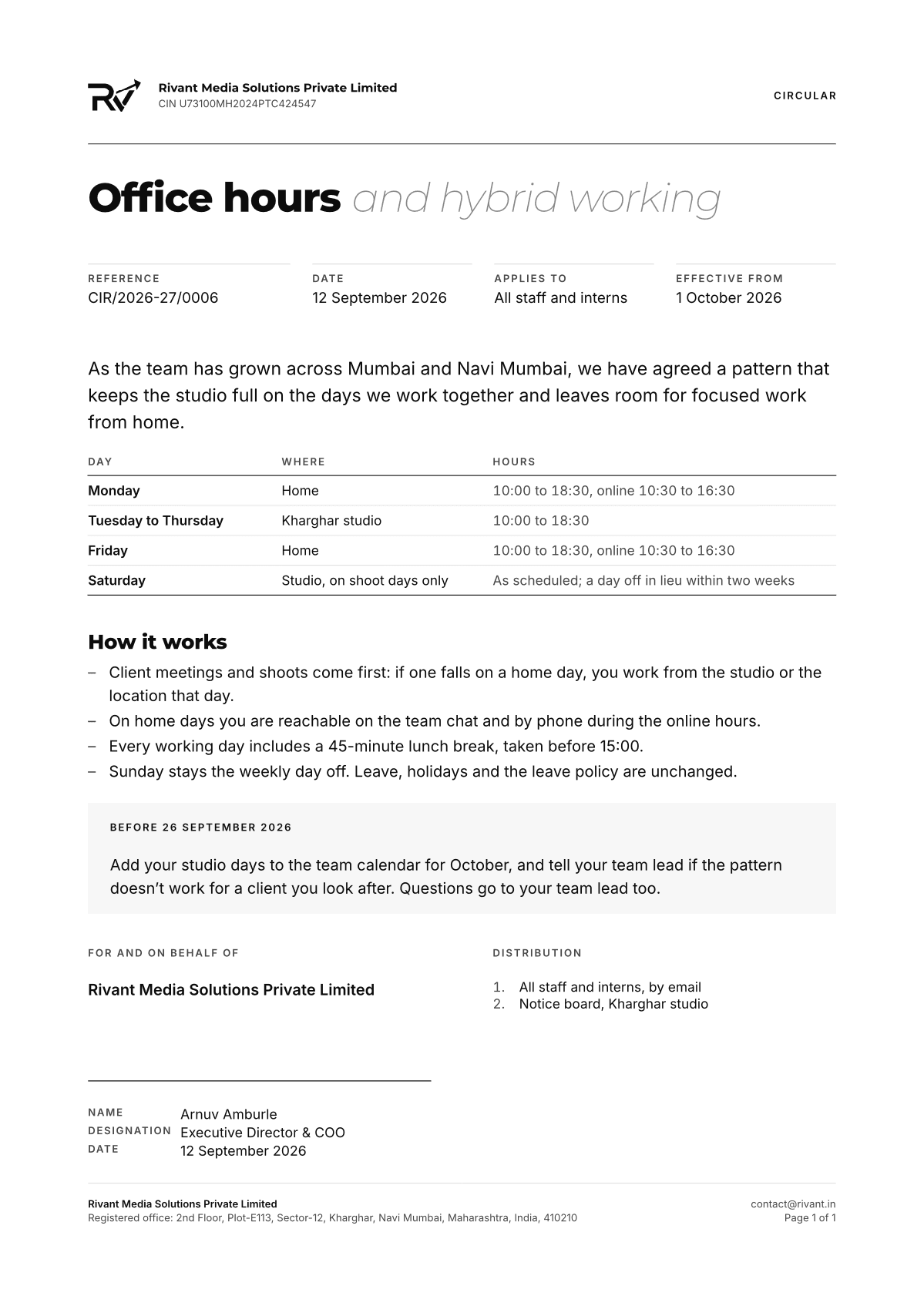
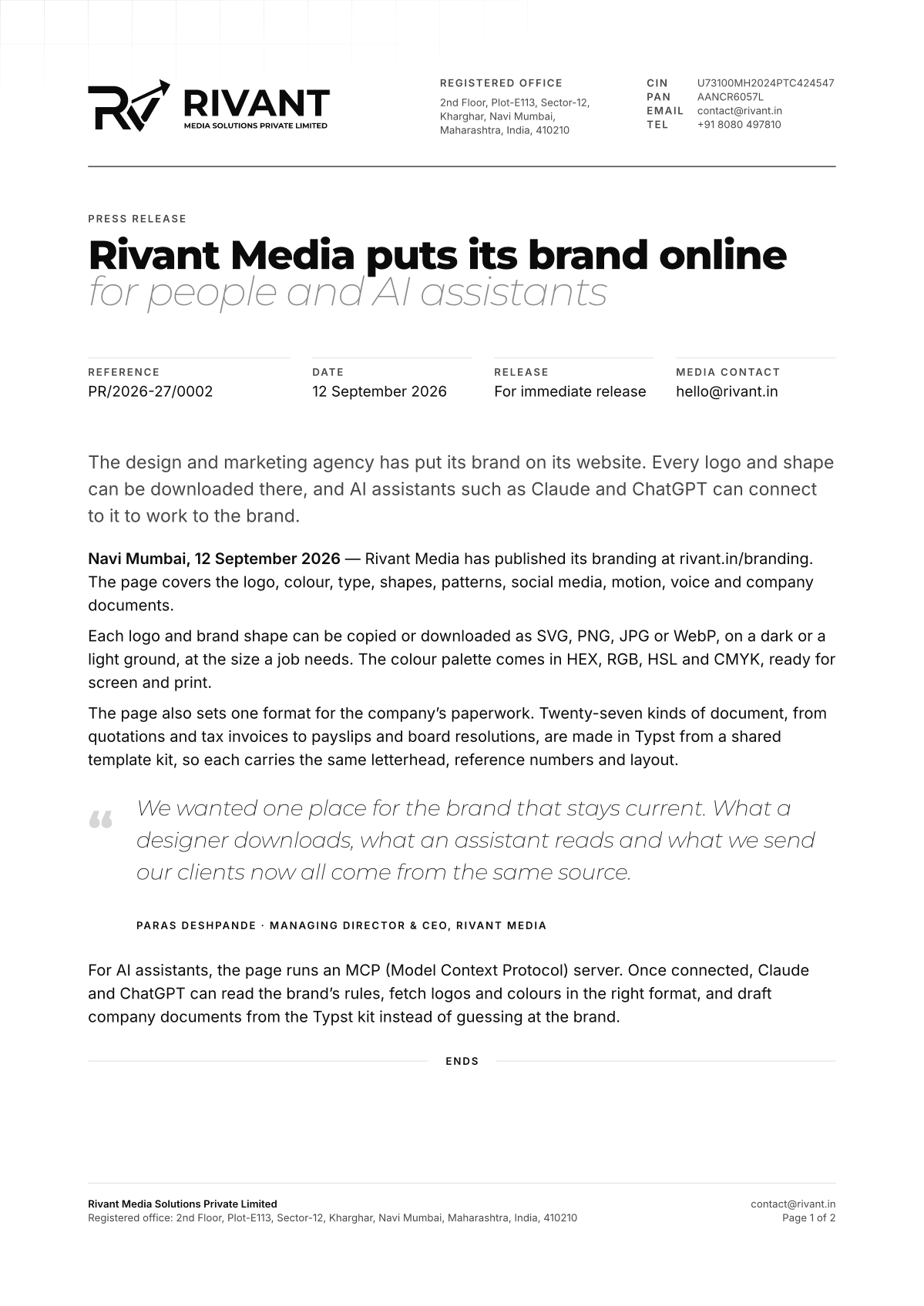
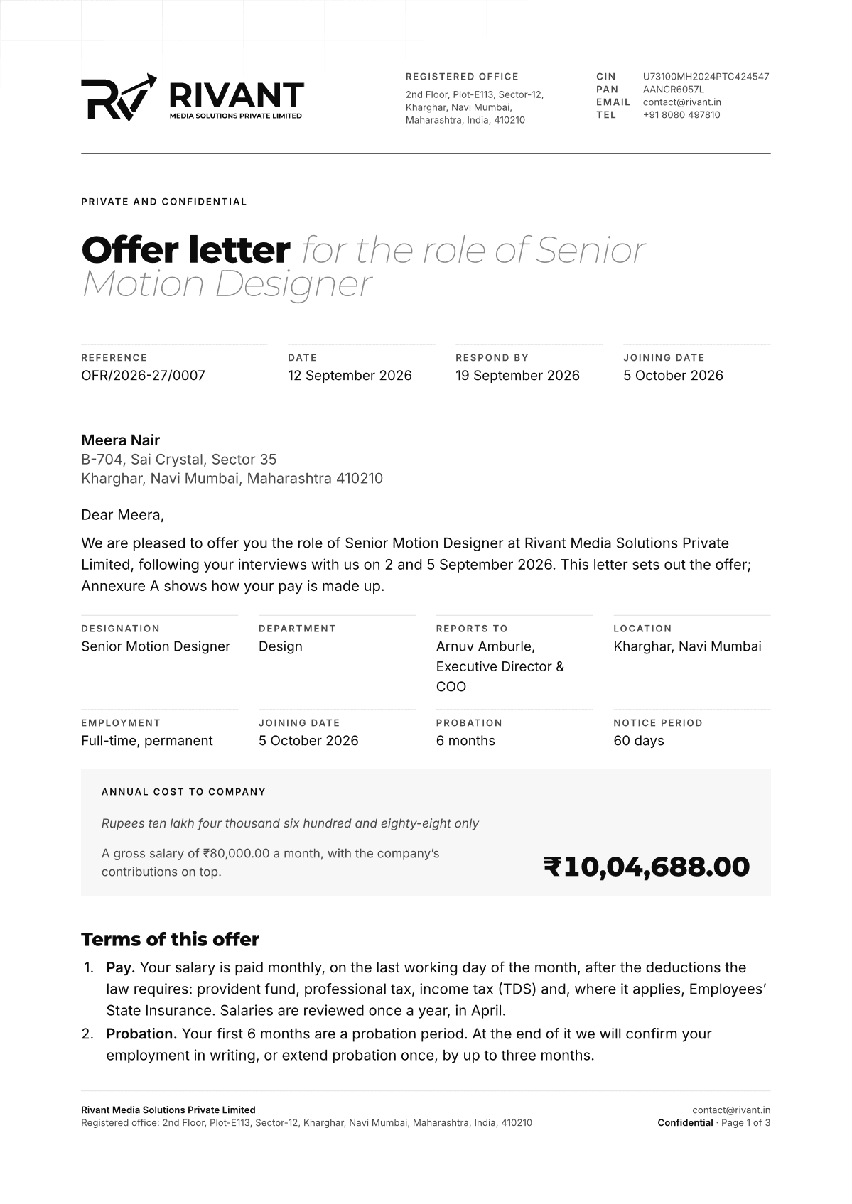
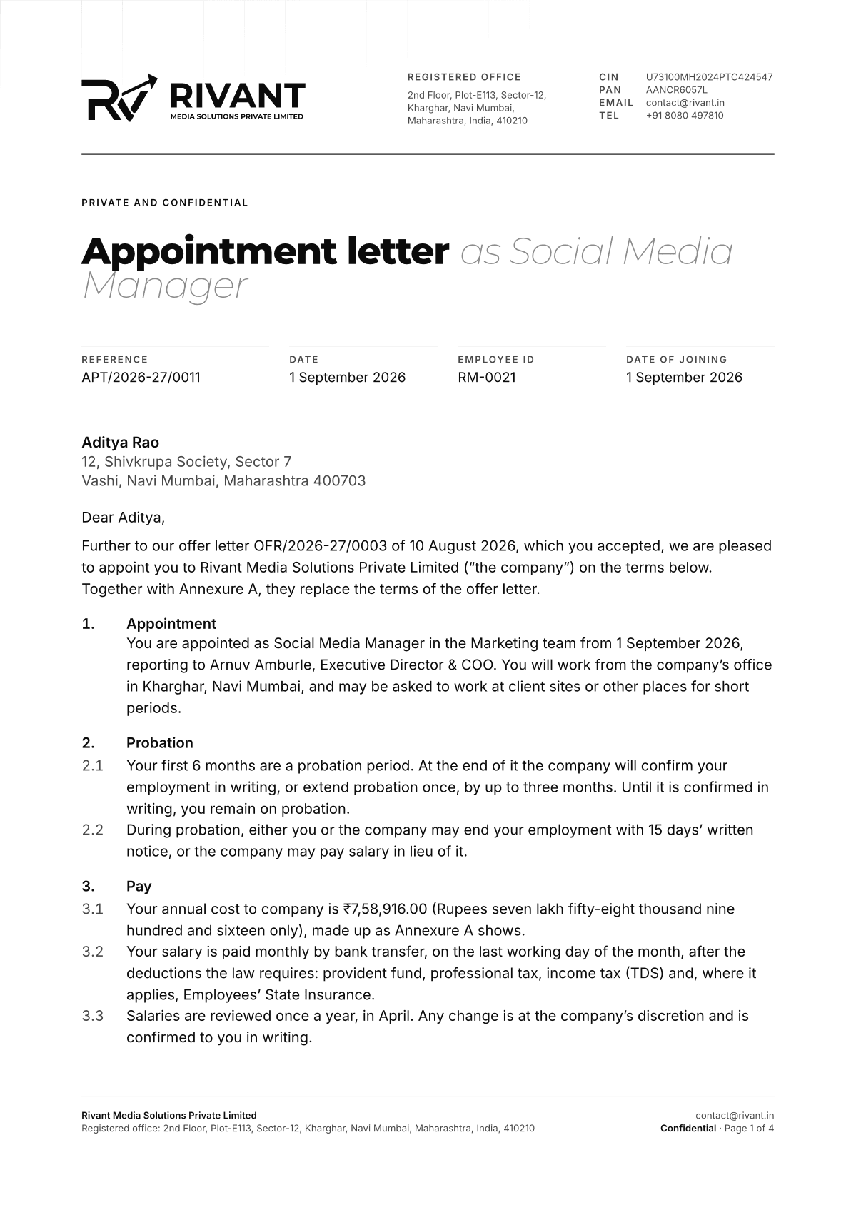
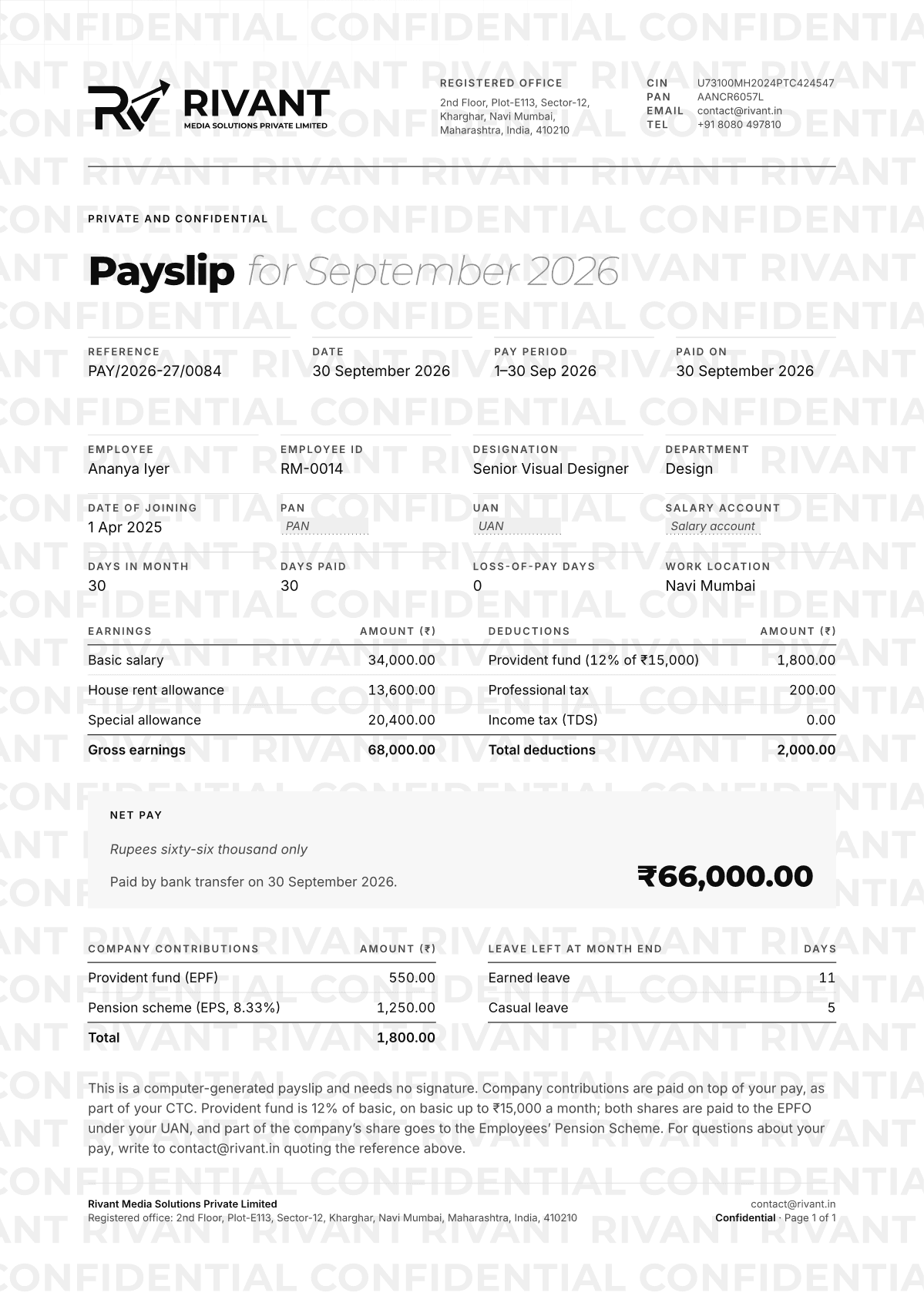
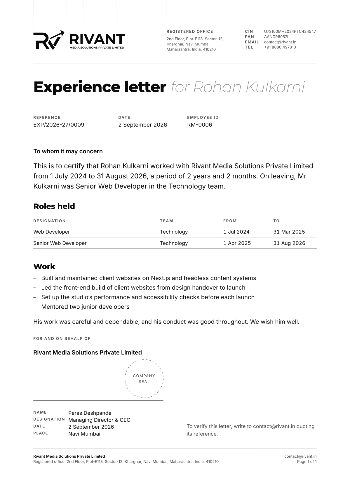
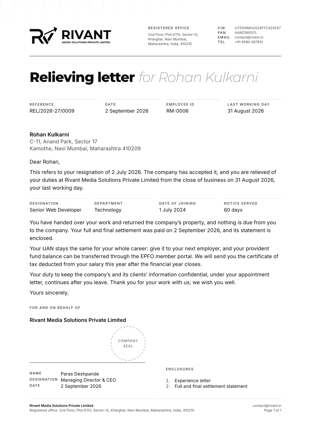
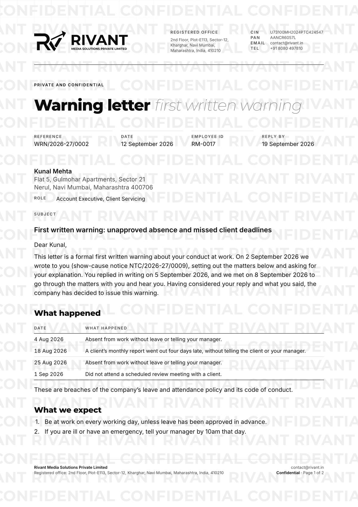
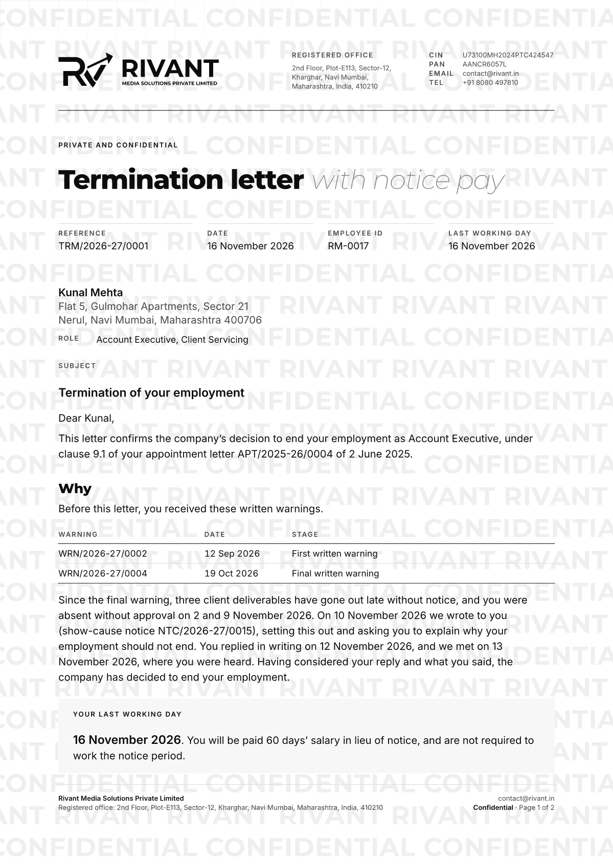
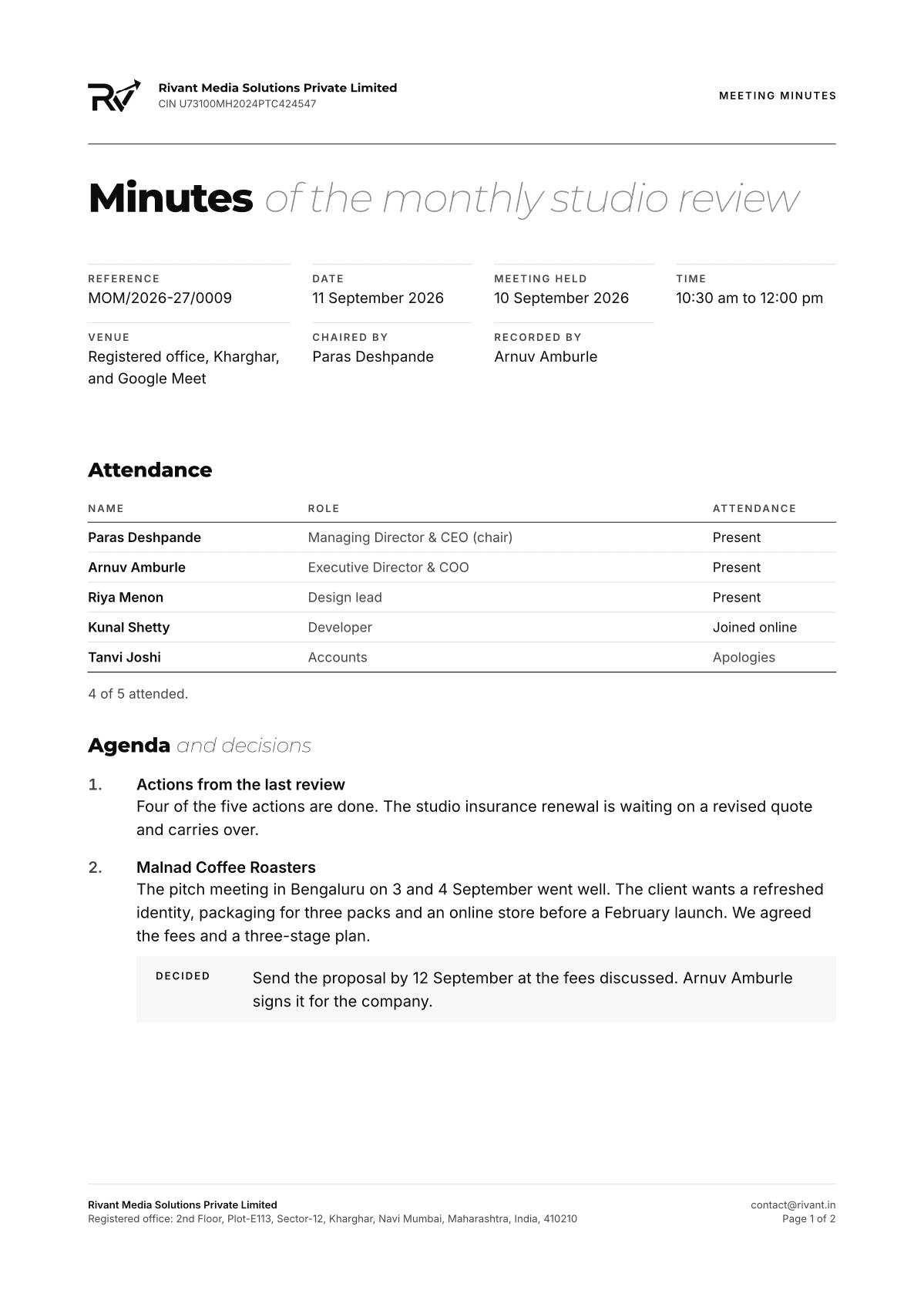
Page one: the legal logo left; registration (CIN, PAN, GSTIN when registered) and contact right; a slate rule below. Later pages: the logomark and the reference number.
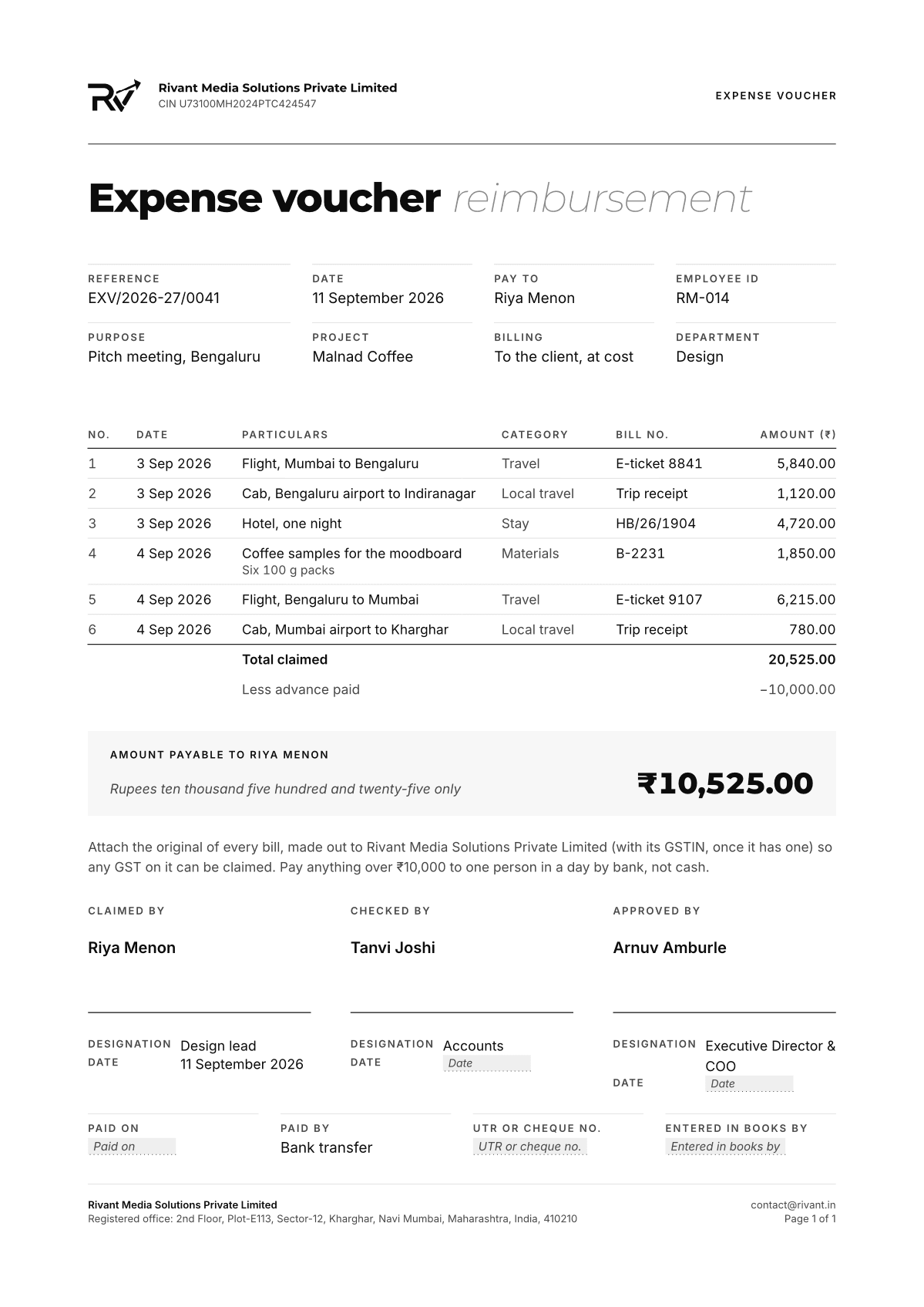
The compact header runs throughout on internal memo, circular, meeting minutes and expense voucher.
3
Reference number
The financial year runs April to March (2026-27). Each document type keeps its own sequence, restarting at 0001 each year. At most 16 characters, as GST requires of invoice numbers.
Written {code}/{fy}/{seq}. Make one below.
4
Money
Rupees with Indian grouping (₹1,23,456.00). Invoices add the amount in words.
5
Blanks, not guesses
Never invent figures, registrations (GSTIN), bank details, salaries or signatures. Ask for them, or leave a clearly marked blank.
6
Type
Inter 10pt on 1.5 leading for text; Montserrat for titles and figures that lead.
7
Signatures
For and on behalf of the company, the signatory's name and title, and space for the company seal.
8
Footer
Every page: the registered office, contact@rivant.in, and "Page n of N".
9
Colour
Void on white, with smoke for small labels (ash is too faint for small print) and slate hairlines. No other colour.
Referencenumbers
Every document is numbered: company, document type, financial year and sequence. Make the next one here.
INV · Document
Tax invoice
2026-27 · Financial year
April 2026 to March 2027
0001 · Sequence
Per document type, from 0001 each April
▾
Written as 0001
Everydocument
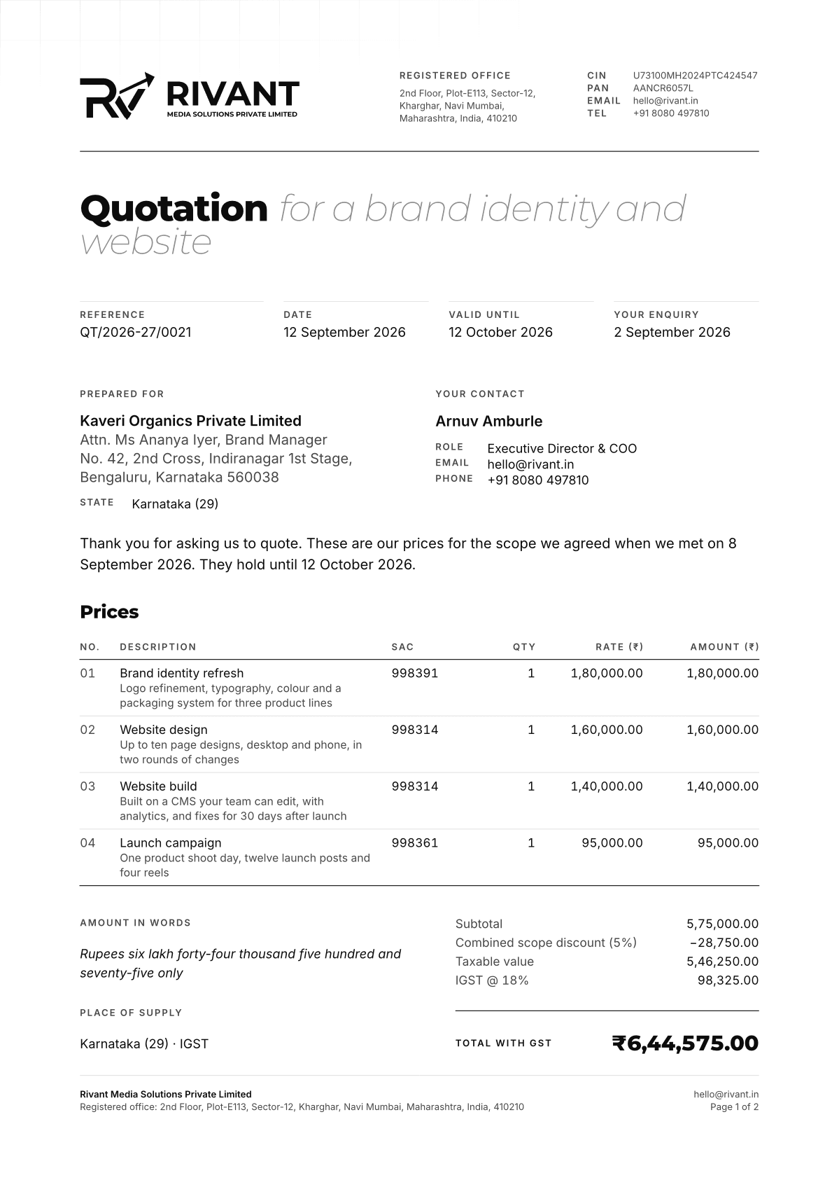
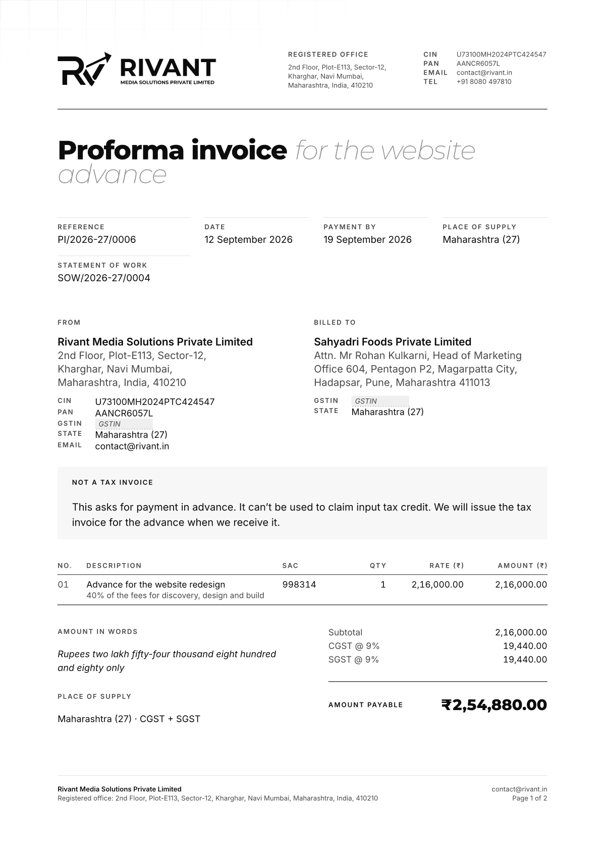
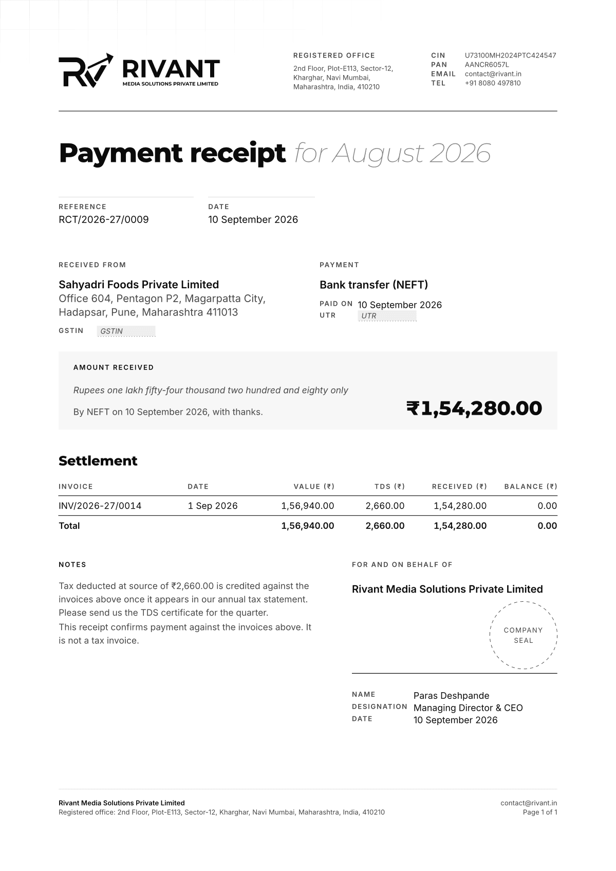
27 templates in five groups. Each one sets its own data block on the shared letterhead, so an invoice and a payslip come out of the same system.
Sales & finance
6 documents
Quotation
Reference code QT
Full letterhead
Prices for a defined scope, with validity, taxes and terms.
Unzip it and drag everything into the project's file panel, folders and all, then delete the empty main.typ the project started with. Typst.app picks up the fonts from the project, so the documents set in Montserrat and Inter there too.
rivant.typthe letterhead, tables and styles
templates/27 templates, one per document
fonts/Montserrat and Inter
assets/the legal logo and the logomark
GUIDE.mdhow to use the kit, for people and assistants
04
Open a template
Open the template for the document you need, templates/tax-invoice.typ for an invoice, and click the eye icon beside it in the file panel, so the preview and the export show it. It imports rivant.typ, which draws the letterhead, the footer and the tables.
05
Fill in the data
Each template opens with the document's data: reference, date, parties, lines and figures. Replace the sample values. What you don't know yet stays blank, never a guess.
templates/tax-invoice.typ
#let data = ( // true while the invoice is still being checked: prints the DRAFT // watermark. Set false for the copy you send. draft: false, // Invoice number: the next one in the tax invoice register for this // financial year (none prints a blank). Never skip or reuse a number; // a cancelled invoice keeps its number in the register. seq: 14, // Date of issue, YYYY-MM-DD. date: "2026-09-01", // Payment due date: 15 days after the date of issue unless agreed // otherwise. due: "2026-09-16", // What the invoice is for, set light after the title. subject: "for August 2026", // "Original for recipient" for the client, "Duplicate for supplier" // for our file. copy: "Original for recipient", // Our GSTIN, from the GST registration certificate. It must be on every // tax invoice; none prints a blank. Never type one from memory. gstin: none, // The recipient.
06
Export the PDF
The preview updates as you type. When it reads right, export it as a PDF and send that, never the source.
On your own machine
Install Typst (brew install typst, or from its GitHub releases), unzip the kit, and compile from its folder. --root . lets the templates reach rivant.typ, one folder up. Swap compile for watch to rebuild the PDF on every save.
Never invent figures, registrations (GSTIN), bank details, salaries or signatures. Ask for them, or leave a clearly marked blank.
10
MCPfor Claude and ChatGPT
Connect the brand to your assistant. It can read these guidelines, fetch any asset in any format and write documents in Typst from our templates.
Server address
https://rivant.in/api/mcp
Name
rivant-brand
Transport
Streamable HTTP
Sign-in
None
Tools
10
Askin plain words
The assistant reads the guidelines, fetches assets and fills in document templates through the server, so what comes back is on brand.
Try asking
Pick one to see what the assistant does with it, or copy it to ask your own.
rivant-brand
Make a tax invoice for Konkan Coast Resorts: a brand identity, ₹1,20,000 plus GST.
make_reference_numbertax-invoice
→ INV/2026-27/0001
get_document_templatetax-invoice
→ tax-invoice.typ, and how to fill it in
Here's the invoice as Typst source, numbered INV/2026-27/0001. Konkan Coast Resorts' address, GSTIN and state weren't in your message, so they're marked blanks; the state decides between CGST with SGST, and IGST. Fill them in, open the file on Typst.app with the kit, and export the PDF.
tax-invoice.typTypst source
Ask about the brand
An illustration of the calls, not a live session.
Connectyour assistant
About a minute in each. The address is the same everywhere, and there is nothing to sign in to.
On claude.ai and Claude Desktop
1Open Settings, then Connectors.
2Choose Add custom connector.
3Name it Rivant brand and paste the address.
4Leave the advanced settings empty: the server needs no sign-in. Choose Add.
5In a chat, switch it on from the tools menu under the message box.
A connector added on claude.ai appears in Claude Desktop too. On Team and Enterprise plans an owner may need to add it for the organisation first.
In Claude Code
Add it from a terminal:
Terminal
claude mcp add --transport http rivant-brand https://rivant.in/api/mcp
Then run /mcp in a session to check it is connected. Add --scope user to have it in every project.
As a connector in developer mode
1Open Settings, then Apps & Connectors.
2Under Advanced settings, turn on Developer mode.
3Back in Apps & Connectors, choose Create.
4Name it Rivant brand, paste the address and set authentication to No authentication. Confirm you trust it, then create it.
5In a chat, open the + menu, choose Developer mode and add Rivant brand.
Developer mode depends on your plan, and in a workspace an admin may have to allow it. The server also offers the search and fetch tools that ChatGPT connectors and deep research look for.
Clients that take an address
Cursor and most MCP clients take an entry like this in their MCP settings. VS Code names the key servers and wants "type": "http" beside the address.
The server offers 10 tools. The assistant picks them for you; you only ask.
01
get_brand_guidelines
The guidelines as text: logo, colour, type, shapes, social, motion, voice, documents.
02
list_brand_assets
Every logo, shape, pattern and watermark, with its formats and links.
03
get_brand_asset
One asset as SVG, PNG, JPG or WebP, at any size, on any brand ground.
04
get_colour_palette
The palette as HEX, RGB, HSL, CMYK, CSS variables or Tailwind tokens.
05
list_document_types
Every document the company issues, with its reference code and letterhead.
06
get_document_template
The Typst template for a document type, and how to fill it in.
07
get_typst_kit
The shared Typst library, fonts and logos, and how to set them up on Typst.app.
08
make_reference_number
The next reference number for a document, in the company's format.
09
search
Searches the guidelines, assets and templates (for ChatGPT connectors).
10
fetch
Fetches one search result in full (for ChatGPT connectors).
Documentscome back as Typst
Ask for an invoice, a letter or a payslip and the assistant returns the template filled in as Typst source, with its reference number and a marked blank for anything it wasn't told. It doesn't make the PDF: open the source on Typst.app with the kit, check it, and export it there.
The fonts are free to use under the SIL Open Font License, and the fonts pack carries each one's licence. The logos, shapes and name are the company's: use them to refer to Rivant Media, as this page shows, and ask before using them anywhere else.


















Social media
Profile pictures, headers and the watermark every post carries, measured to the pixel.
Profile picture
Use the square full logo, name and tagline included, in paper on a void circle. Not the logomark alone, not inverted, not cropped or overflowing the circle.
The name and tagline are hard to read at the smallest sizes. They stay anyway: seen beside the mark every time, they teach people what the mark means.
At the sizes it’s seen
Watermark on every post
The logomark sits in the top right corner of every post: 120 × 74px, 74px from the top and 60px from the right on content 1080px wide, whatever its height.
The watermark file: the logomark in paper.
Header without a logo
Headers use the grid and the brand shapes in greyscale, with no logo or copy: the profile picture carries the name.