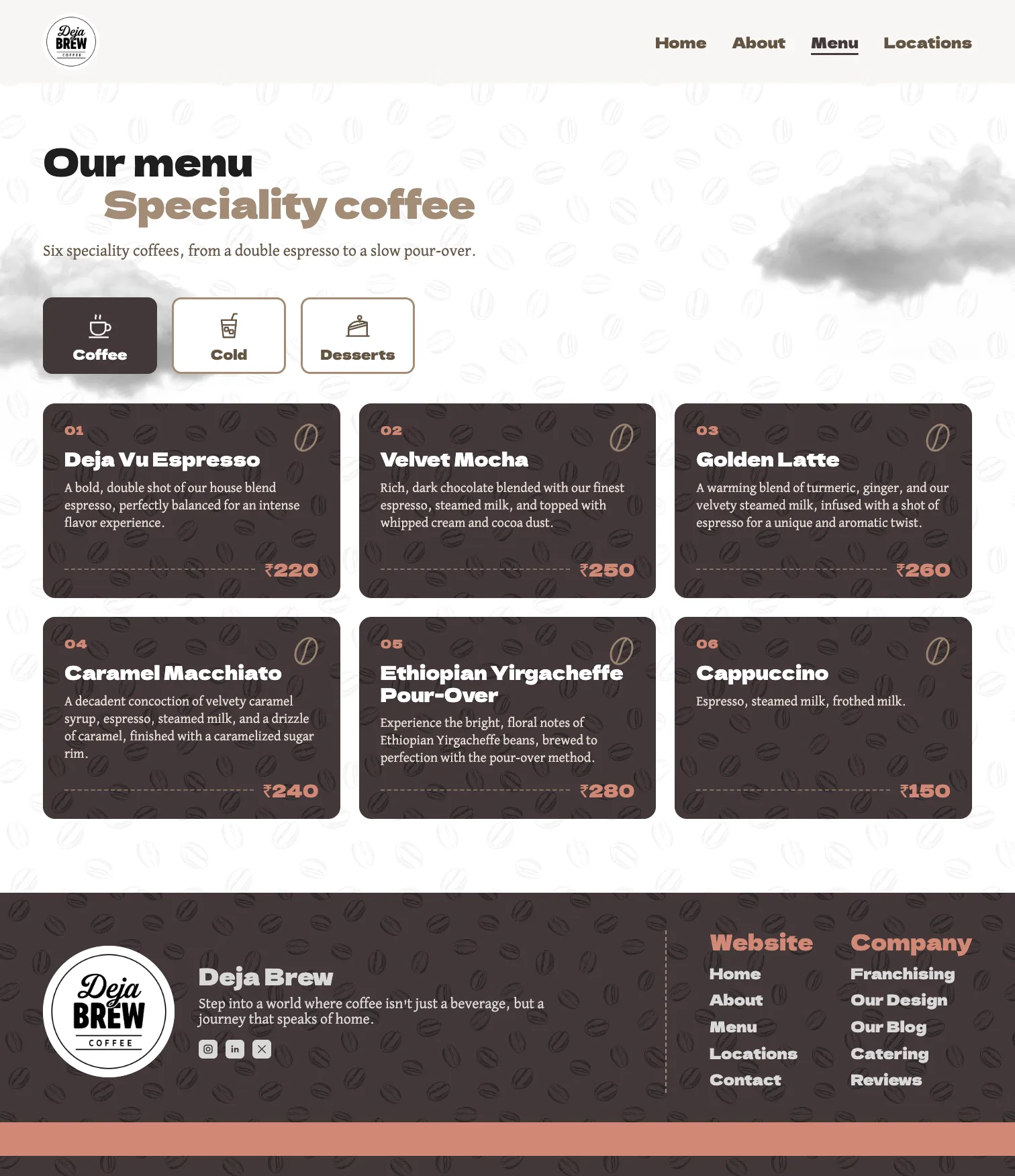
Deja Vu Espresso
A bold, double shot of our house blend espresso, perfectly balanced for an intense flavor experience.
₹220
Case study · Website
A coffee website that walks you from the farm to the cup.
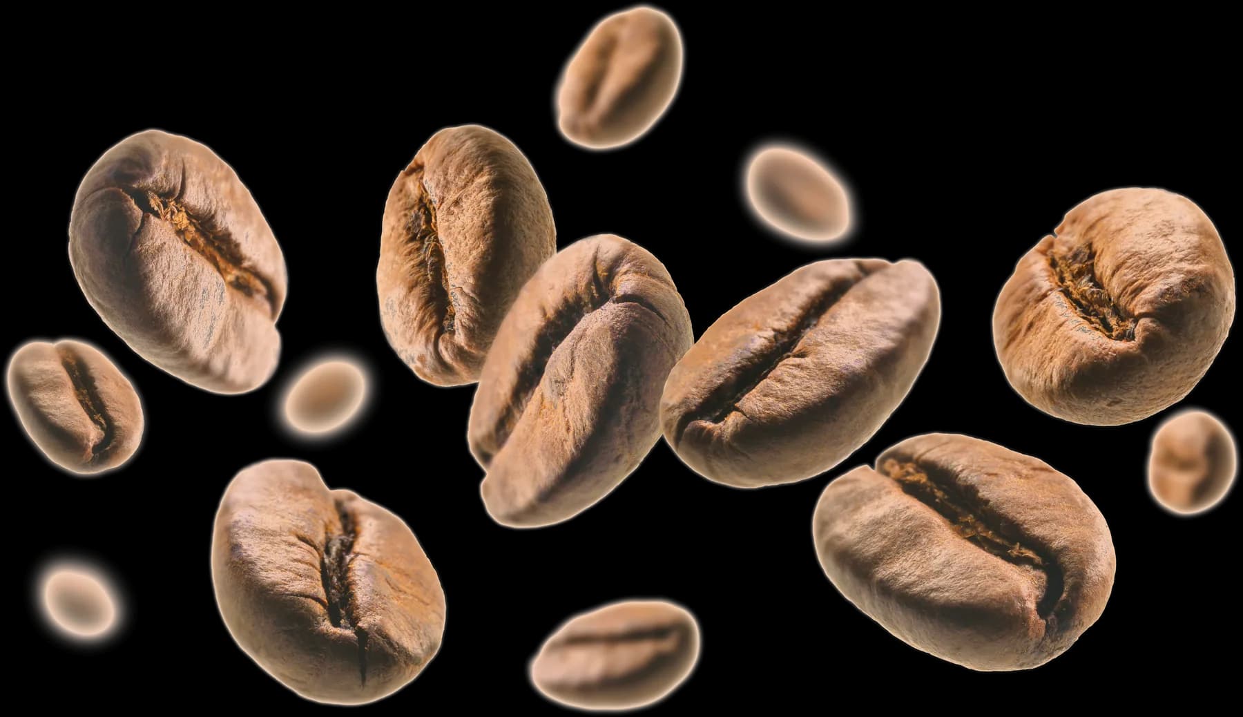
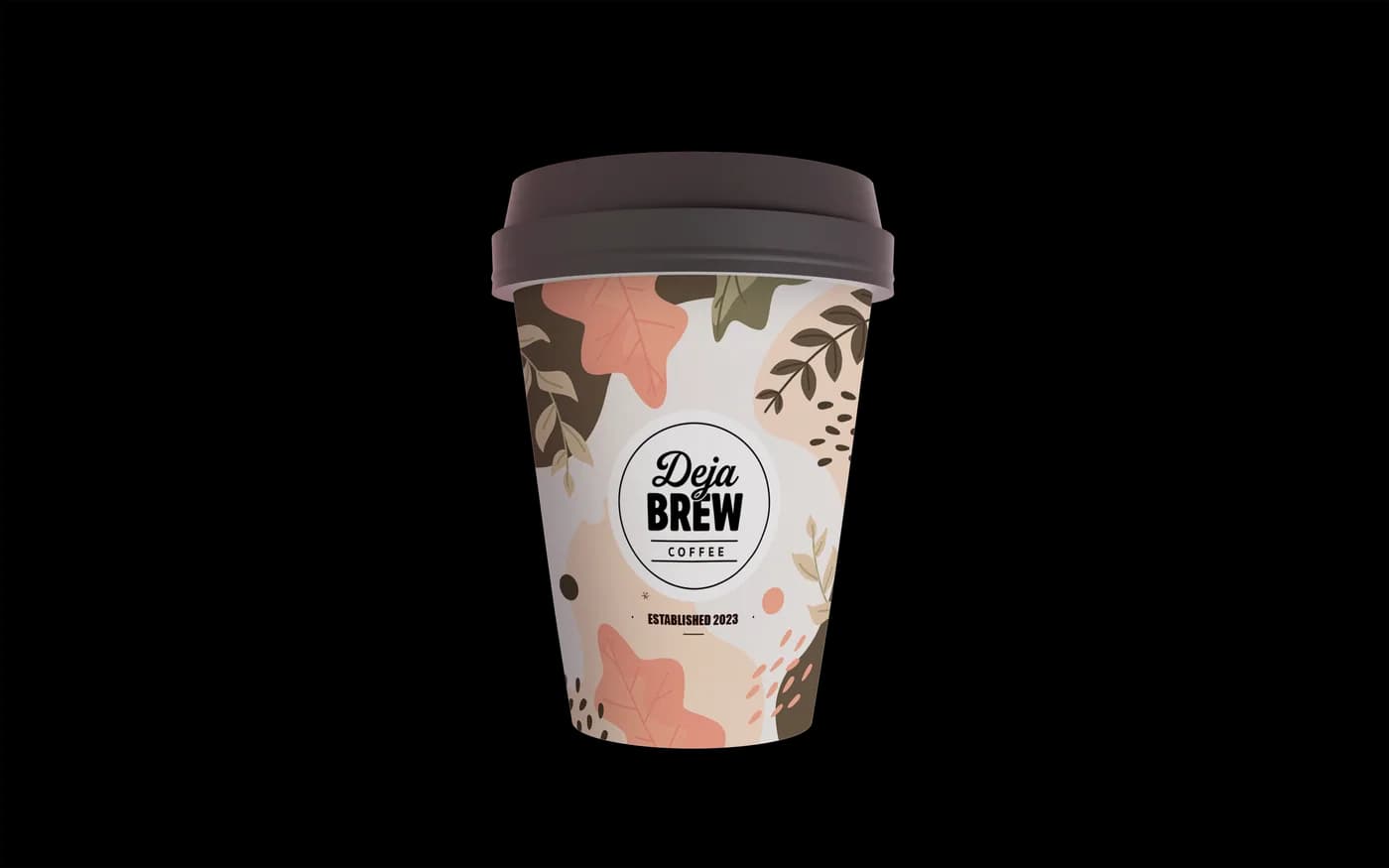
“Coffee that speaks of home” was the line to design to. The site had to feel homely, take its time, and show where the coffee comes from before it asks anyone to visit.
Drawn up before any page: two fonts, nine colour tokens and a type scale for desktop and phone, then the parts the pages are built from.
Dela Gothic One
Used for headings
David Libre
Used for paragraphs
Where it all begins
Handpicked with care
With nature’s touch
Rolling hills adorned with emerald green coffee bushes, basking under the golden rays of the sun. This is where our coffee’s journey begins, in the heart of the lush coffee fields.
Gokhalenagar
Open from 06:00am – 10:00pm
Plot no. 56, SB Road
The home page opens on the floating cup, then walks back to where the coffee started: eight stops down a dashed path, from “Picture a place” to “Served with passion”, before the café’s promises and the footer.
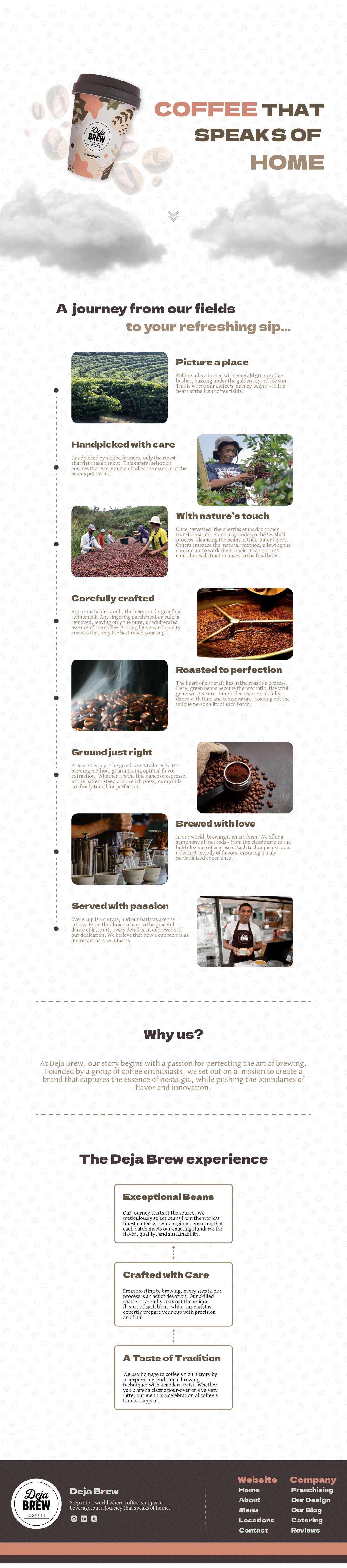
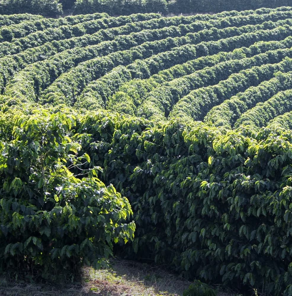
Picture a place
Rolling hills adorned with emerald green coffee bushes, basking under the golden rays of the sun.
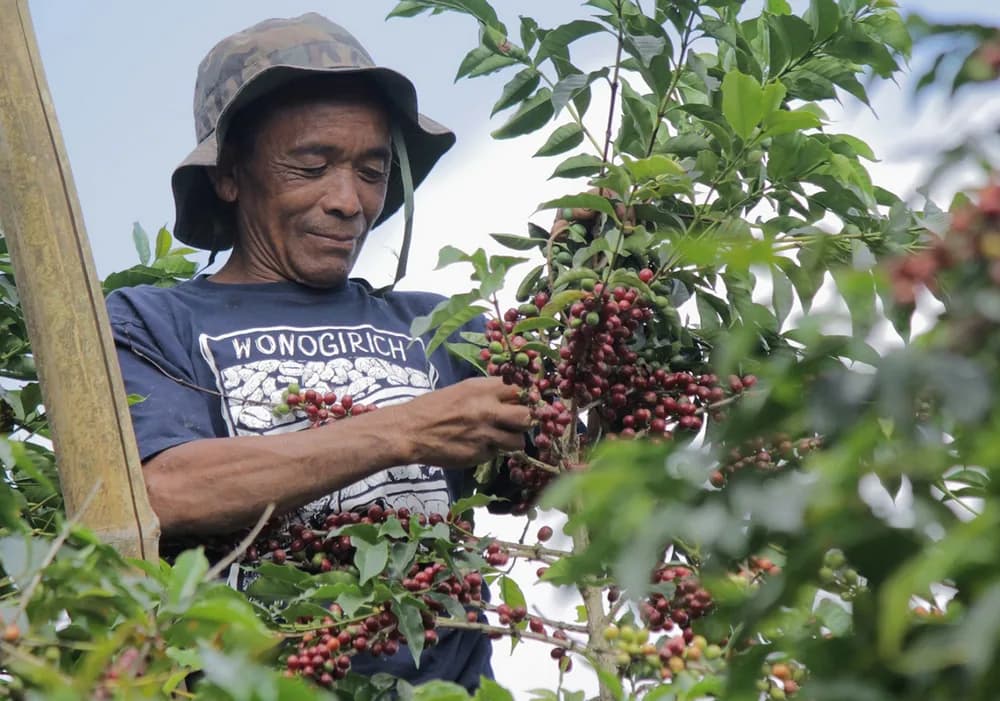
Handpicked with care
Handpicked by skilled farmers, only the ripest cherries make the cut.
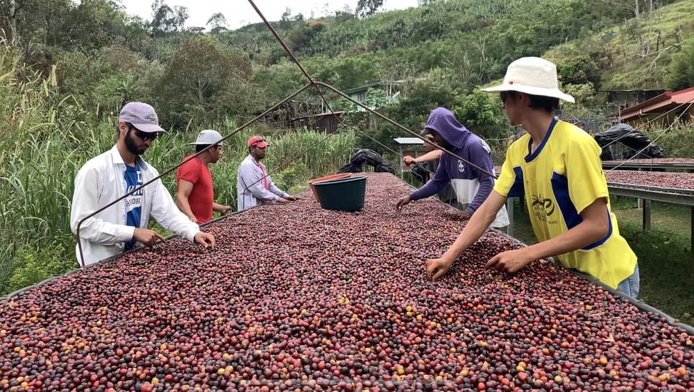
With nature’s touch
Some cherries go through the ‘washed’ process; others the ‘natural’ method, left to the sun and air.
Carefully crafted
At the mill, the last parchment and pulp come off, and the beans are sorted by size and quality.
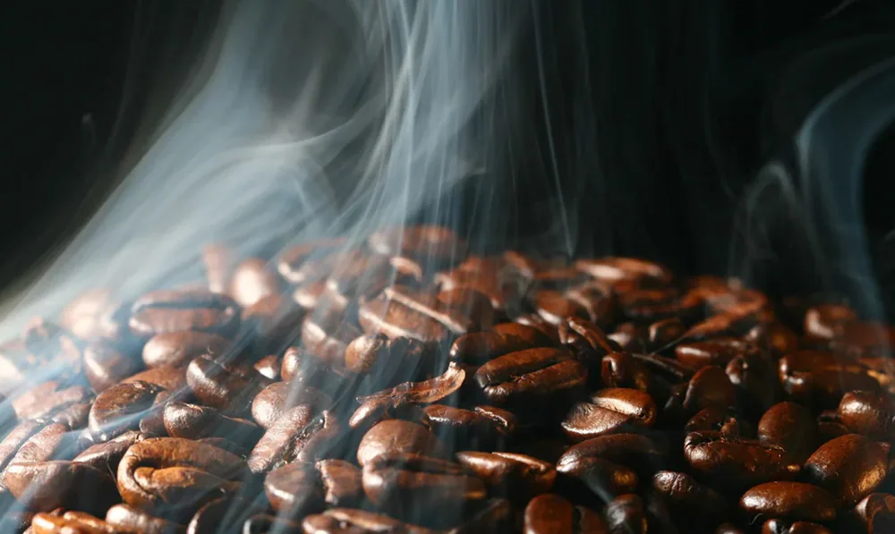
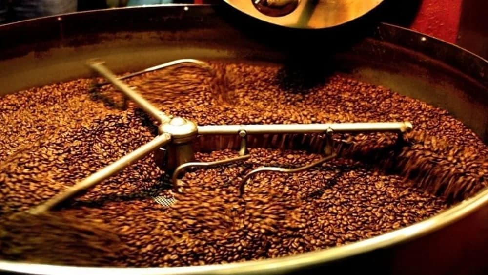
Roasted to perfection
Green beans become the aromatic, flavourful gems we treasure.
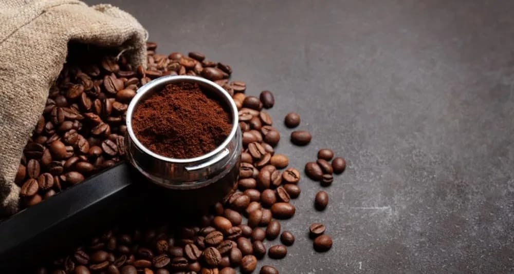
Ground just right
The grind is tailored to the brewing method, from espresso to French press.
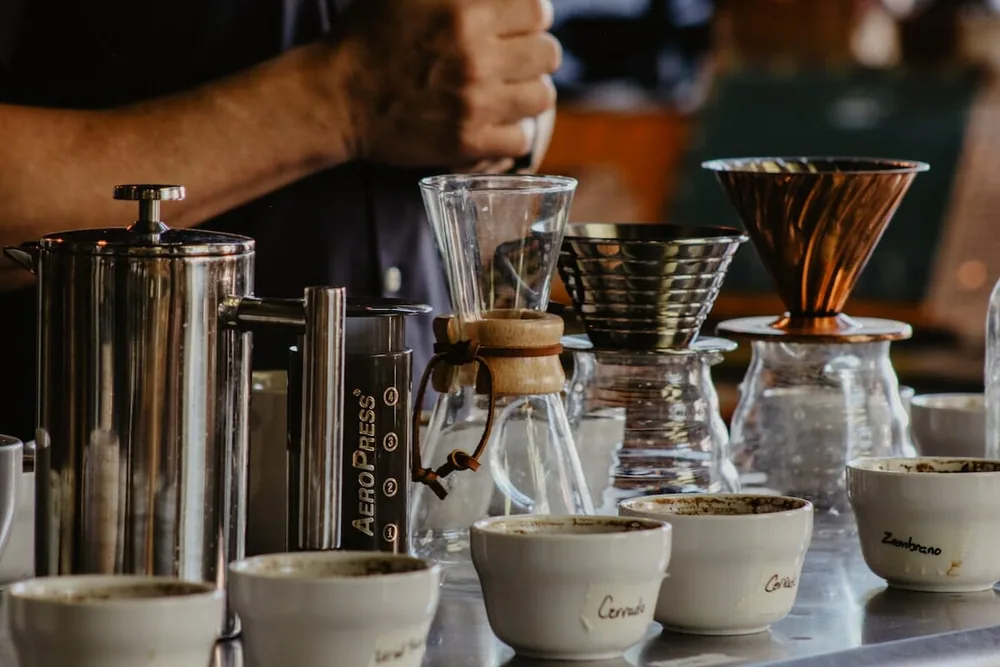
Brewed with love
A symphony of methods, from the classic drip to the bold elegance of espresso.
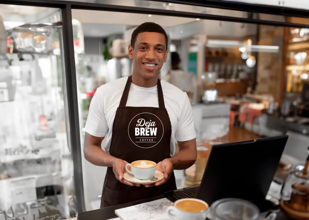
Served with passion
Every cup is a canvas, and our baristas are the artists.
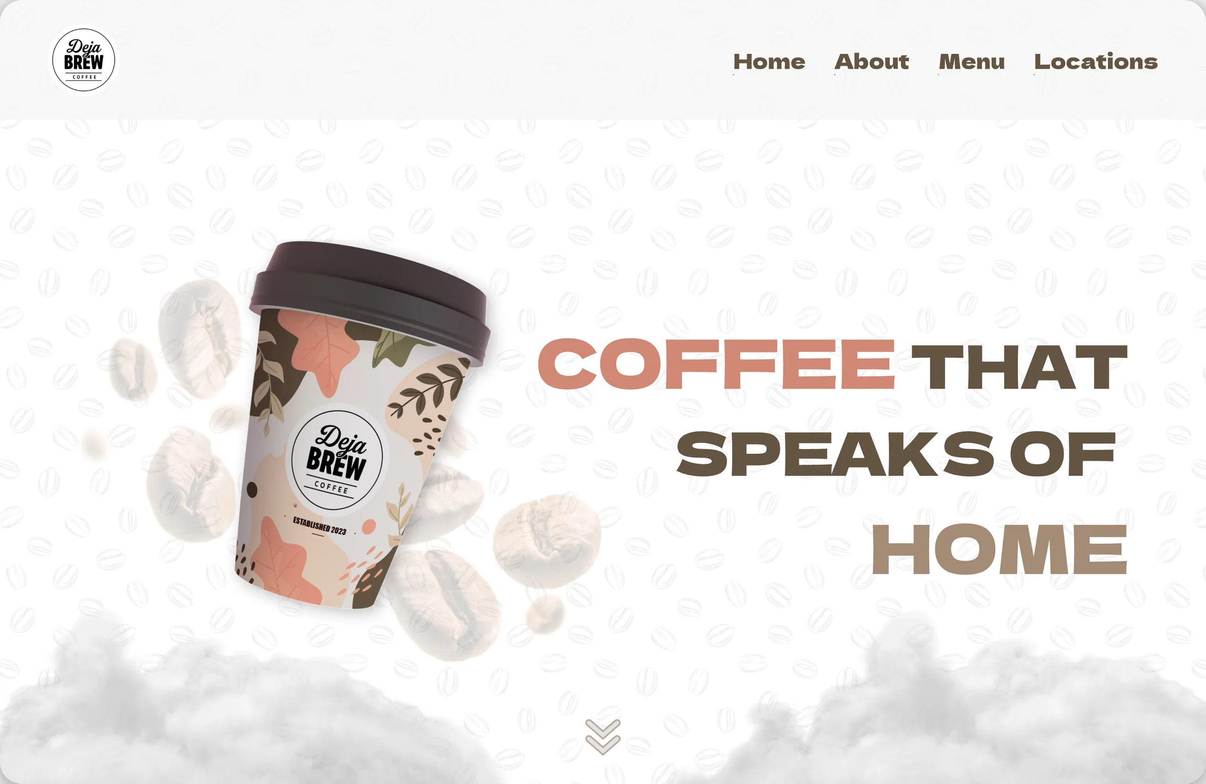
The home page’s first screen
The same journey, stacked: the cup above the line, the path down the left edge, every photograph full width, and the navigation folded into one button.

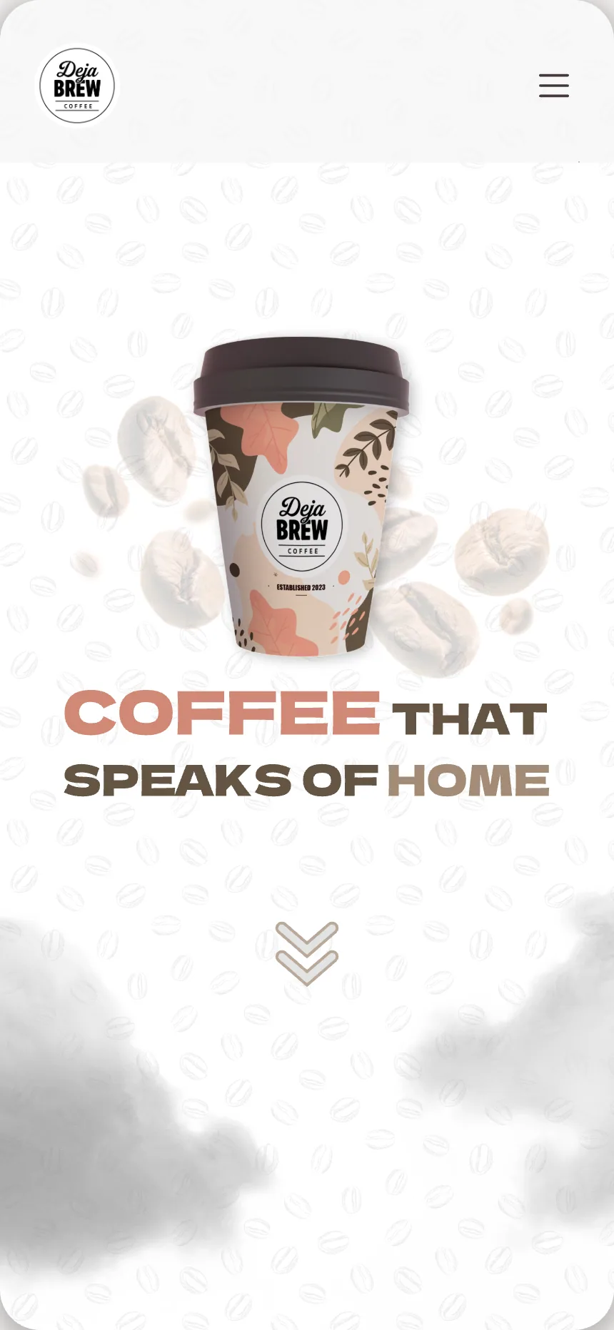
The first screen on a phone
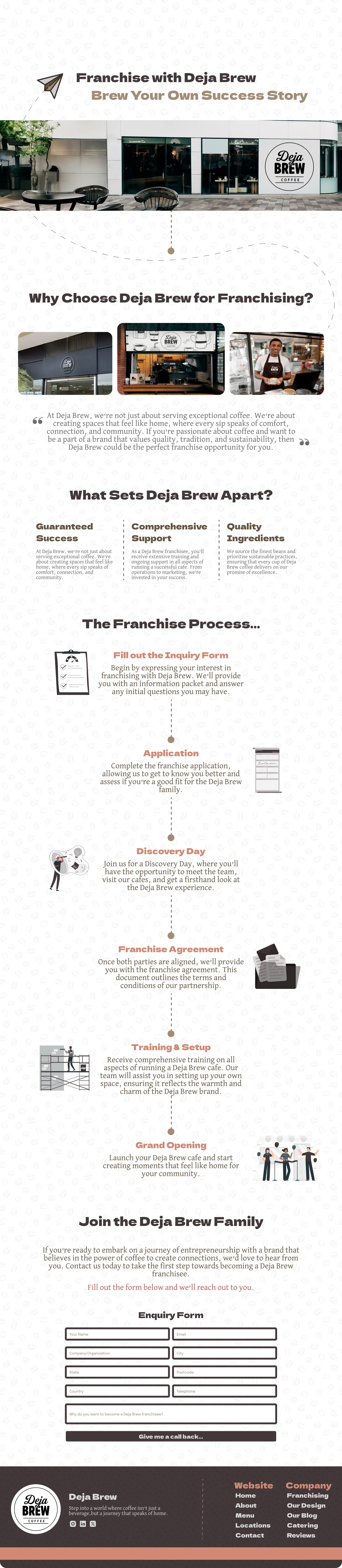
“Brew your own success story.” The franchise page makes the case in three columns, then lays out the application as the same dashed path as the journey, six stops from the enquiry form to the grand opening, and ends on the form itself.
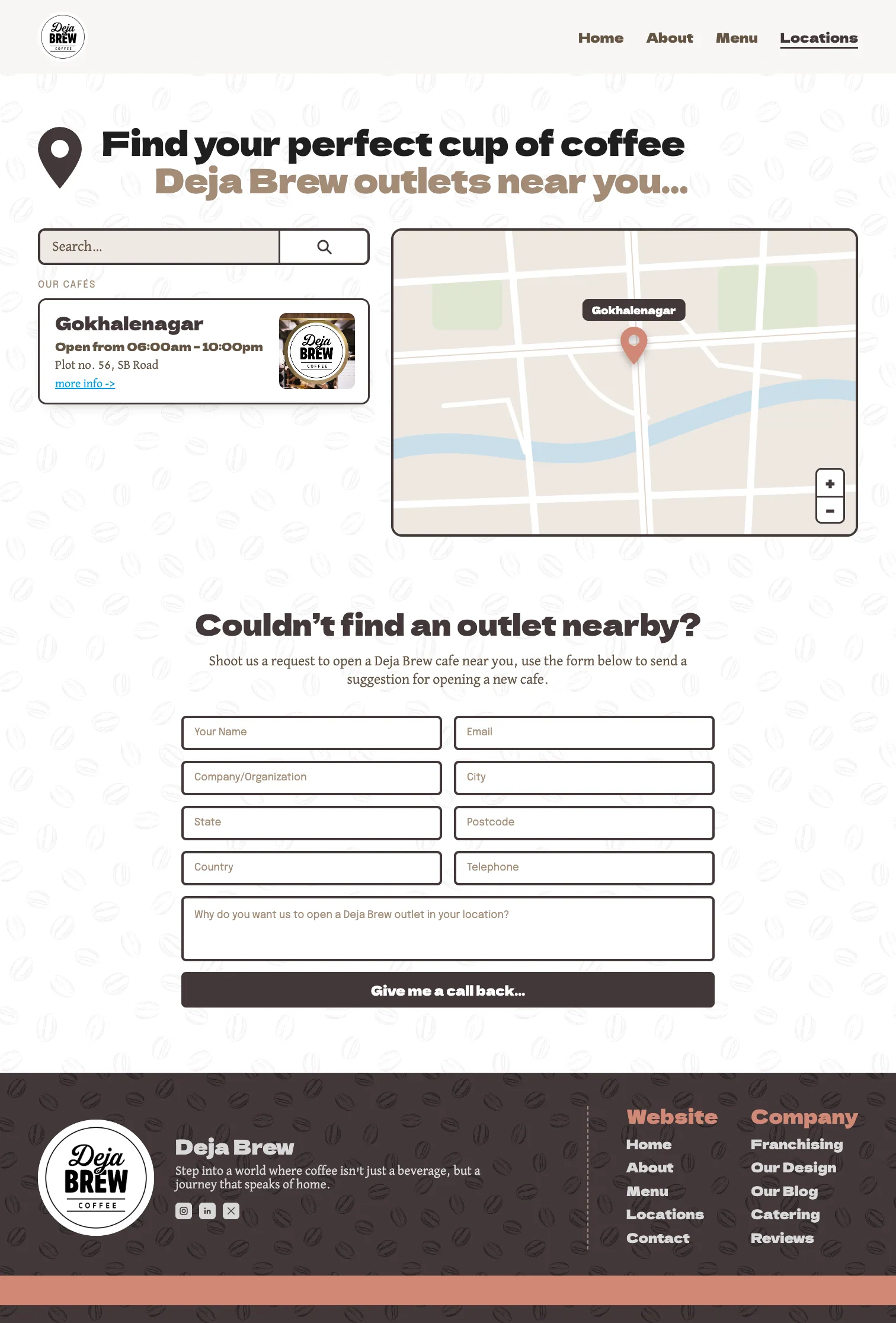
Both were stubs in the file: a heading and one card on the menu, one placeholder outlet repeated six times on locations. We finished them. The speciality list sits in dark cards under three counters; the finder shows the one real café beside a map, with the request-a-café form below.


The badge over the door, on a kiosk and on the wall behind the counter, in the mock-ups that run through the site, from the franchise page to the outlet cards. We designed the takeaway cup too.