RIVANT

Float Energy

Three cans, a four-pack and a launch kit for an energy drink
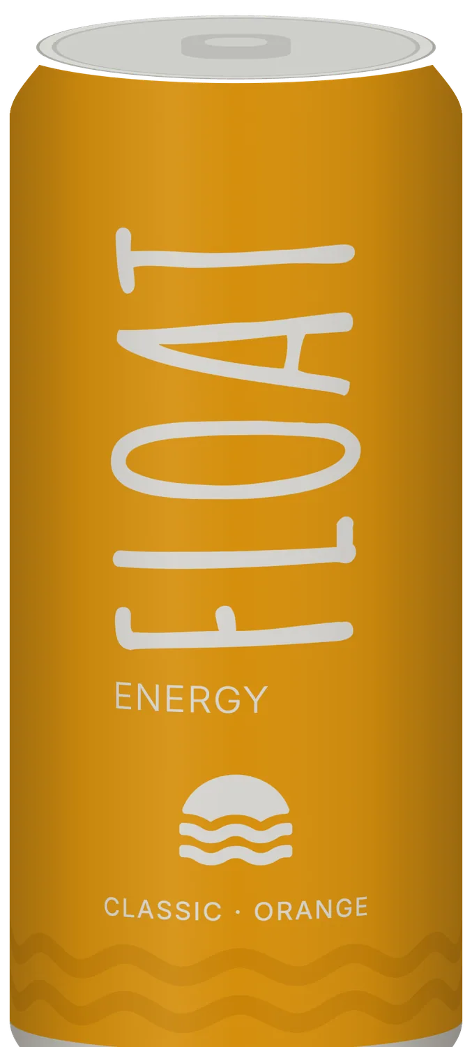
The Classic Orange can: FLOAT in warm grey running up an orange can
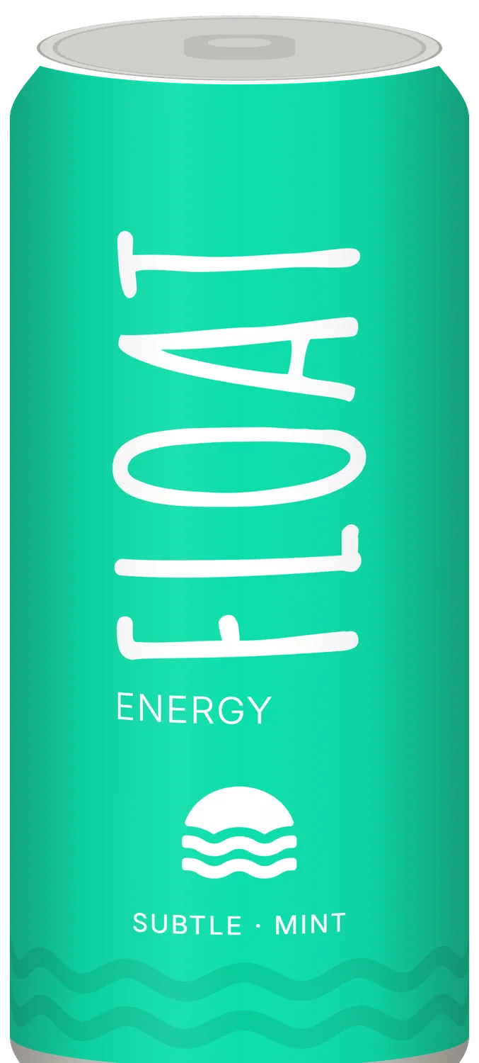
The Subtle Mint can: FLOAT in white running up a mint can
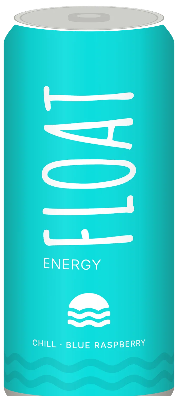
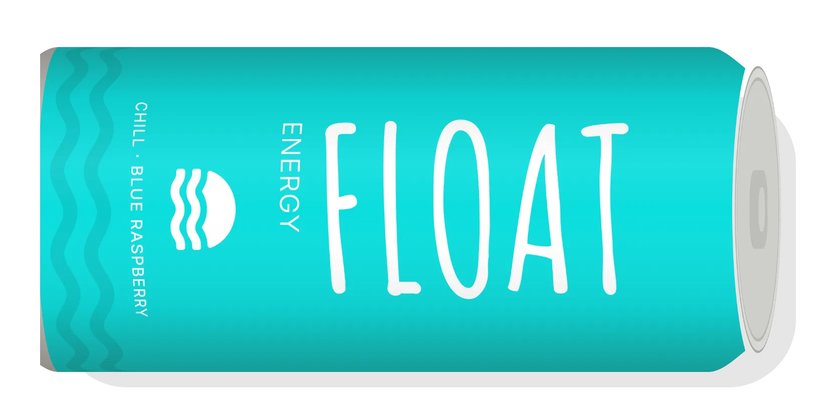
The Chill Blue Raspberry can: FLOAT in white running up a cyan can

The brief

It started as a hand-drawn word, a small sun over the sea and three flat panels in Figma. We made it a range you can pick off a shelf.
What we made

  • Wraparound labels for three flavours
  • A mixed four-pack carton
  • Lockups, the icon and a profile picture
  • A brand kit
  • Launch posts and a story
  • A one-page product site
  • A shelf wobbler
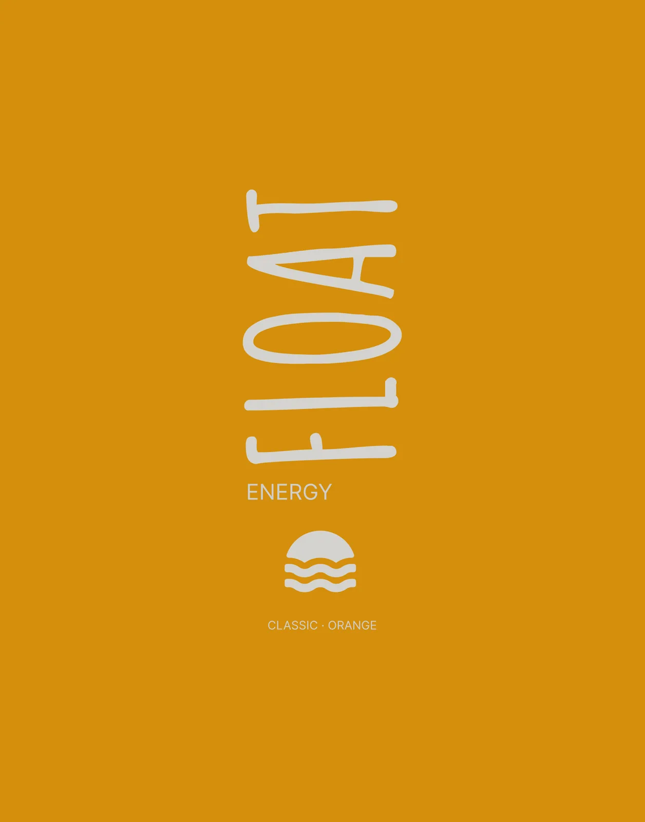
The first orange panel from the Figma file: FLOAT, ENERGY, the icon and CLASSIC · ORANGE on flat orange
Where it started: the first orange panel in the client’s Figma file.

The mark

FLOAT stands on end, the way you hold the can.

The letters are drawn by hand and set to read up the can. Under them a sun goes down into two waves. Both work in one colour, warm grey on orange and white on mint and cyan, and FLOAT turns to read across when there’s no room to stand it up.
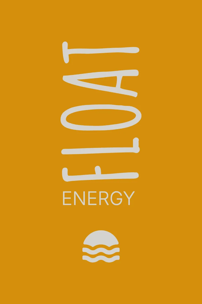
  • The vertical lockup in warm grey on orange: FLOAT, ENERGY and the icon
    Vertical, as it stands on the can
  • The horizontal lockup in light black on cream: the icon, FLOAT turned to read across, and ENERGY
    Turned to read across, for a nav bar or a carton top
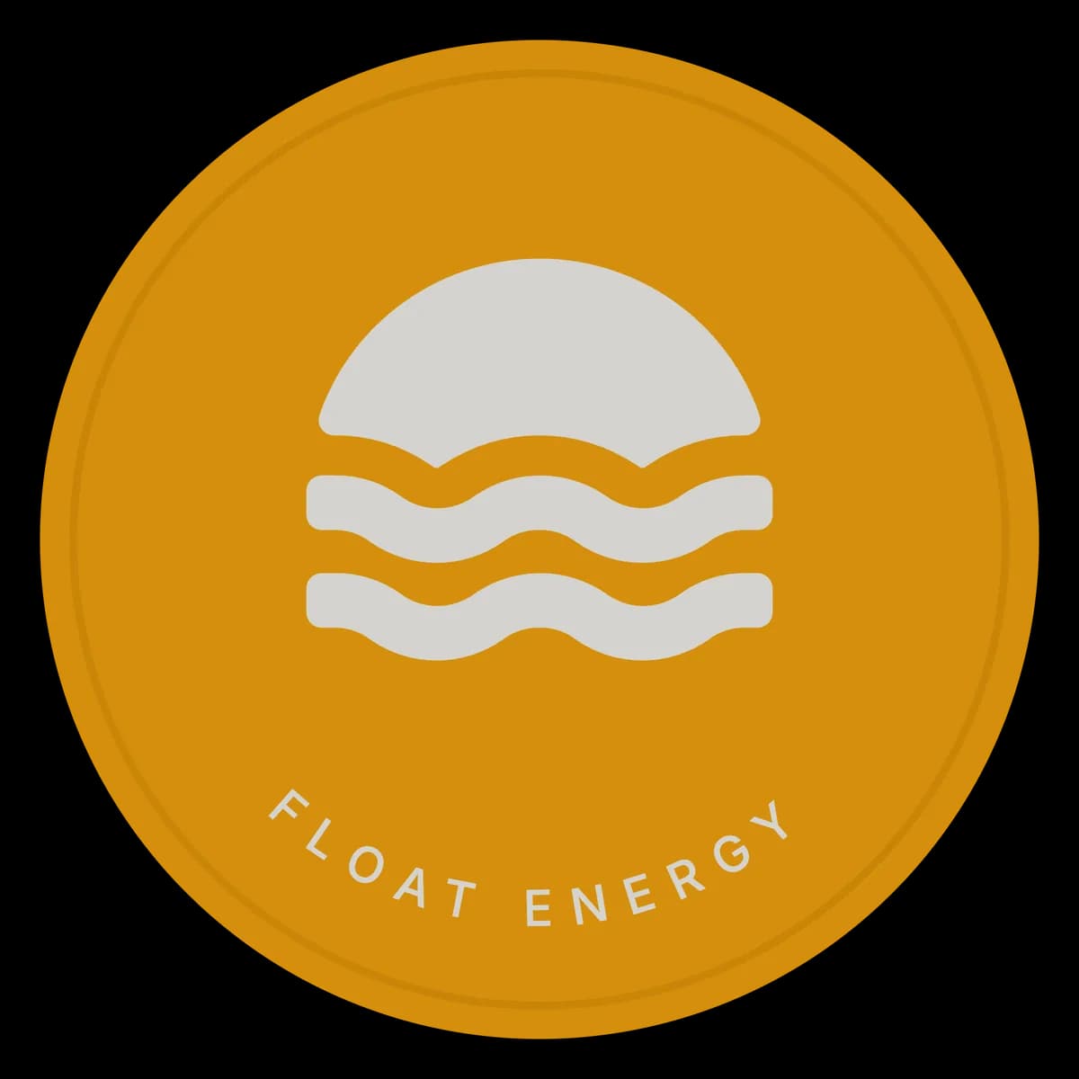
  • The profile picture: the sun-over-waves icon in warm grey on an orange circle
    The icon alone, as a profile picture

Three flavours

One colour each, all the way round.

Each can is one flat colour. The mark goes warm grey on orange and white on mint and cyan, the flavour’s line takes a darker shade of its colour, and the icon’s waves run right round the base. Scroll past a can and it turns: back, side, front.

We named the third flavour Chill Blue Raspberry and wrote the lines on the cans.

Classic Orange

Sourced from the best

250 ml sleek can · 182 × 115 mm wrap

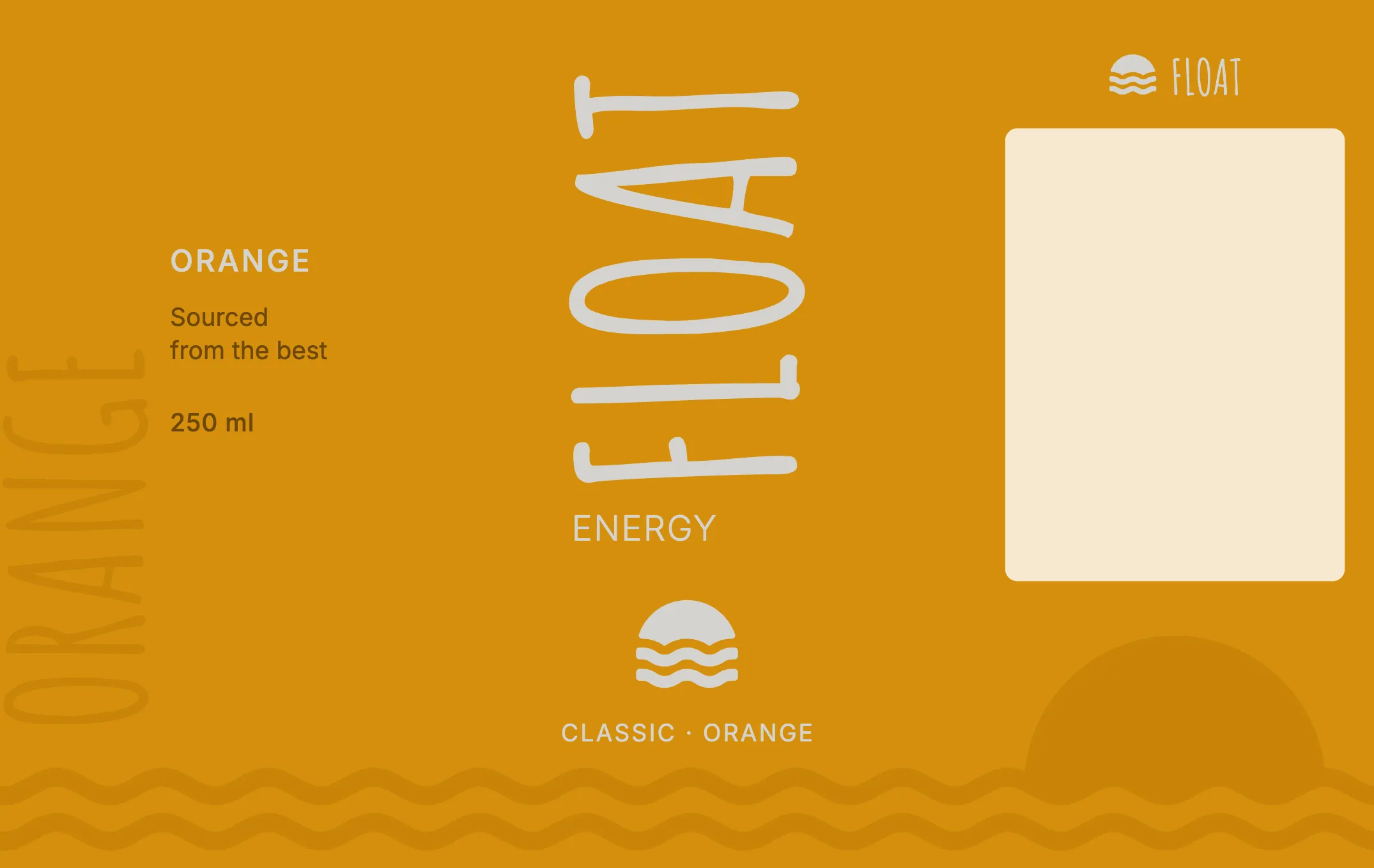
The Classic Orange can, turning to show its label. The Classic Orange wraparound label laid flat: side panel, front and back.

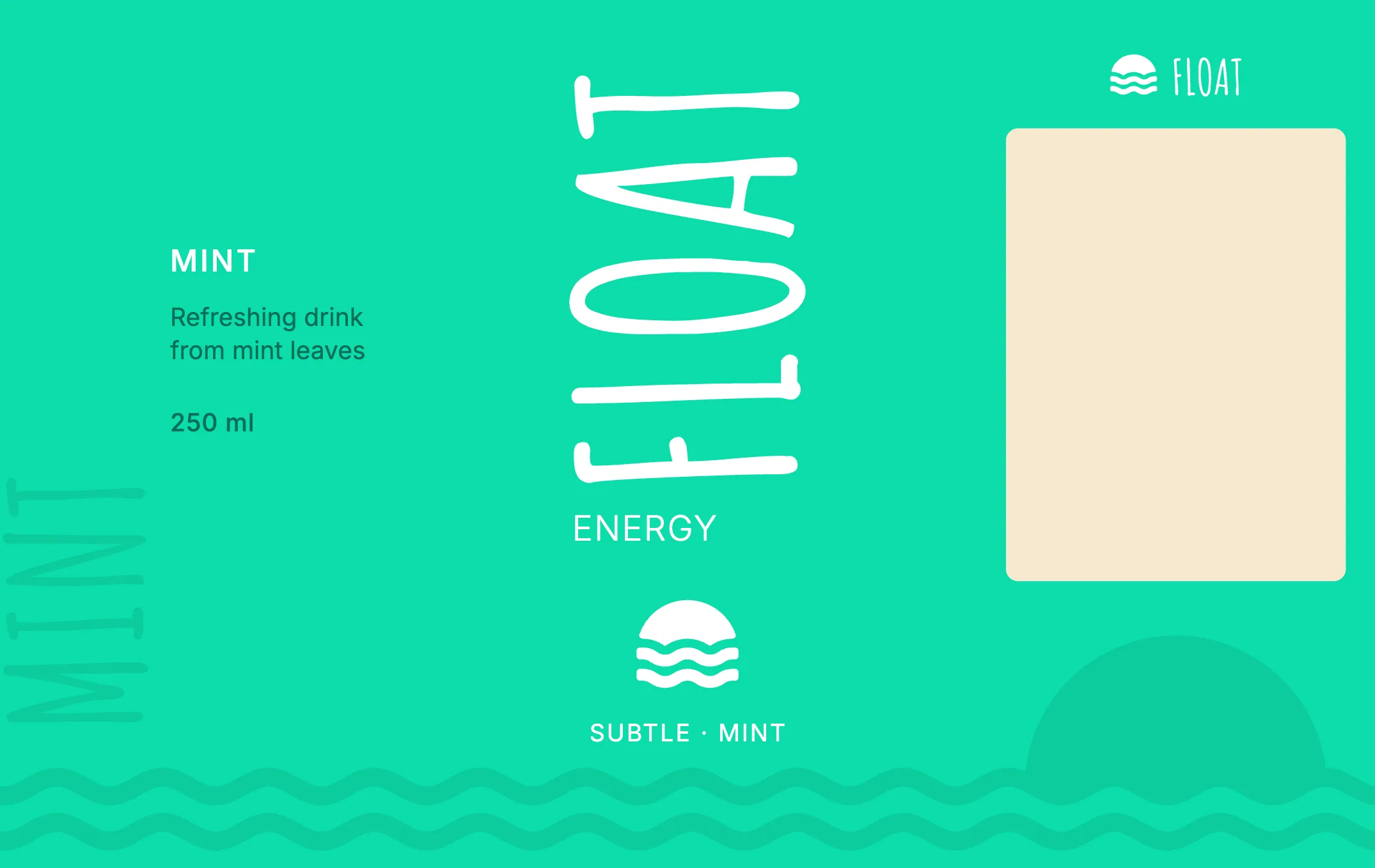
Subtle Mint

Refreshing drink from mint leaves

250 ml sleek can · 182 × 115 mm wrap

The Subtle Mint can, turning to show its label. The Subtle Mint wraparound label laid flat: side panel, front and back.

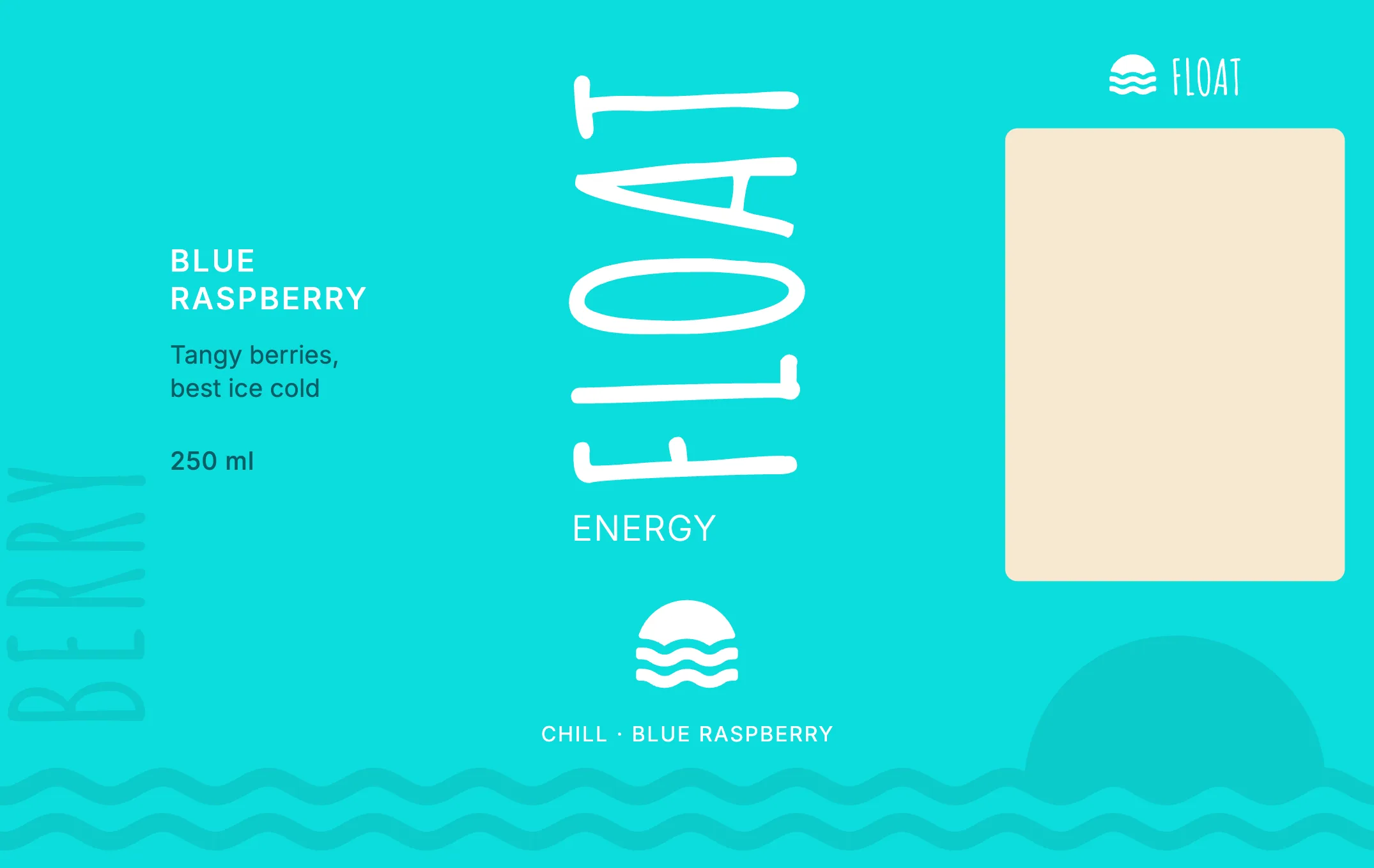
Chill Blue Raspberry

Tangy berries, best ice cold

250 ml sleek can · 182 × 115 mm wrap

The Chill Blue Raspberry can, turning to show its label. The Chill Blue Raspberry wraparound label laid flat: side panel, front and back.

The label

One template, three colours.

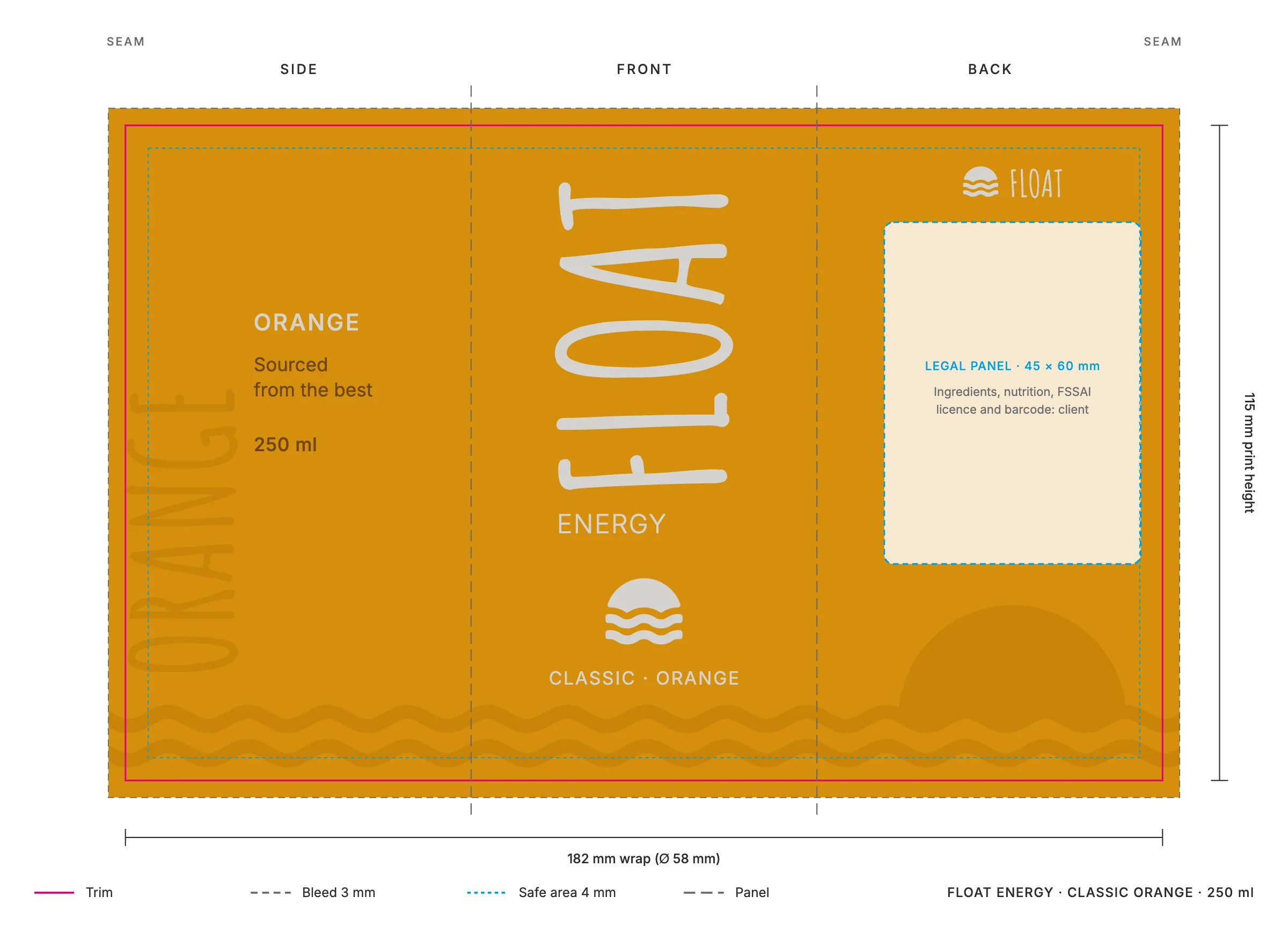
Print area
182 × 115 mm, the wrap of a 250 ml sleek can, with 3 mm bleed and a 4 mm safe area.
Front
FLOAT 54 mm tall, ENERGY, the icon and the flavour.
Side
The flavour set large and tonal, its line, and the contents.
Back
A 45 × 60 mm panel left clear for the client’s ingredients, nutrition, FSSAI licence and barcode, over a sun setting into the waterline.
Base
Thirteen waves, 14 mm apart, so they meet at the seam.
The Classic Orange label with its print marks: trim, 3 mm bleed, safe area, the side, front and back panels and the 45 by 60 mm legal panel
Classic Orange with its print marks. The other two use the same template.
  • The Classic Orange wraparound label laid flat: side panel, front and back
  • The Subtle Mint wraparound label laid flat: side panel, front and back
  • The Chill Blue Raspberry wraparound label laid flat: side panel, front and back

The cans

The range, together and one at a time.

The cans as designed, each on a ground tinted from its flavour.
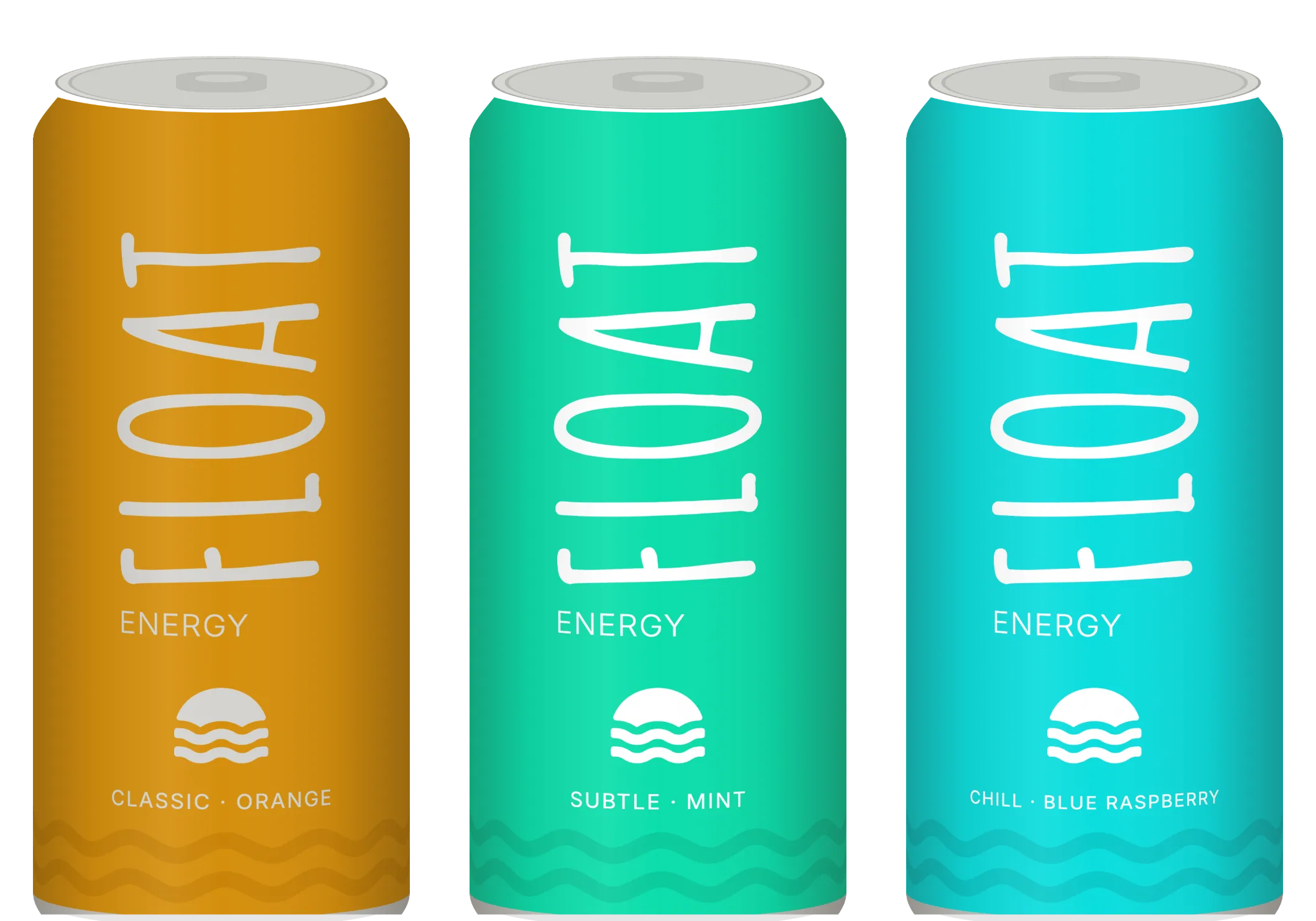
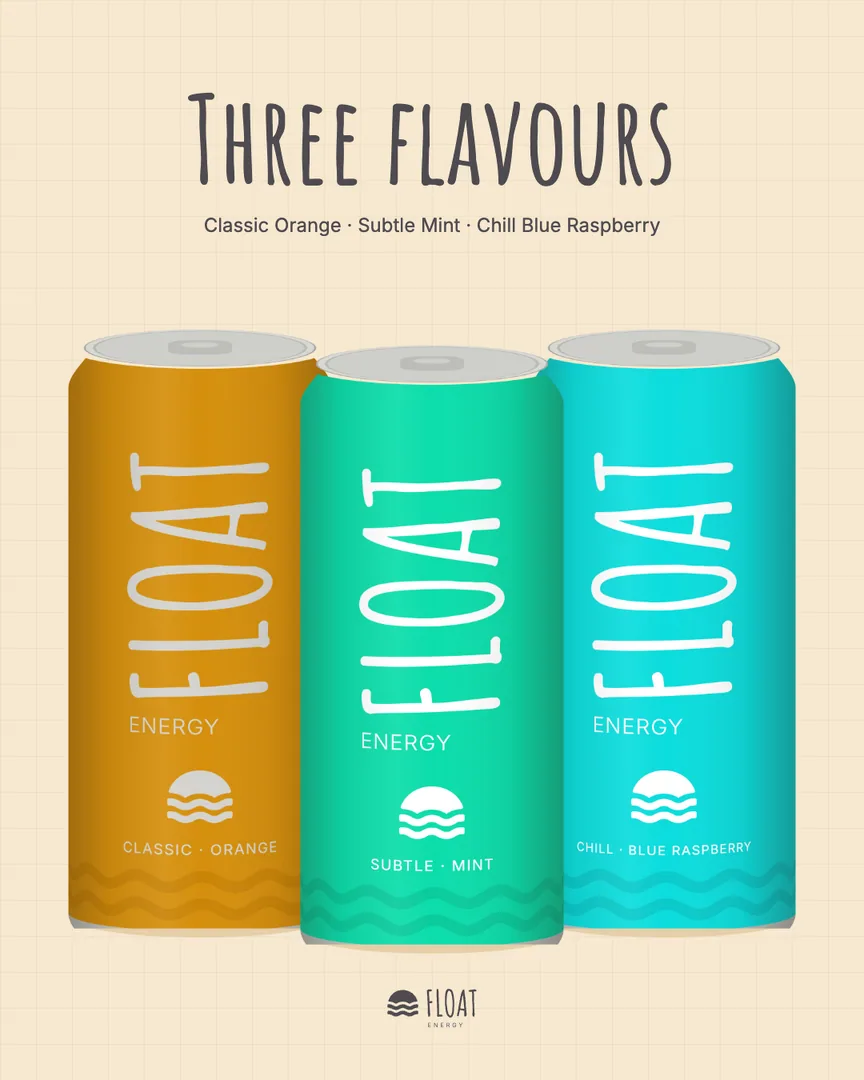
The three Float cans side by side: orange, mint and cyan

Classic Orange, Subtle Mint and Chill Blue Raspberry, as designed

The Classic Orange can: FLOAT in warm grey running up an orange can

Classic Orange, as designed

The Subtle Mint can: FLOAT in white running up a mint can

Subtle Mint, as designed

The Chill Blue Raspberry can lying on its side, FLOAT reading across it

Chill Blue Raspberry, laid on its side

Lay it down and FLOAT reads across.

The four-pack

The three colours wrap round it like a band.

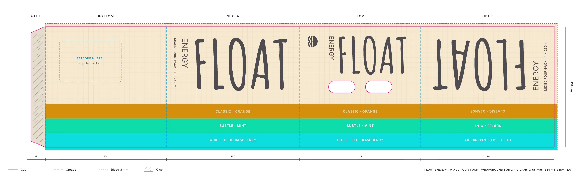
A wraparound carton for four cans, open at both ends so the cans show. The flavour stripes run the length of the blank, so on the pack they go up one side, over the top and down the other. FLOAT stands on each side, each flavour’s name reads up its own stripe, and the finger holes sit over the gap between the cans.
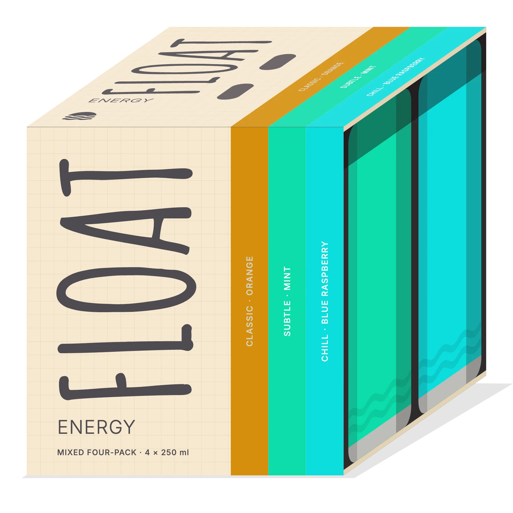
The mixed four-pack: FLOAT up the side, three flavour stripes wrapping over the top, and the cans showing at the open end

The carton made up, as designed

The four-pack laid flat with its cut and crease lines: glue flap, bottom, side, top with finger holes, side
Laid flat: 514 × 118 mm with an 18 mm glue flap. Cuts in magenta, creases in blue. The barcode and legal panel on the base is left for the client.

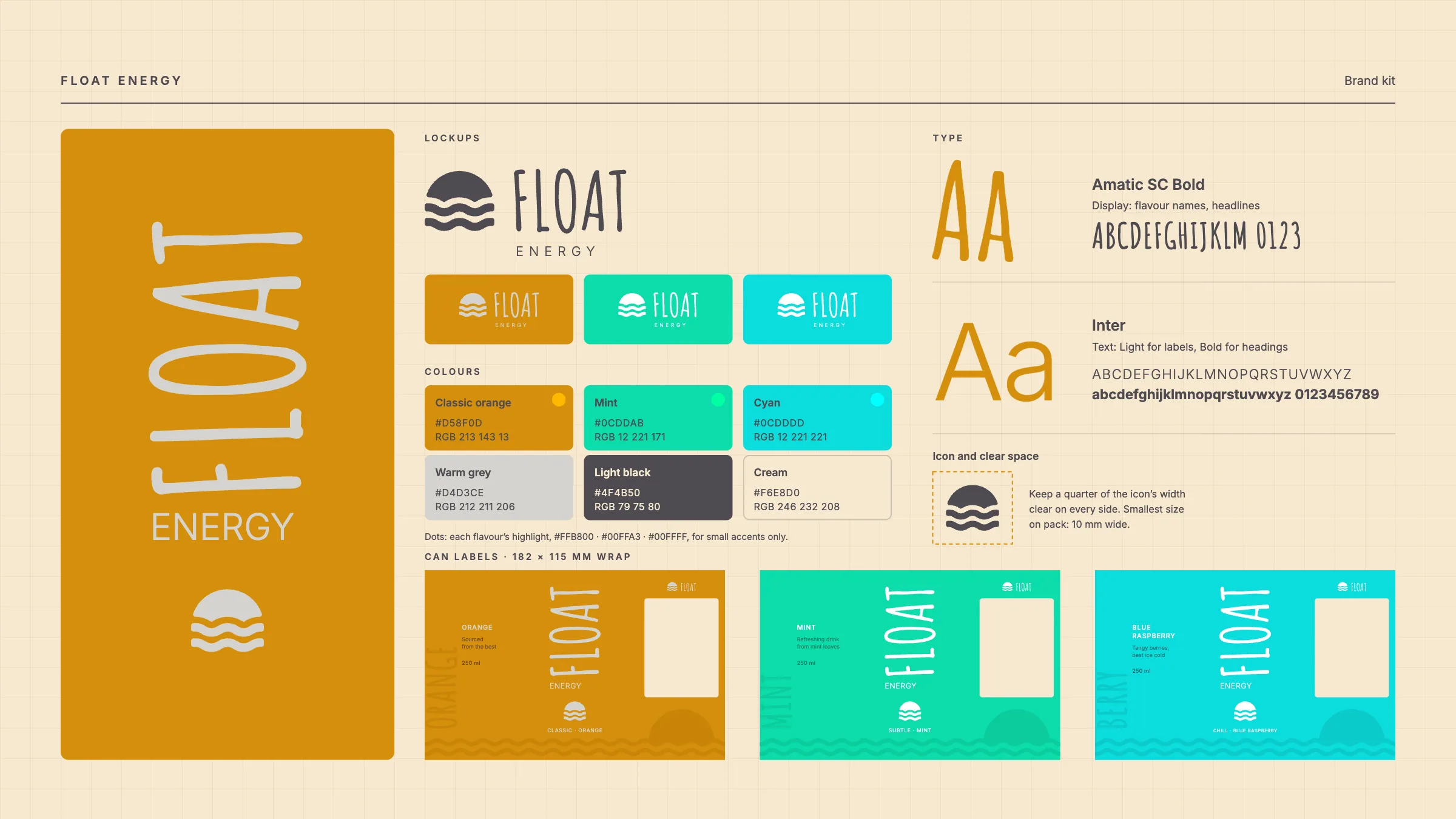
Brand kit

Everything on one board.

The Float Energy brand board: lockups, the six colours with their values, Amatic SC and Inter, the icon's clear space and the three can labels

Colours

  • Classic orange

    #D58F0D

  • Mint

    #0CDDAB

  • Cyan

    #0CDDDD

  • Warm grey

    #D4D3CE

    the mark on orange

  • Light black

    #4F4B50

    type

  • Cream

    #F6E8D0

    the grid ground

  • The profile picture: the sun-over-waves icon in warm grey on an orange circle
    Profile picture
  • A round shelf wobbler: the icon on orange with FLOAT ENERGY round the lower edge
    Shelf wobbler, 150 mm

Launch posts

A post for each flavour, one for all three, and a story.

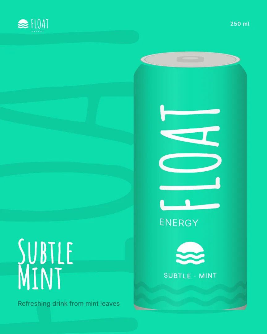
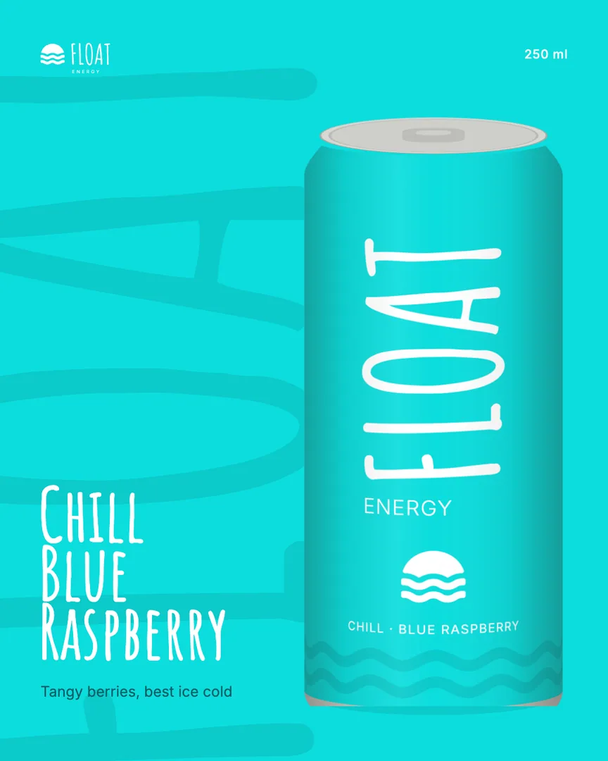
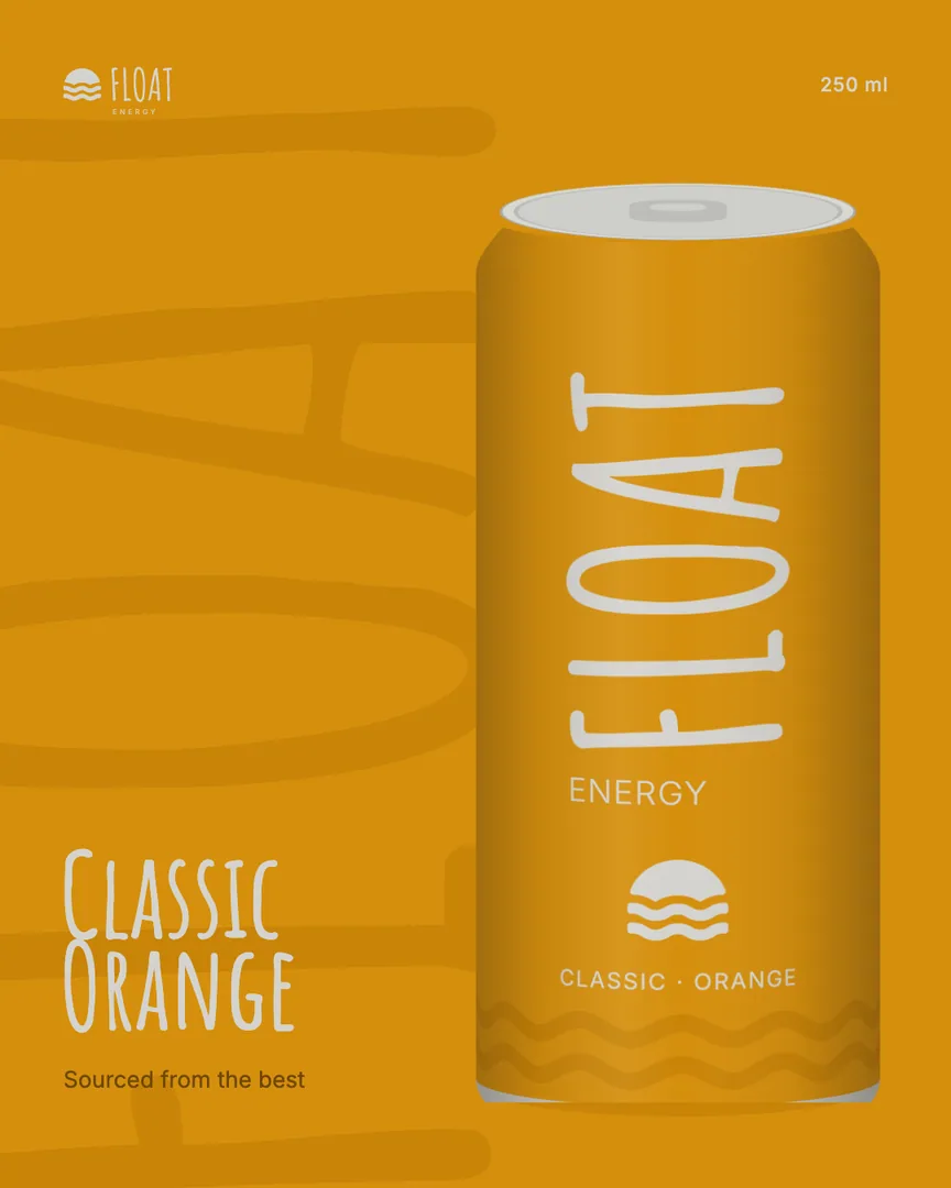
FLOAT runs huge and tonal behind each can, so a post still says whose it is when the feed crops it. The story lays the cans on their sides, where the word reads across.
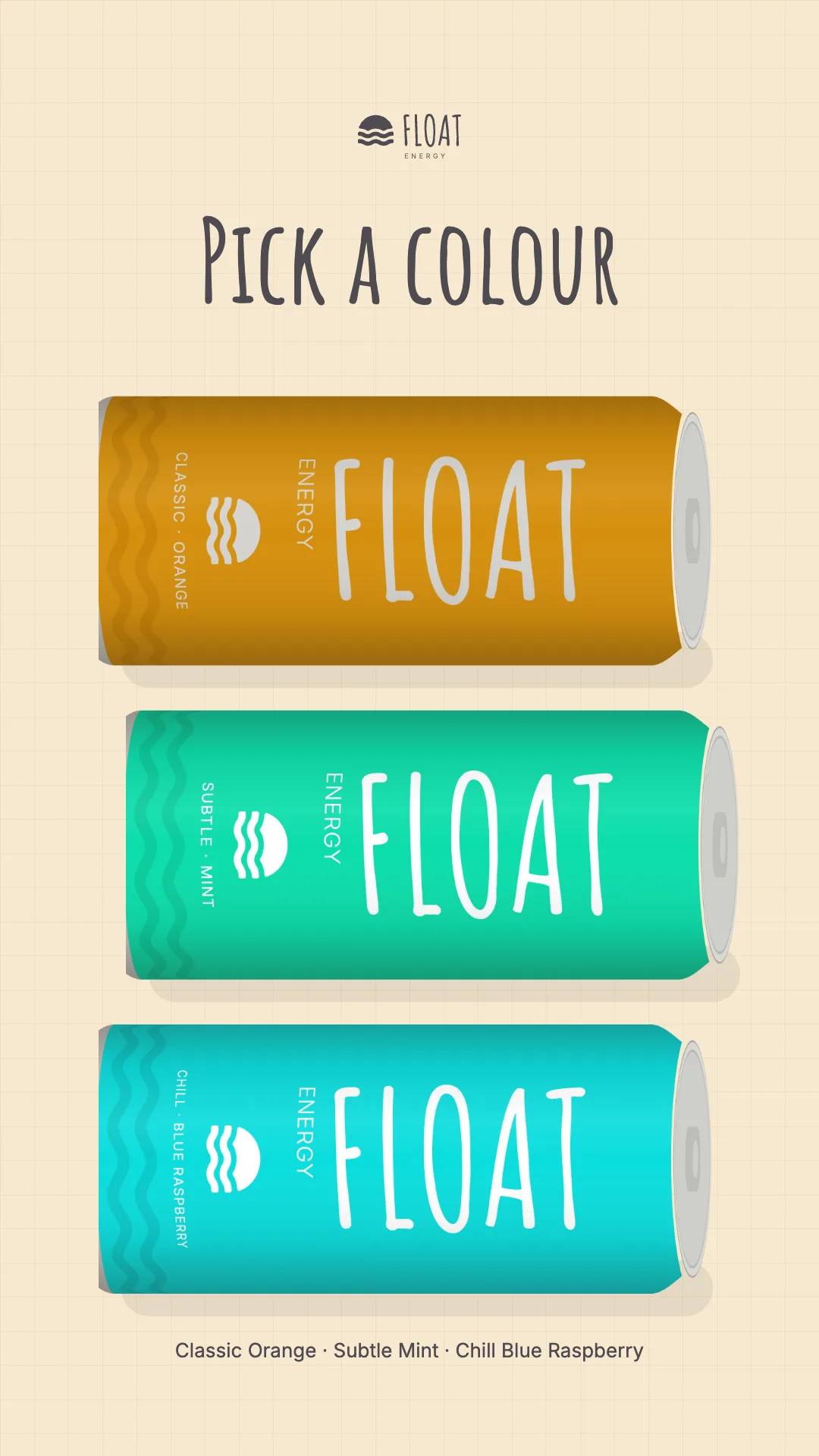
Launch story: the three cans laid on their sides and stacked under the words Pick a colour
  • Launch post for Classic Orange: the can on orange, FLOAT huge and tonal behind it
  • Launch post for Subtle Mint: the can on mint, FLOAT huge and tonal behind it
  • Launch post for Chill Blue Raspberry: the can on cyan, FLOAT huge and tonal behind it
  • Launch post: the three cans on the cream grid under the words Three flavours

A one-page site

The cans up top, then a band for each flavour.

The words are the labels’ own: the flavours, their lines and the size. Nothing on the page claims more than the can does.
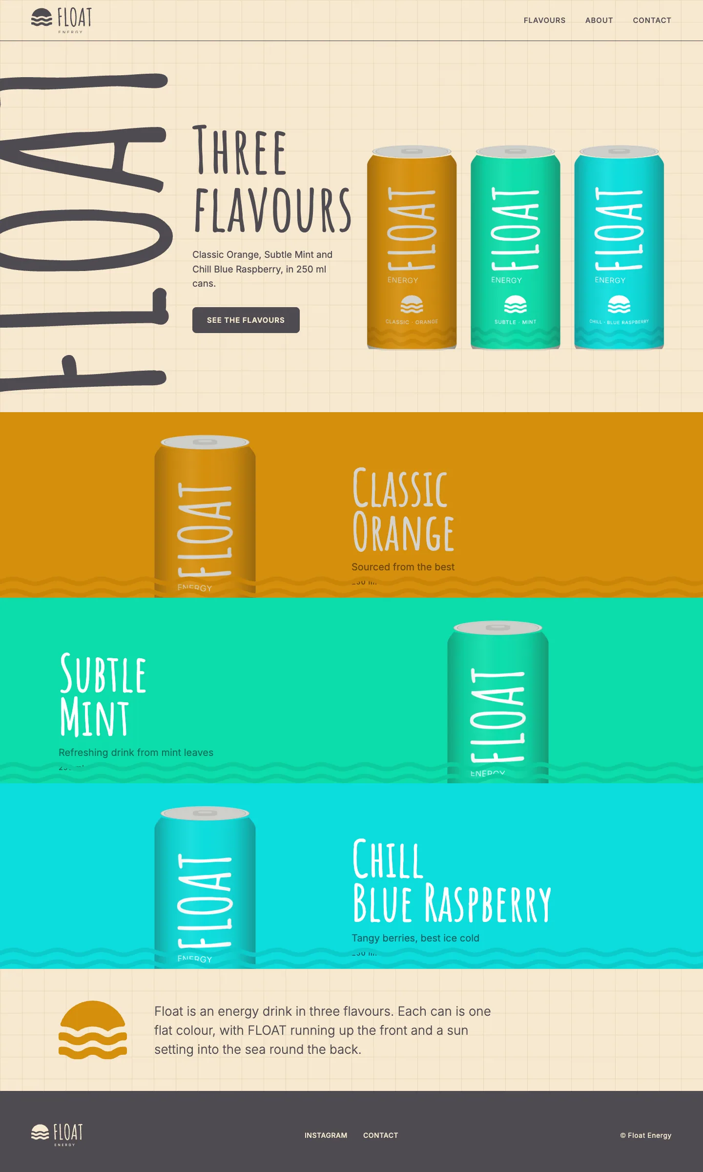
The Float Energy site on a desktop: the three cans on the cream grid, then a band for each flavour and a line about the drink
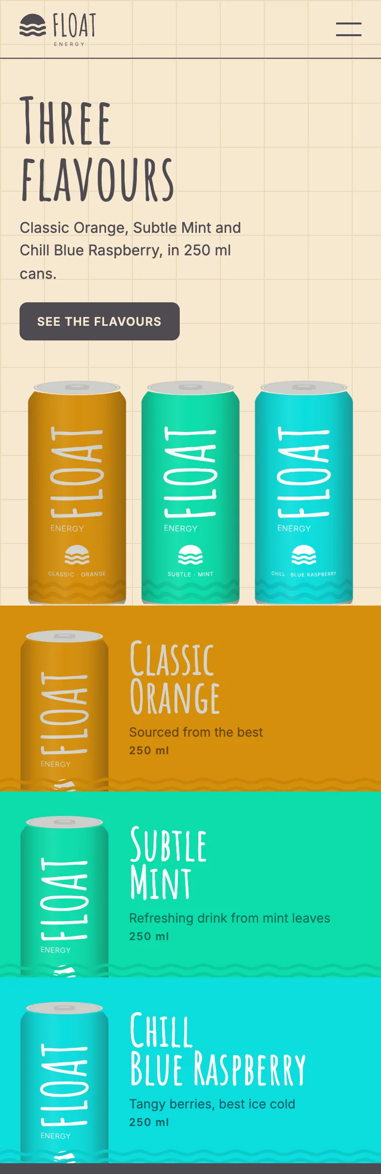
The Float Energy site on a phone: the three cans, then a band for each flavour

Credits

Client
Float Energy
Year
2023
Services
Identity design, Packaging design, Social media design, Web design
What we made
Three wraparound can labels with print files, a four-pack carton and its dieline, lockups and a profile picture, a brand board, four launch posts and a story, a one-page site, a shelf wobbler.
Notes
We named Chill Blue Raspberry and wrote the lines on the cans. The legal panel on each can and the barcode panel on the carton are left for the client, and the range is shown as designed.