
Case study · Café
Mocha Kaffe
A café crest in coffee red, and the website it was missing.

The brief
“Premium coffee at pocket friendly prices” is the café’s own line, and it was the brief. The identity had to look like the first half without ever pricing itself out of the second.
- Client
- Mocha Kaffe
- Sector
- Café: coffee, shakes, mocktails
- What we did
- Identity design, UI/UX design, Print design, Packaging design
The crest
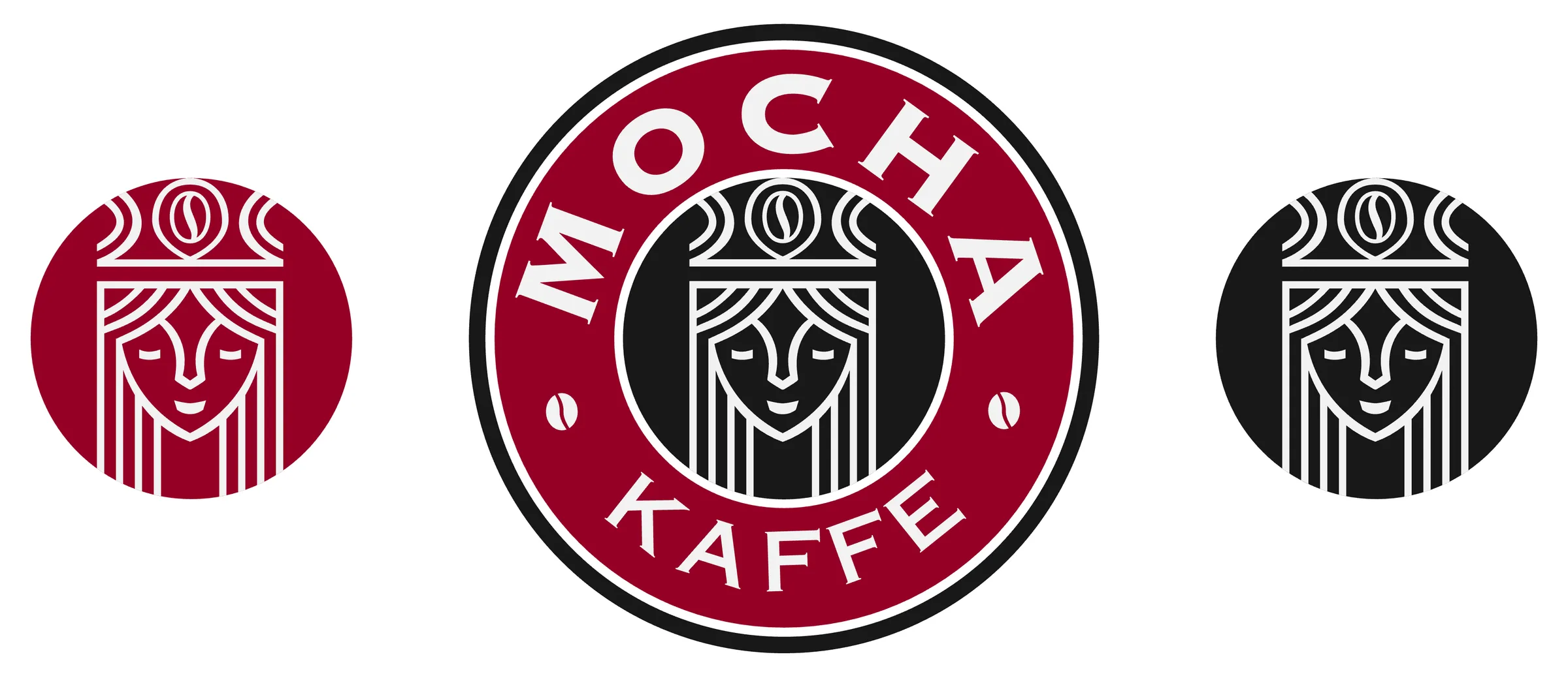
A woman’s face under a crown whose jewel is a coffee bean, drawn in one even line so it holds up as small as a cup lid and as large as a sign. The full crest carries the name around it; the icon badges, in red and black, go where there’s no room for words.
Colour, type and pattern
One deep red, a coffee brown that prints as a true black, and a white with a little grey in it, so it doesn’t glare under café lights. The name is set in Copperplate’s wide capitals; the website talks in Crete Round.
- Red#960025RGB 150 0 37The crest, rules and the order band
- Coffee brown#231F20RGB 35 31 32Print ground: the menu, labels, footers
- Darker white#F1F2F2RGB 241 242 242Lettering, and the label stock
- Black #181818 · The website's ground
- Pink tint #FAE6E6 · The website's buttons
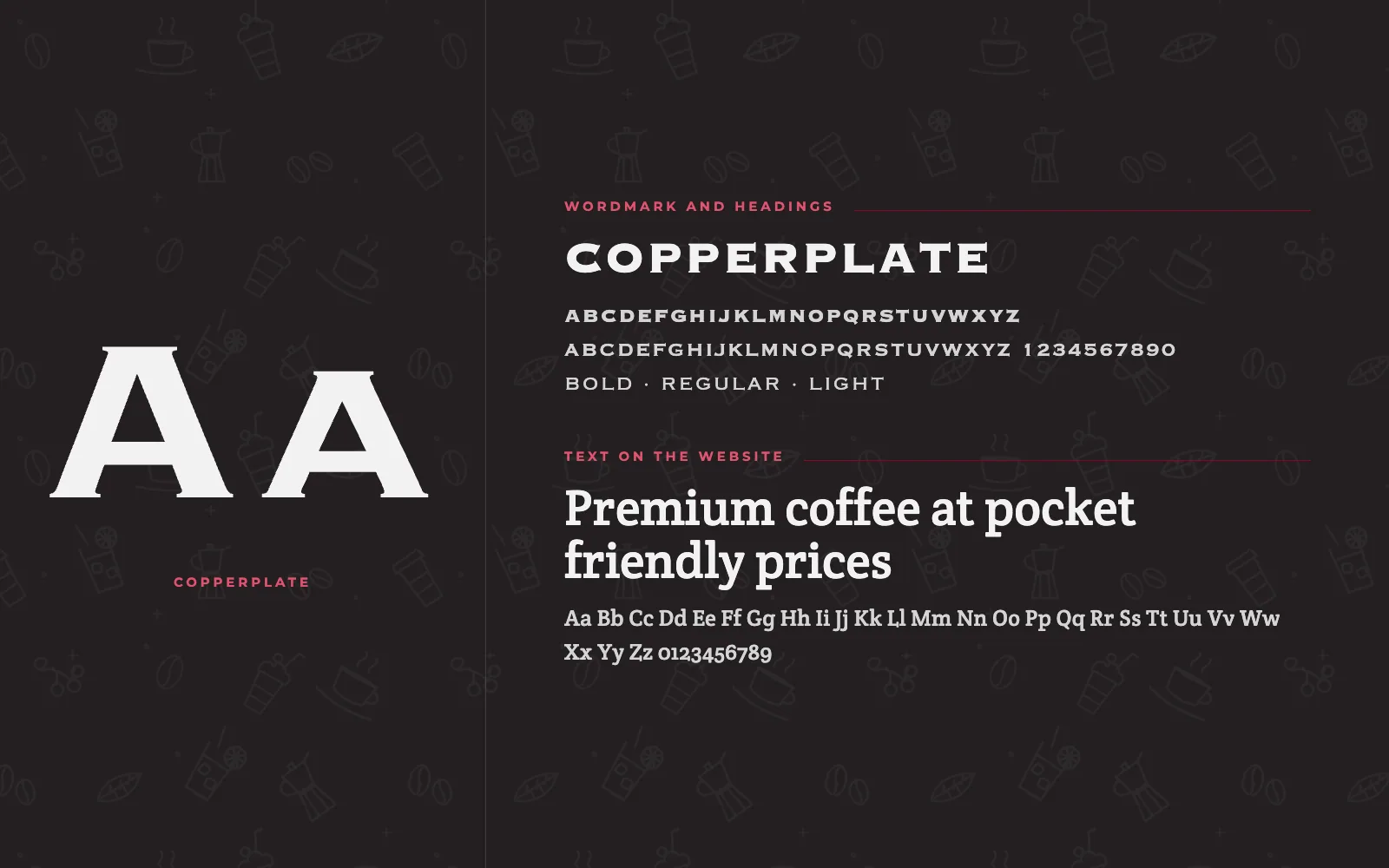
A pattern of the menu
We drew the menu as a line pattern: beans, a cup and saucer, a moka pot and cherries for the coffee, a tall glass with cream for the shakes, and a tumbler with a lemon wheel for the mocktails. Light on the black, brown on kraft.
Cups, bags and signs
The pattern wraps the takeaway cup with the crest on its face. The kraft bags get a label, 80 by 120 mm, with a red foot of the pattern. The icon goes on caps behind the counter; the full crest and the lockup go outside.
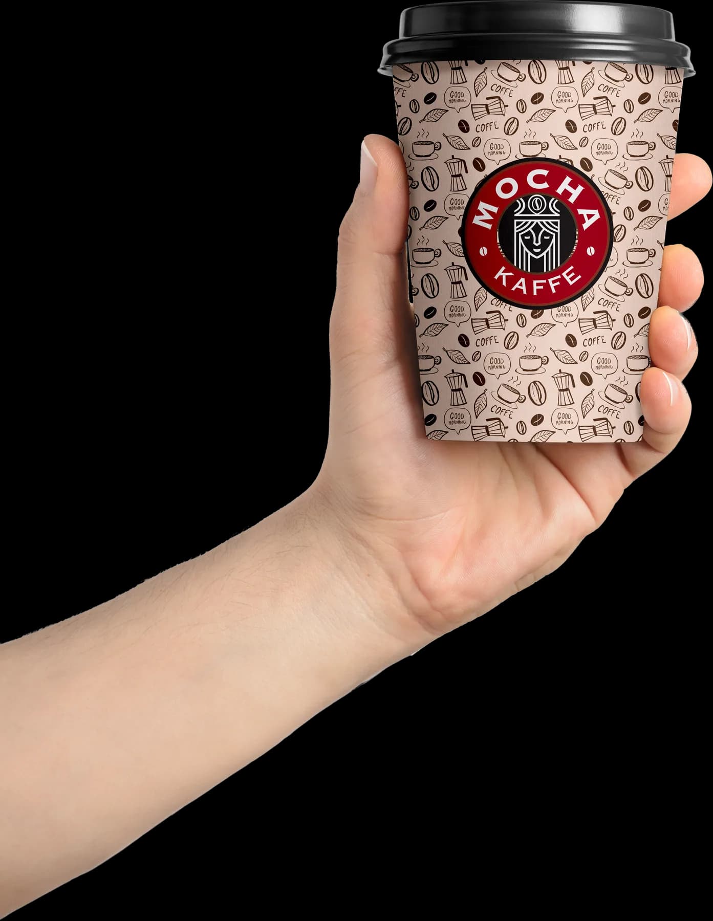
The takeaway cup
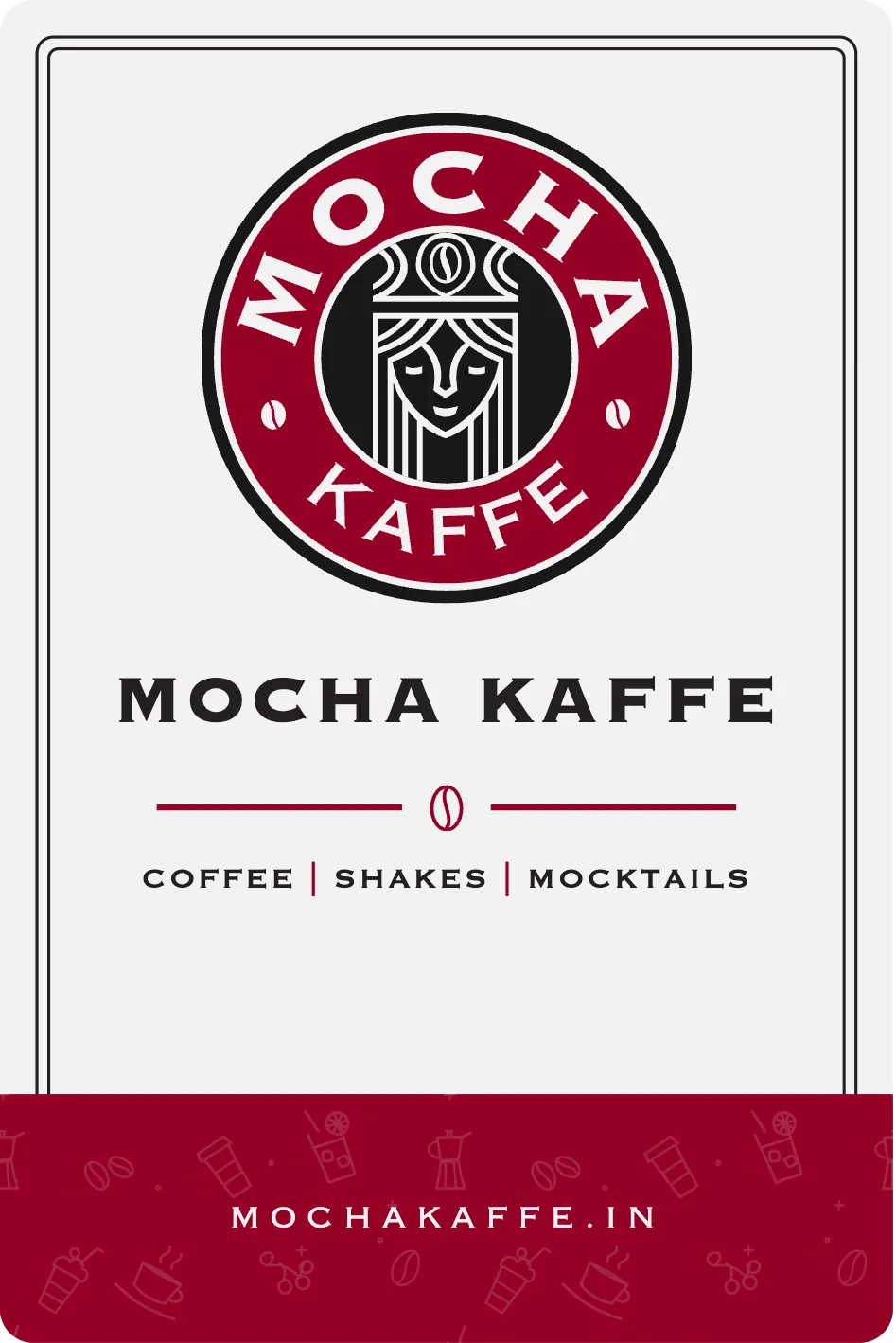
The bag label, on kraft
The horizontal lockup, reversed for the sign
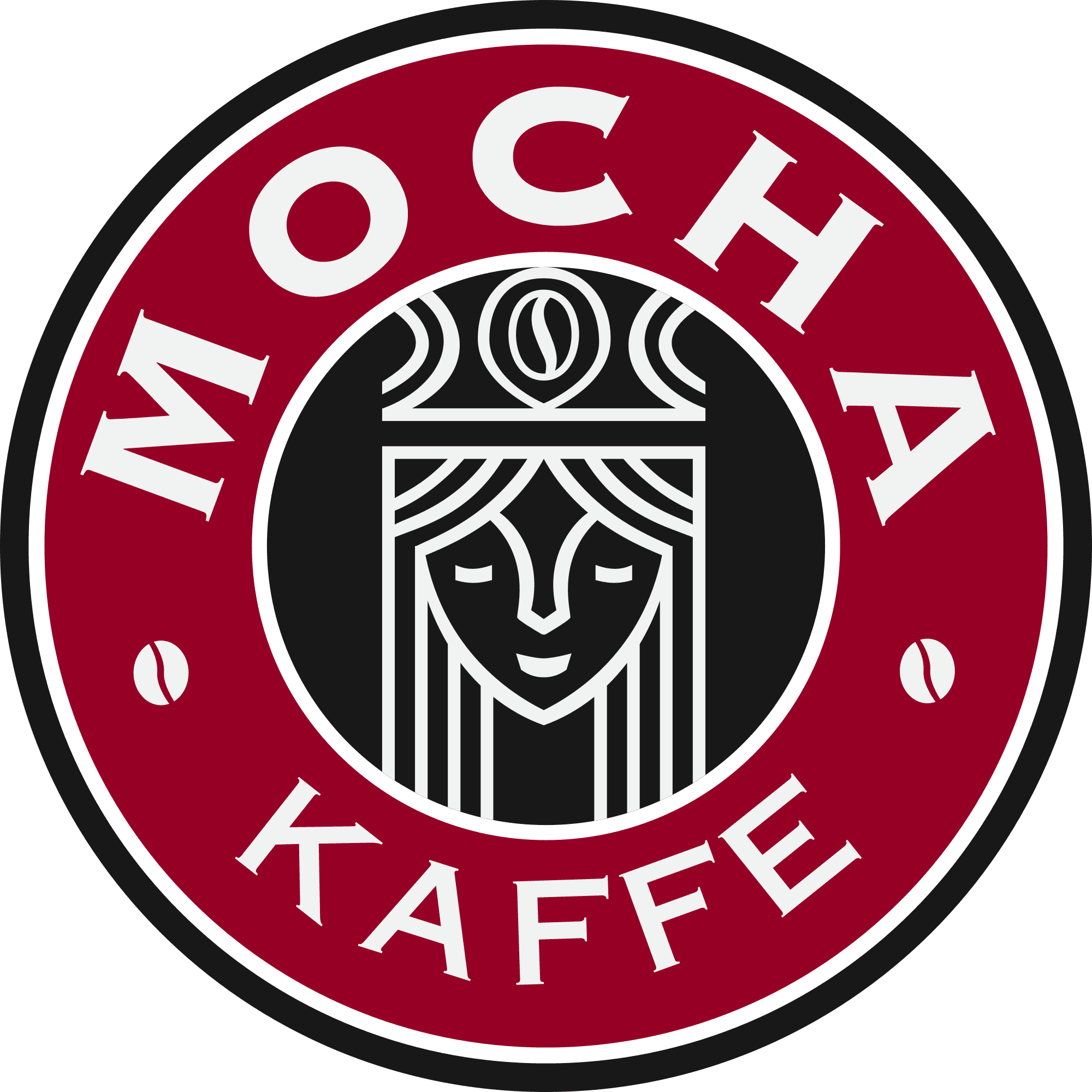
The full crest, for the hanging sign
The icon, for the caps
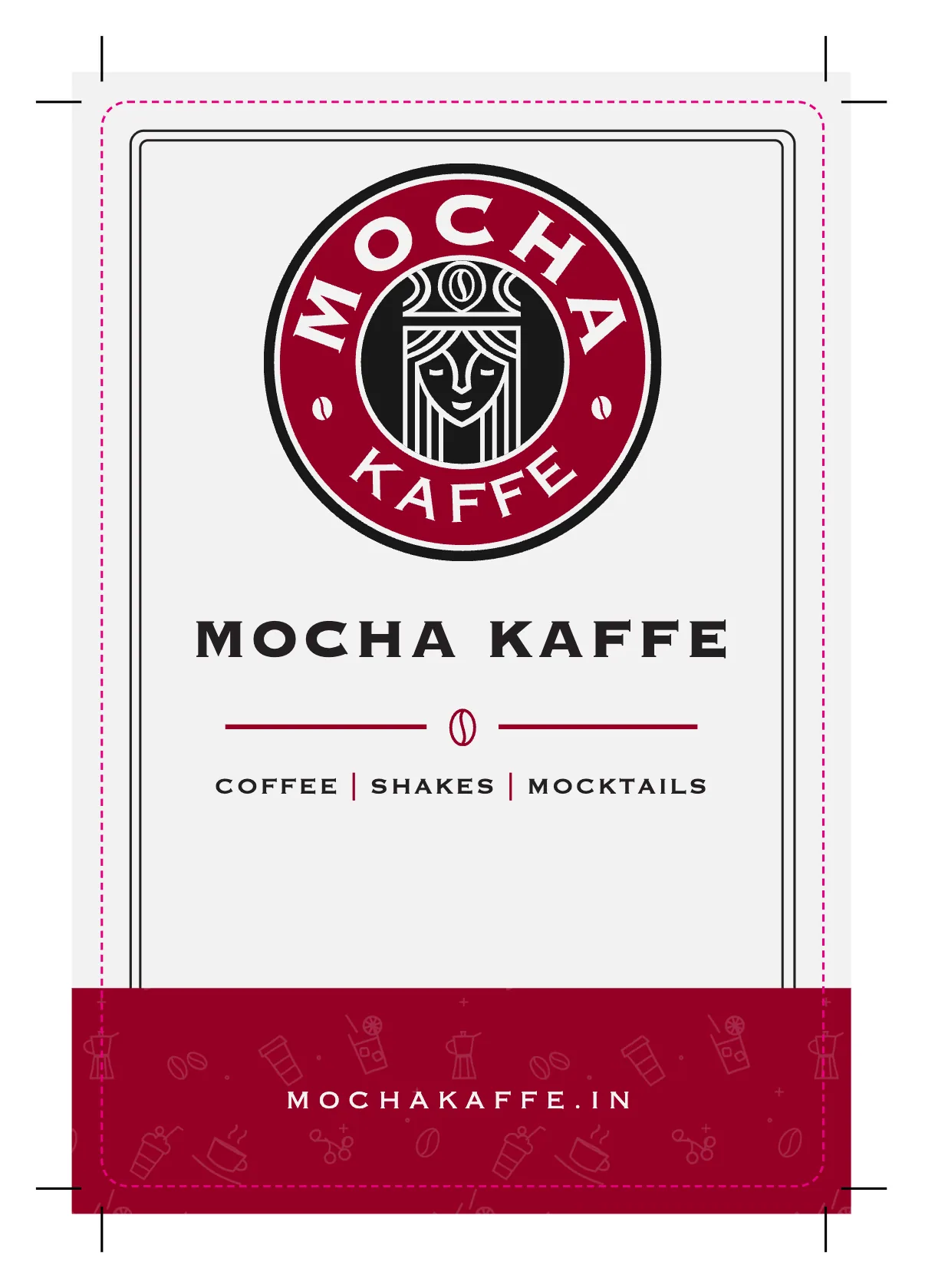
The label as sent to print, with bleed and crop marks
The website
The Figma file stopped after the hero: a hand holding the cup, and “Premium coffee at pocket friendly prices”. We designed the rest of the home page on the same black: three counters for coffee, shakes and mocktails, a word band, locations, ordering and the footer, for a laptop and for a phone.
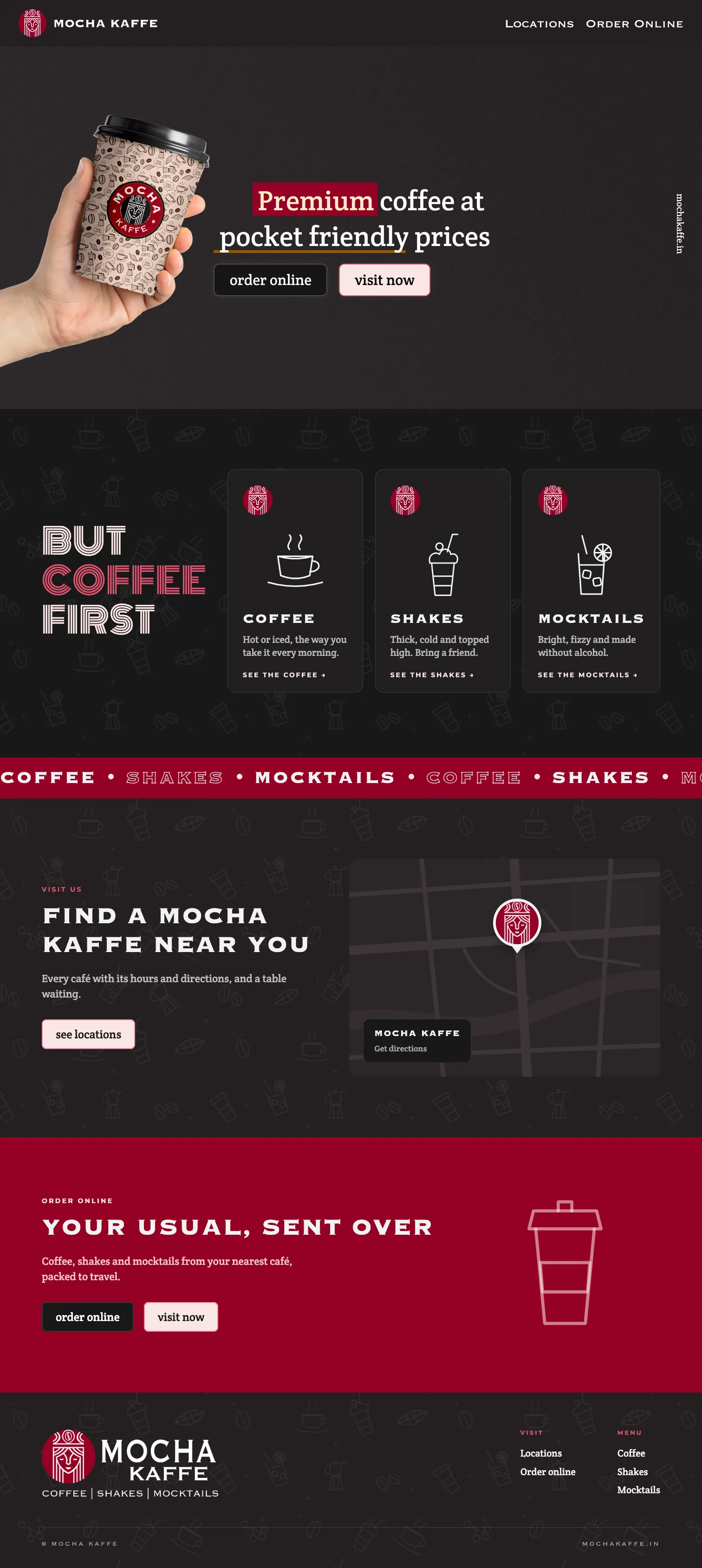

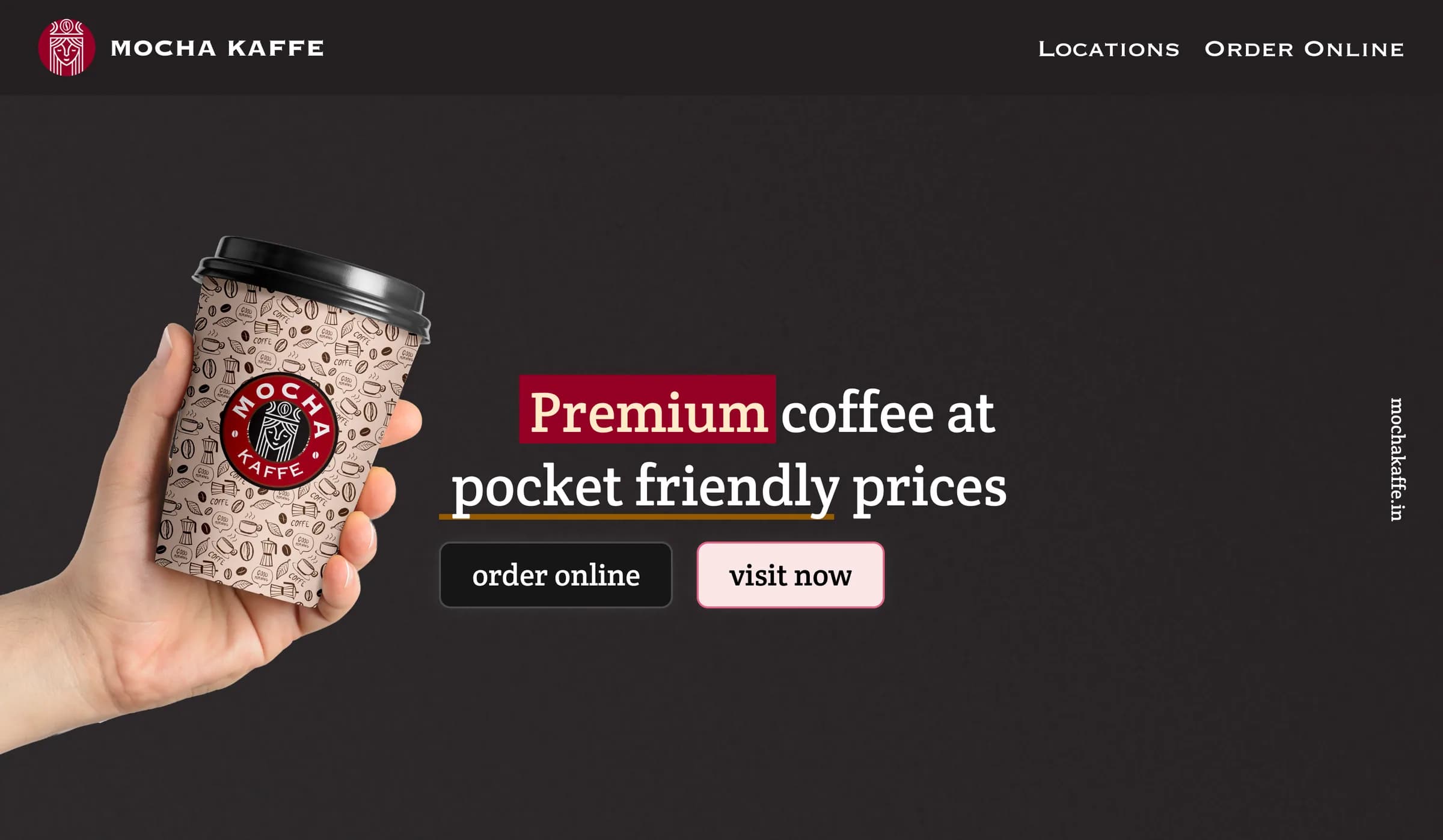
The home page’s first screen
The menu card
A4, printed both sides. The crest and the word MENU on the front; inside, the three counters with dotted leaders and red rules, and the pattern faint behind. The inside is a template: the café sets its own items and prices.
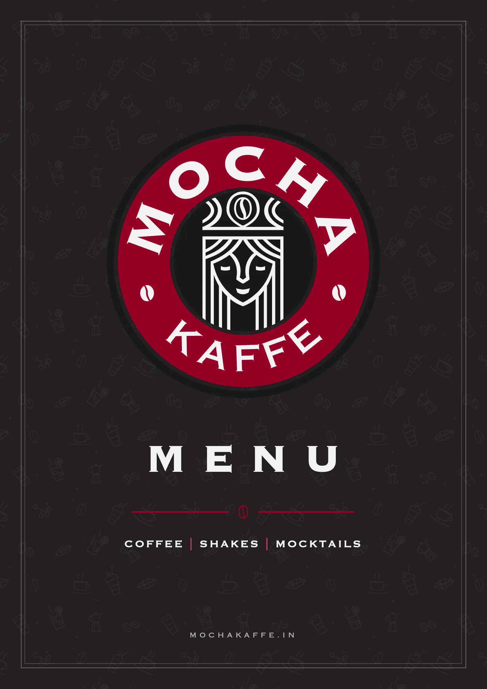
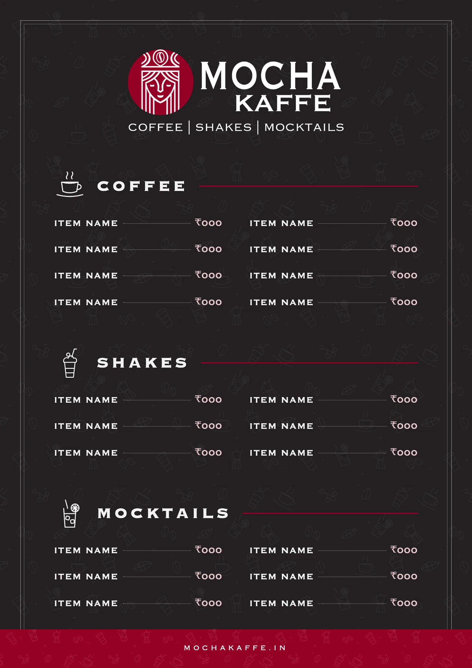
The menu’s front
Credits
What we made
- Crest, icon badges and horizontal lockup
- Palette and type
- A line pattern drawn from the menu
- Cup, bag label, cap and signs
- Menu card, A4, both sides
- Home page, desktop and phone
Services
- Identity design
- UI/UX design
- Print design
- Packaging design