
Link shortener (open source)
Profyl
A rounded P redrawn, and every page of a free link shortener
- Services
- Logo refinement · Wordmark · Identity system · Icons and illustration · Website design · Product UI design
- Year
- 2023–26
The brief
Take a rounded P and a first design, and finish them: the brand, the website and the whole product.
Profyl makes short links on prf.ink, counts the clicks on each one and is open source, with an API. We redrew its rounded P as two strokes from one round pen, drew a lowercase wordmark with the same pen, and built the system around it: colour, type, icons, illustration and the pieces an open-source product needs. Then we designed the whole product for desktop and phone, from the home page and the docs to sign-in, the dashboard, each link's clicks and settings.
Short links on prf.ink
Paste a long address and get a short one, with or without an account.
Clicks for every link
Each link counts its clicks: when, from which site, from where and on what.
Open source, with an API
The code is public, and all you need is an API key to make links from your own app.
Where it started
A first design, on phones and a landing page
Profyl’s own Figma file had the P, a navy and a blue, Noto Sans, a sign-in card and one landing page. We kept the P, the colours and the line Shorten your URLs with ease, and drew everything else again.
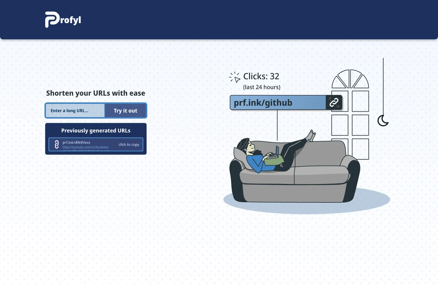
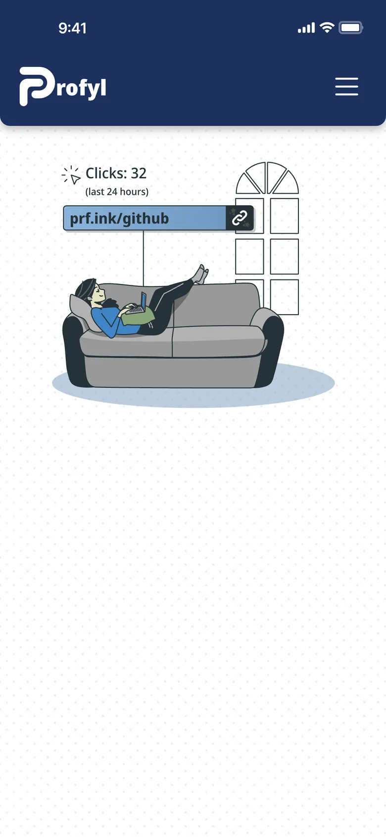
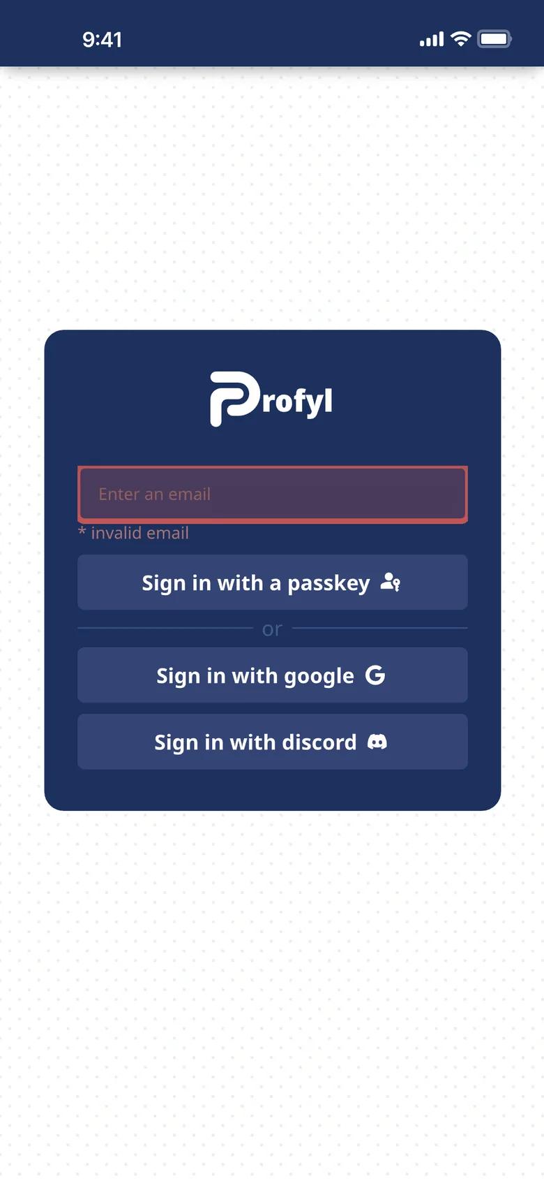
The first design, rendered from the Figma file.
The mark
Two links, drawn with one pen
The P is two strokes of the same round pen. The upper one runs out along the top and round the bowl; the lower one comes up the stem and ends inside the bowl, one link hooked through another.
Construction
Redrawn on a grid, with the same idea
Uprights 200 units wide, bars 186, every corner on a 160-unit radius, and the lower stroke ending inside the bowl with the same gaps around it as everywhere else: 110 to the side, 121 above and below.

1The corner
Its outer and inner curves turned on different centres, so the bend ran 20% heavy. Now they share one.
2Between the bars
The gap was half a stroke, 100 units. Now it is 121, and the bars are 186 instead of 200.
3Beside the stem
The gap was 100 units. Now it is 110, the same as inside the bowl.
An even corner
The lower stroke’s corner was two unrelated curves and ran 20% heavy. It now turns on one centre.
Lighter bars
Horizontal strokes are 7% thinner than the uprights, which is what makes them look the same.
Open gaps
Half a stroke became 110 units between uprights and 121 between bars, so the links stay apart when small.
A small cut
Below 32 px a version with wider gaps takes over, for favicons and tabs.
Wordmark and lockups
The P leads a lowercase name in the same pen
The first logo set rofyl in Noto Sans Black beside a P twice its weight. Now every letter is drawn with the mark’s pen, at the mark’s weight, with its corners, and the P reads as the first letter of profyl.
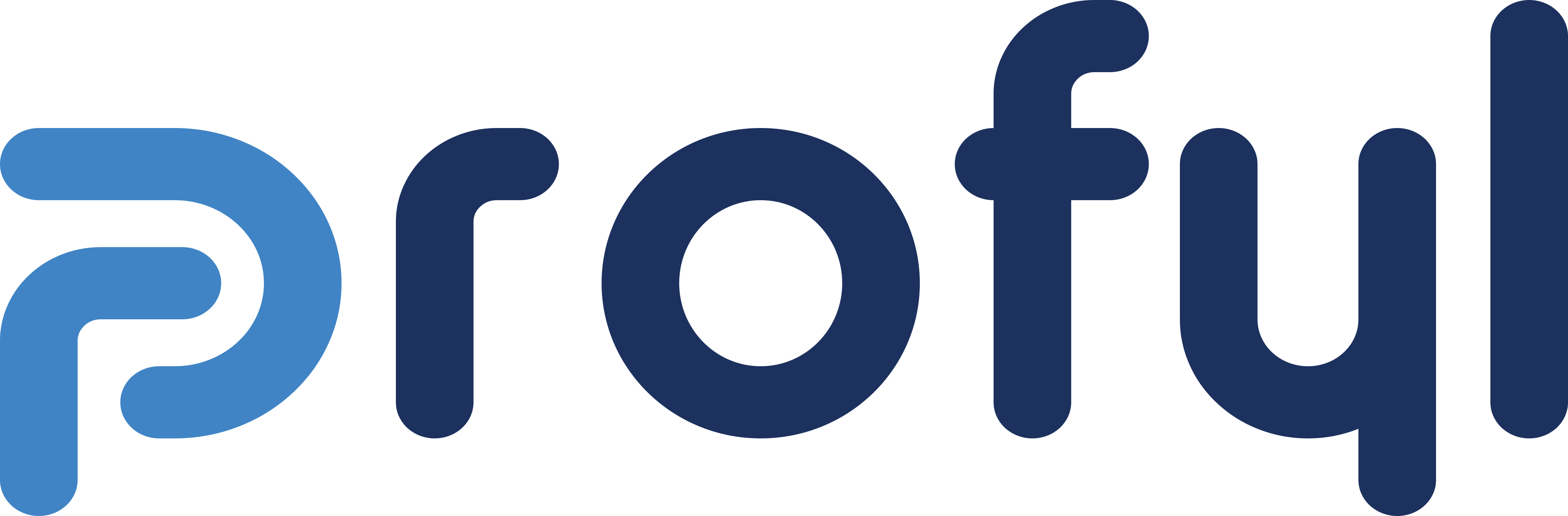


Lockups with their clear space, 2X on every side where X is the stroke of the lockup’s P, and their smallest sizes. The stacked lockup sets the mark over the whole name, the way an icon sits over its label, so the P shows twice, in one colour. Then the colour versions: primary, one colour, black, reversed, on blue and on the dark theme.
The system
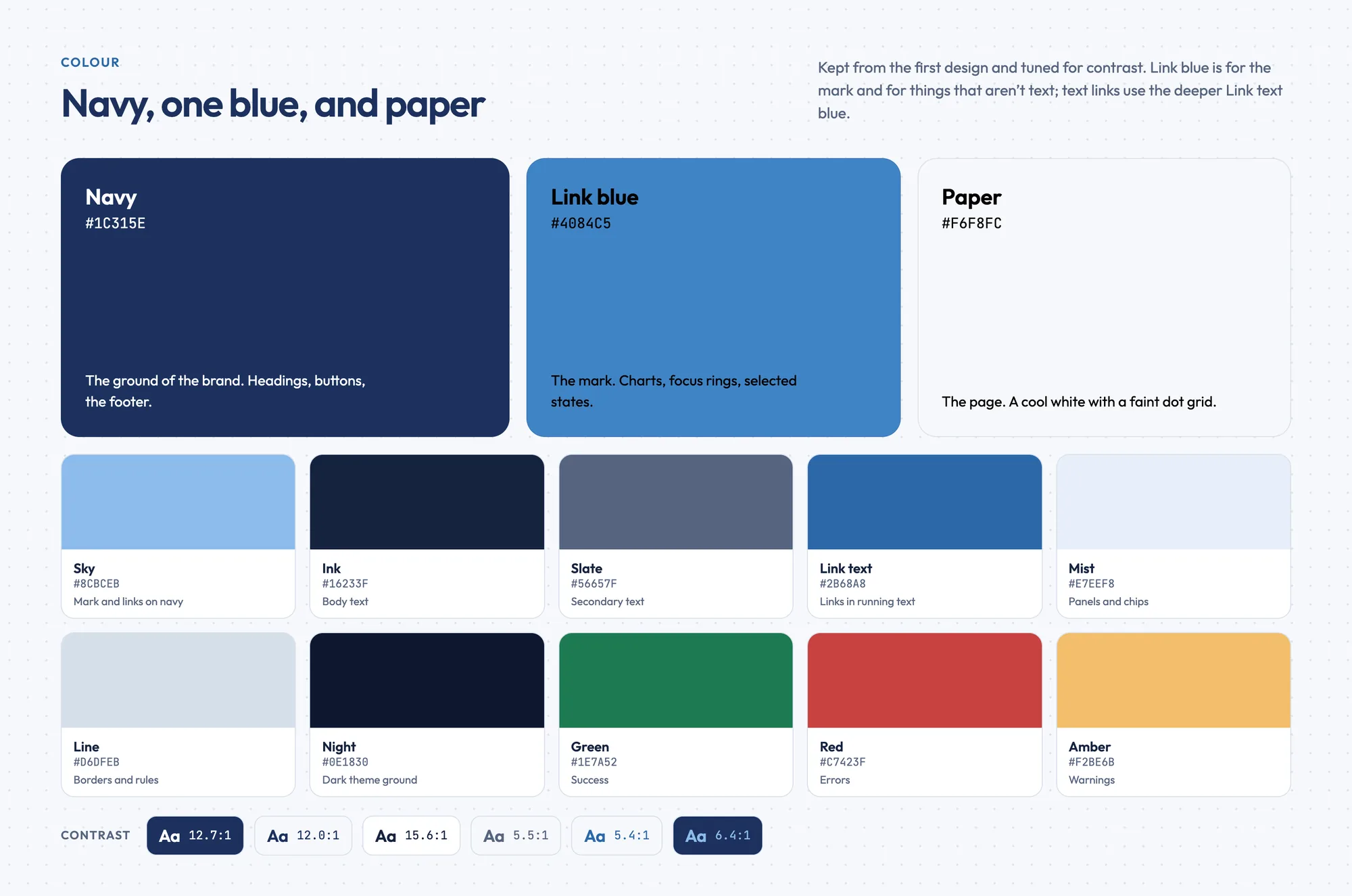
Navy, one blue and paper, and the pen everywhere
- Navy#1C315EHeadings, buttons, the footer
- Link blue#4084C5The mark, charts, focus
- Paper#F6F8FCThe page, with its dot grid
- Sky#8CBCEBThe mark on navy
- Ink#16233FBody text
- Slate#56657FSecondary text
- Link text#2B68A8Links in text
- Night#0E1830The dark theme
Link blue is kept for the mark and for things that aren’t text. Links in running text use the deeper Link text blue, 5.4 to 1 on paper.
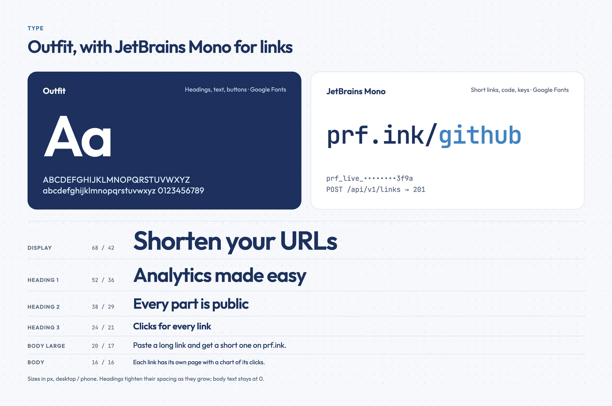
Outfit
Headings, text, buttons
prf.ink/github
JetBrains Mono, for short links, keys and code
- Display68 / 42Shorten your URLs
- Heading38 / 29Analytics made easy
- Body16 / 16Each link has its own page with a chart of its clicks.
Icons from the same pen
Forty-three of them, on a 24-unit grid with a 1.8 round stroke: the product’s own things, links, clicks, keys, passkeys and branches, drawn the way the mark is.
- link
- copy
- check
- chart
- click
- key
- code
- globe
- user
- sliders
- trash
- edit
- external
- plus
- search
- passkey
- logout
- menu
- close
- branch
- sun
- moon
- clock
- arrow
- phone
- laptop
- eye
- alert
- info
- home
- profile
- dots
- book
- shield
- lock
- refresh
- heart
- download
- chevron
- chevdown
- filter
- calendar
Spot drawings
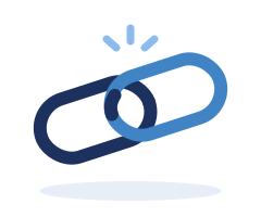
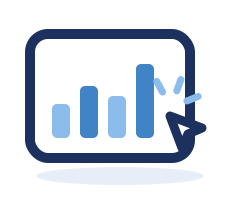
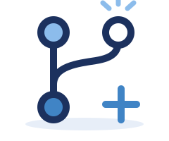
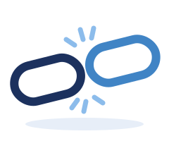
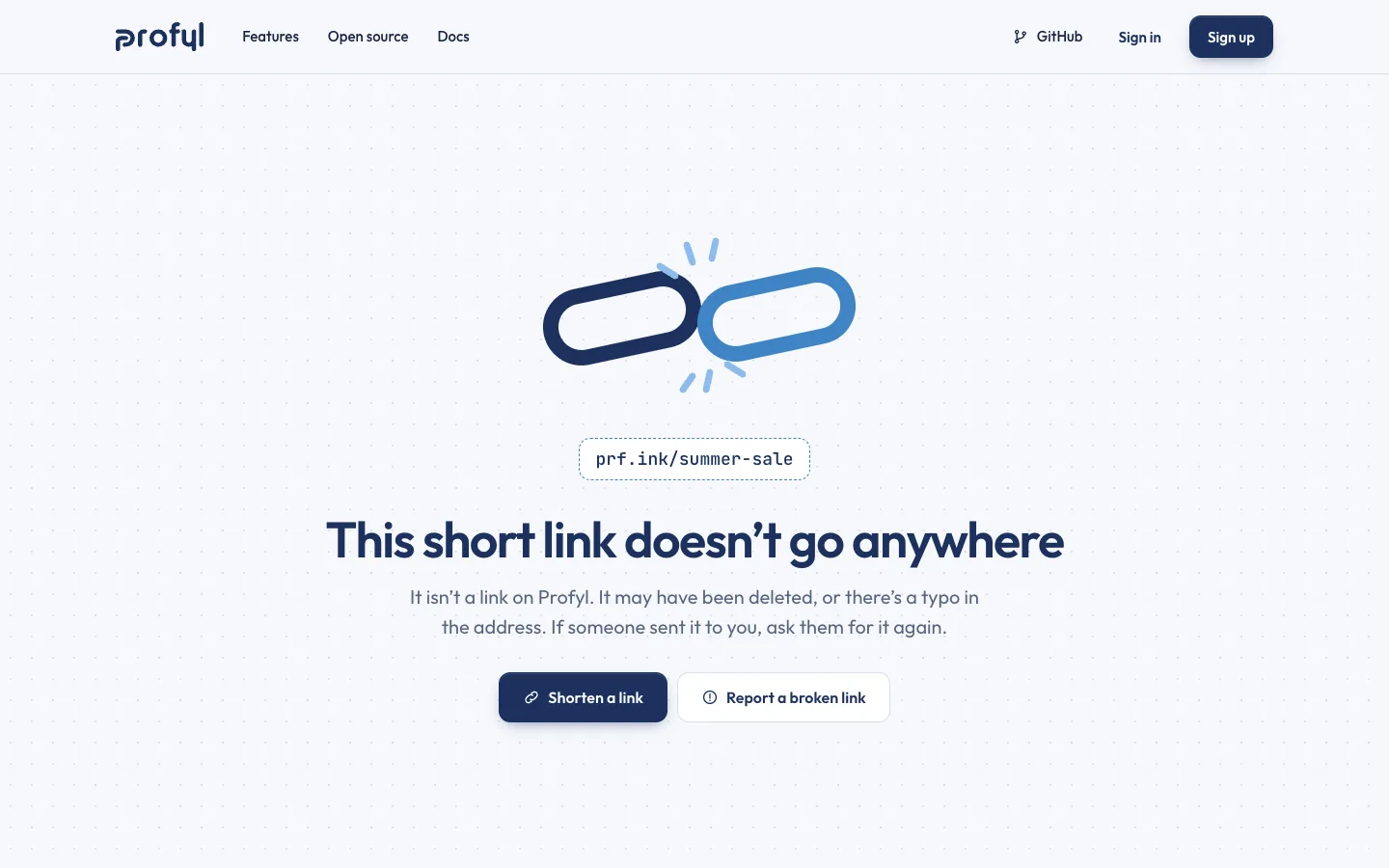
Thick navy lines, flat fills from the palette and three short sparks where something happens. They fill empty states, errors and feature cards, like the broken link on the missing-link page.


Applications
Where an open-source tool shows up
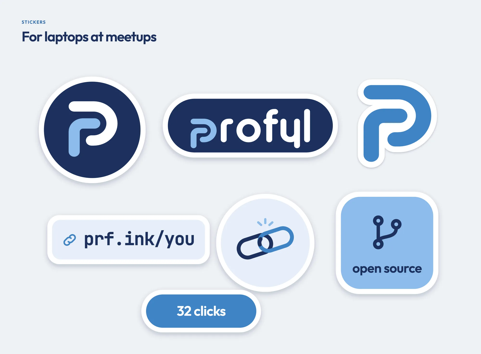
A home-screen icon, a tab, an avatar on GitHub and Discord, the card a shared profile page unfolds into, and a sheet of stickers.
On navy, two tones
On navy the mark on its own splits into its strokes, white above and sky below, so the two links show even at the size of a fingertip: on the icon, the avatar and the round sticker. Inside the name and the lockups, on light grounds and in the small cut, it stays one colour. The favicon uses the small cut.


The website
A shortener you can use before you sign up
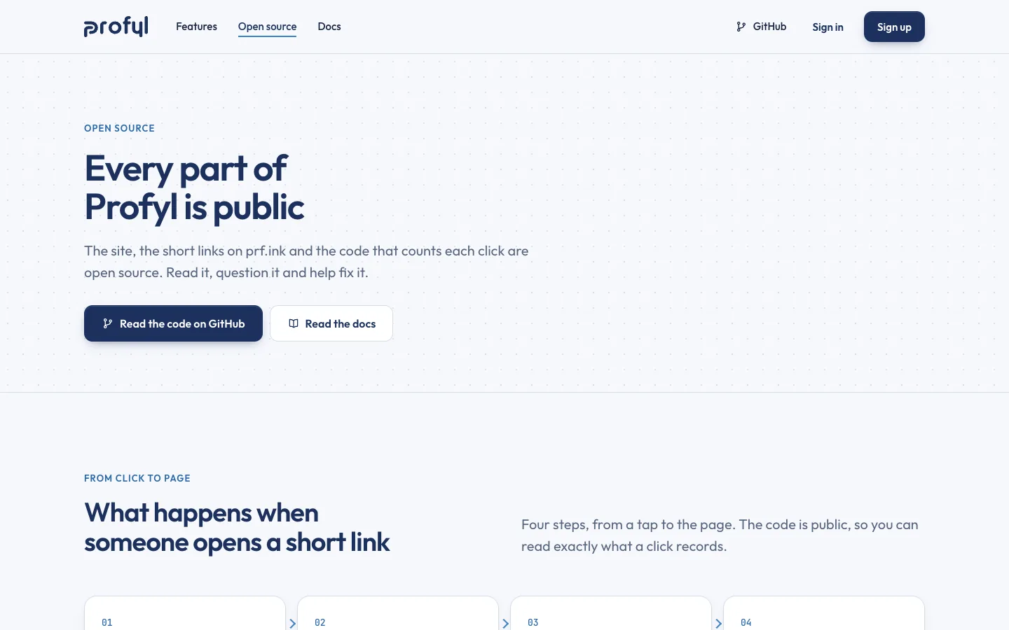
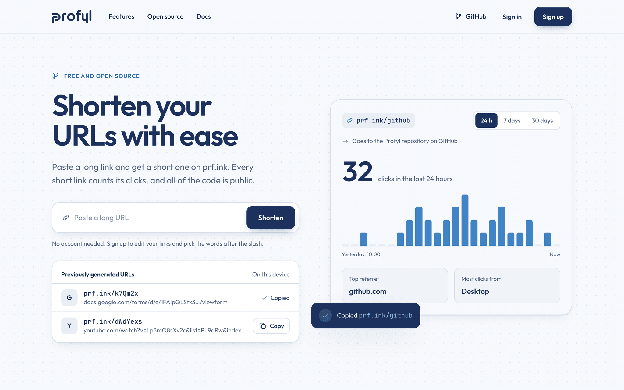
The home page is the product: paste a link, get a short one, see its clicks. Then how it works, the analytics, the features, and the open-source story with the API beside it.
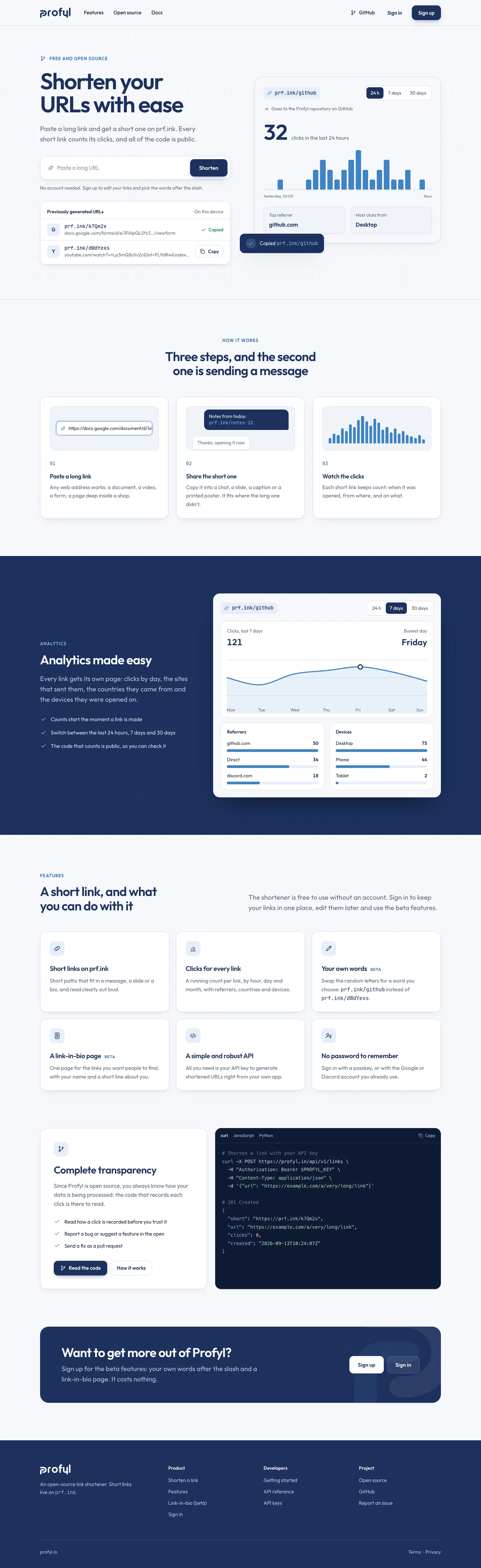

Home
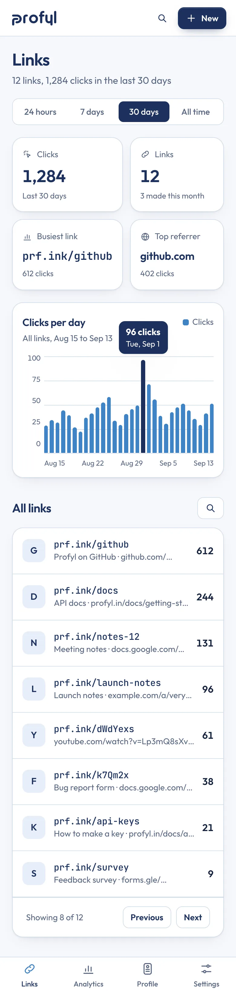
Links

One link’s clicks
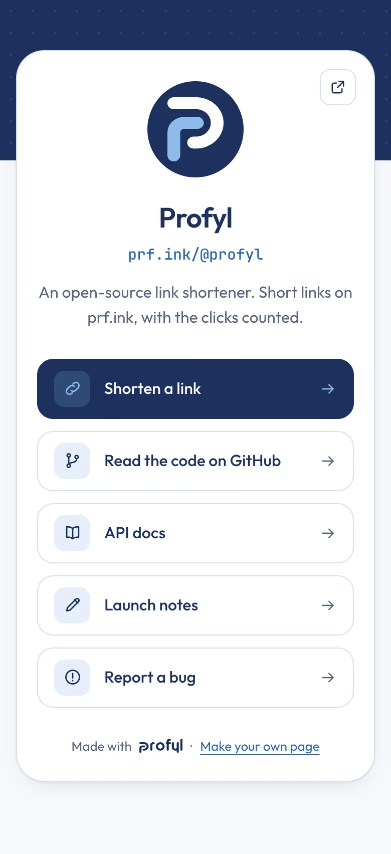
Profile page
Every page it needs
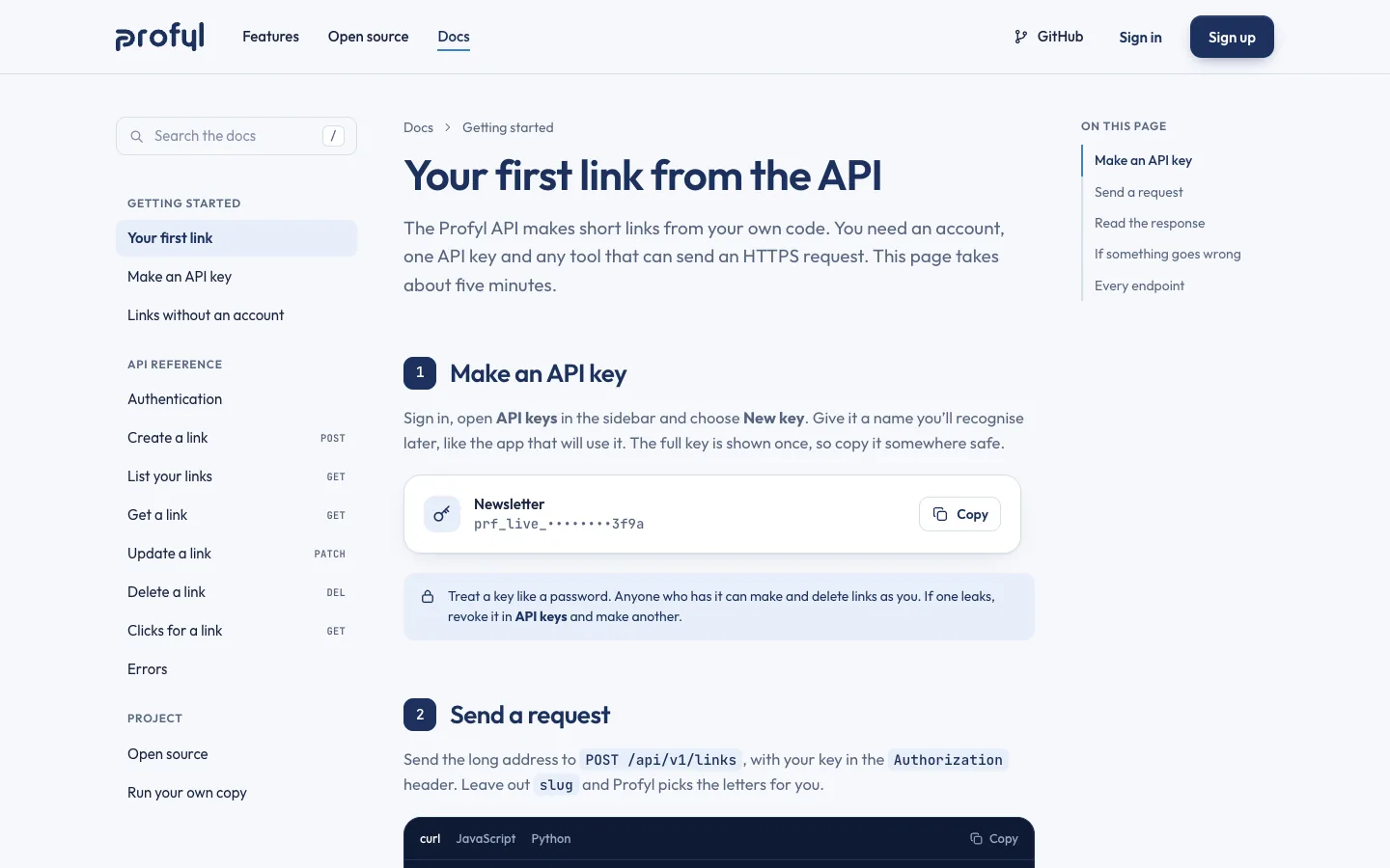
Designed at 1440 and 390 pixels wide from one set of parts: buttons, fields, cards, the link chip and the chart.
The website
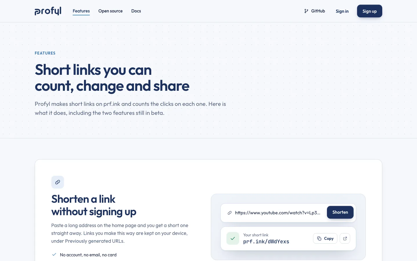
- Home, with the shortener on it
- Features
- Open source
- Docs: getting started and the API
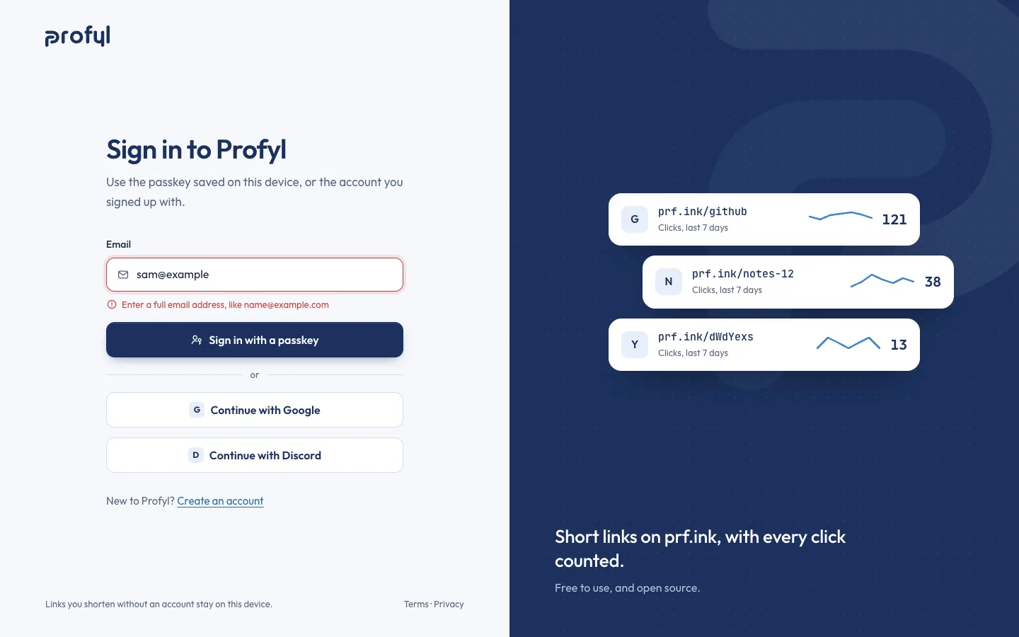
- Sign in and sign up, each with its error
- A page for short links that don’t exist
- The phone menu
The app
- Links: the dashboard
- One link’s clicks
- New link
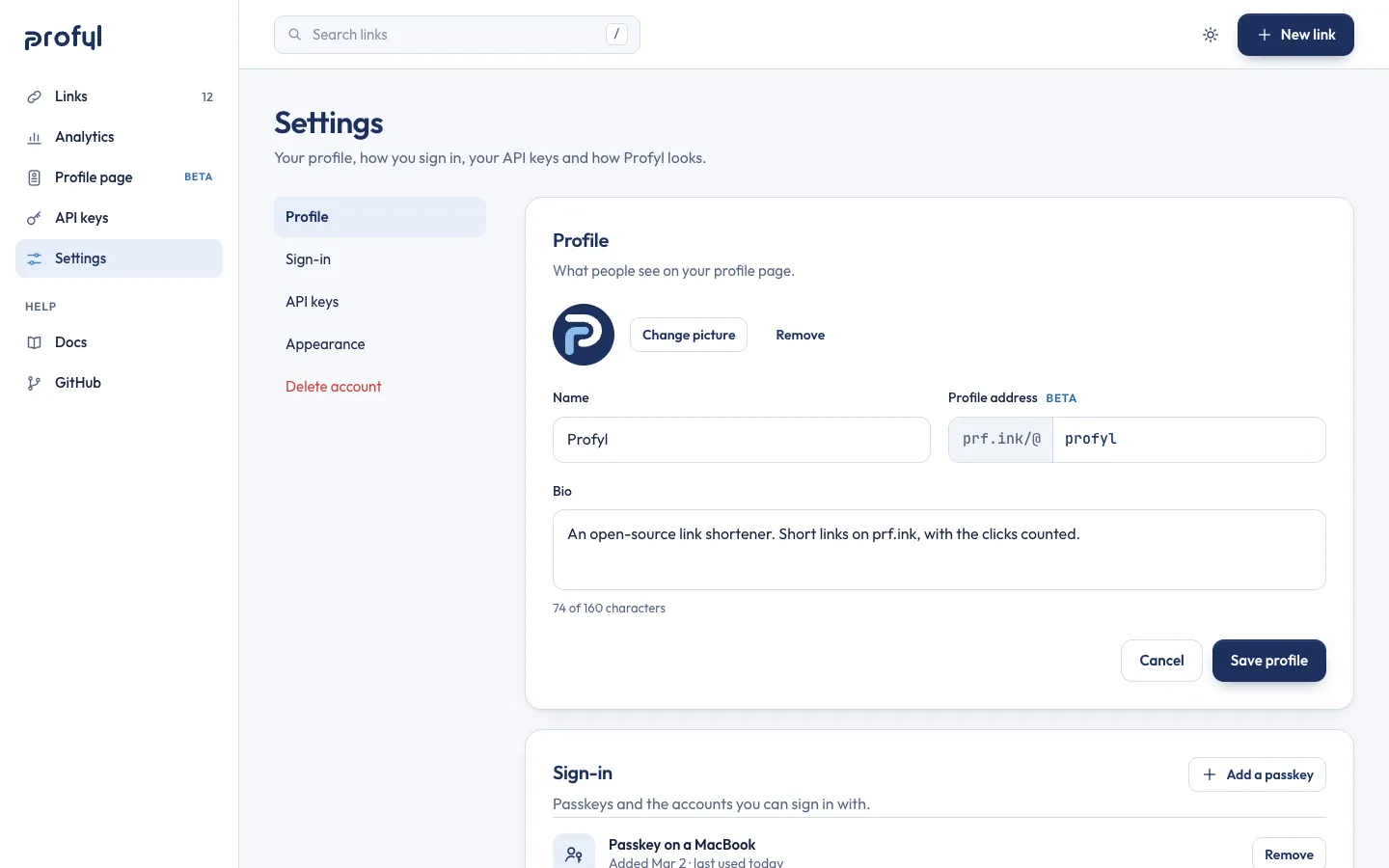
- Settings: profile, sign-in, keys, appearance
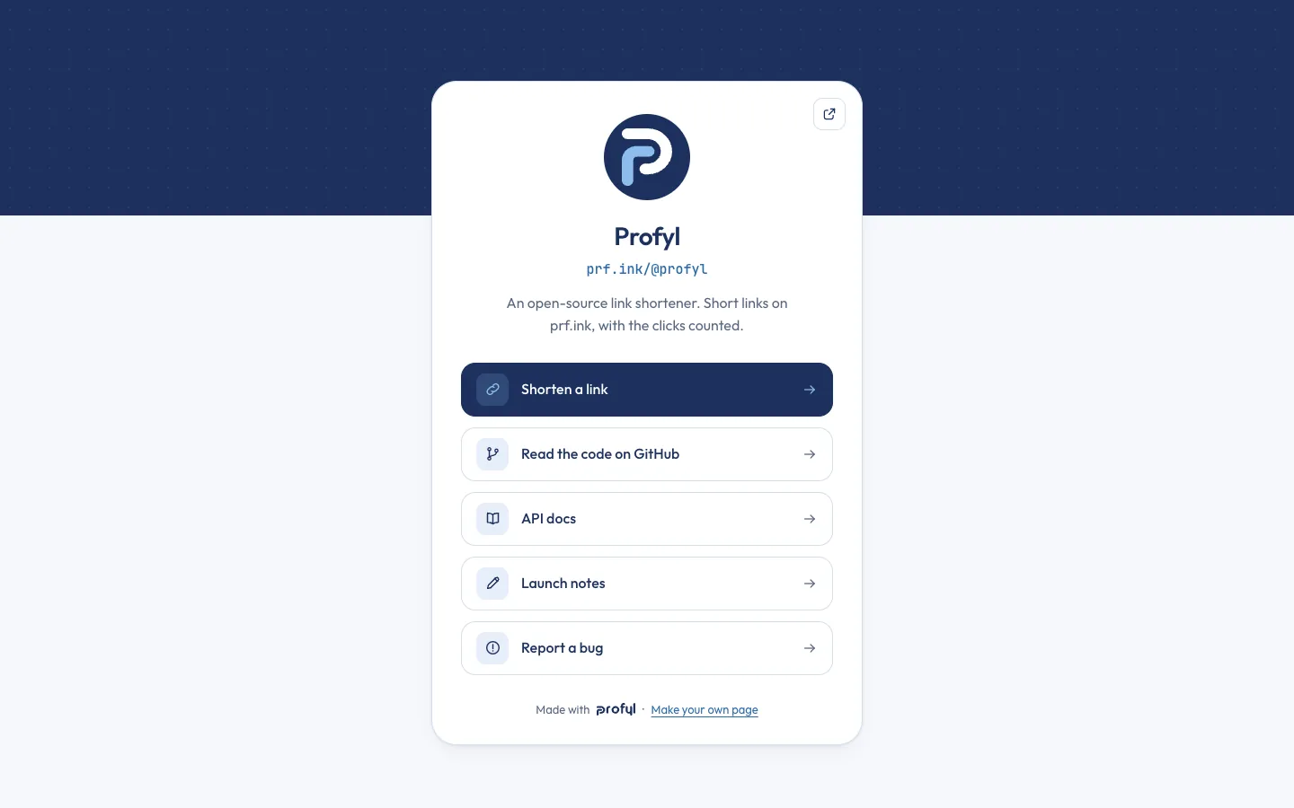
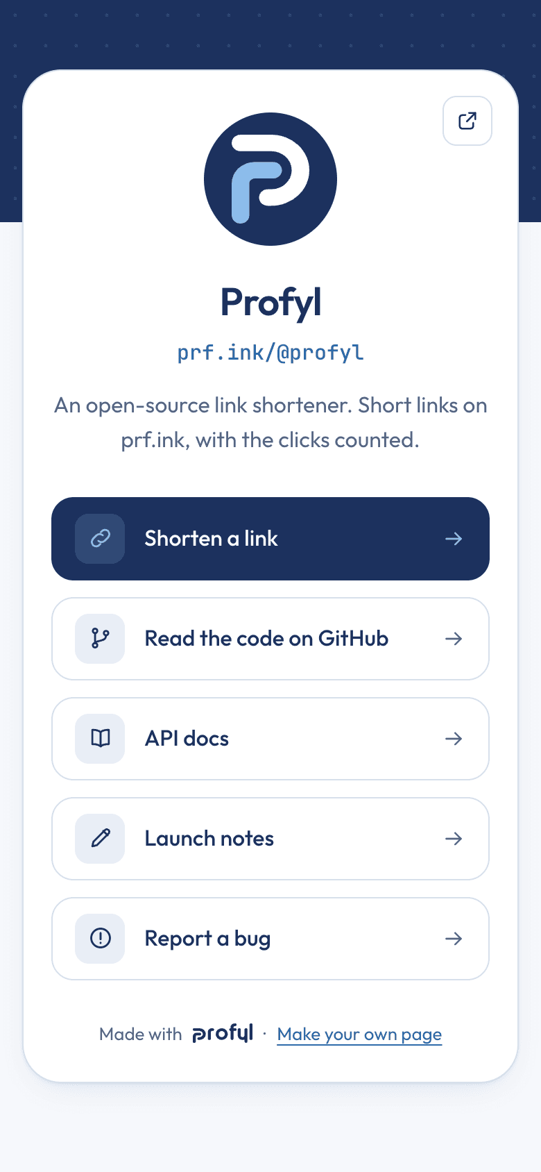
- A public profile page
- The dashboard in the dark theme
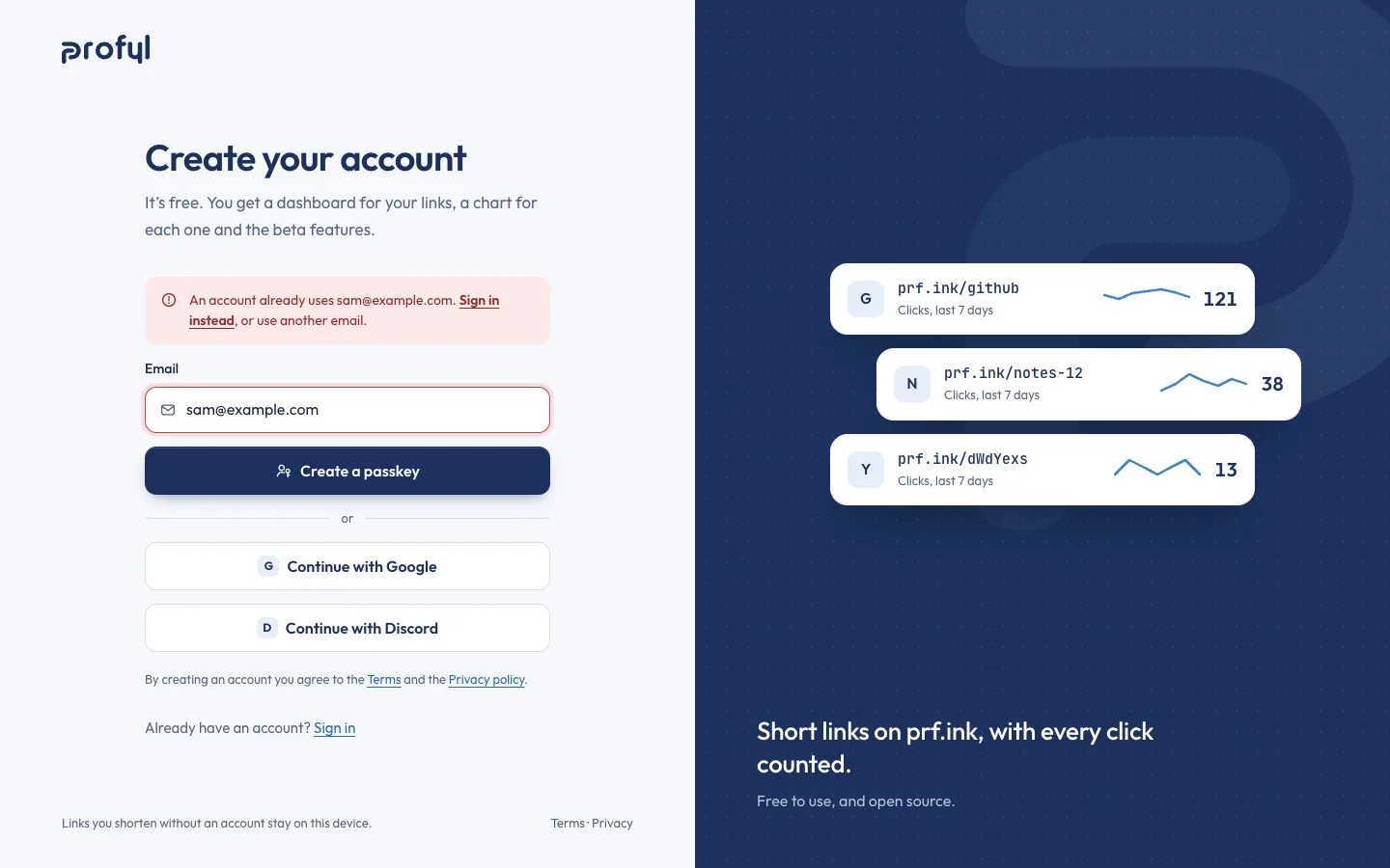
Sign in without a password
A passkey first, then Google and Discord, as the first design had it. Errors say what to do next, under the field they belong to.
The app
Analytics made easy, one link at a time
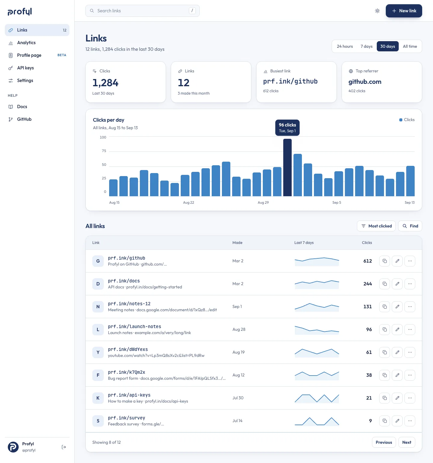
The dashboard lists every link with its clicks and a week’s sparkline. Each link opens onto its own page: clicks by day, where they came from, and what they were opened on. The numbers here are samples.
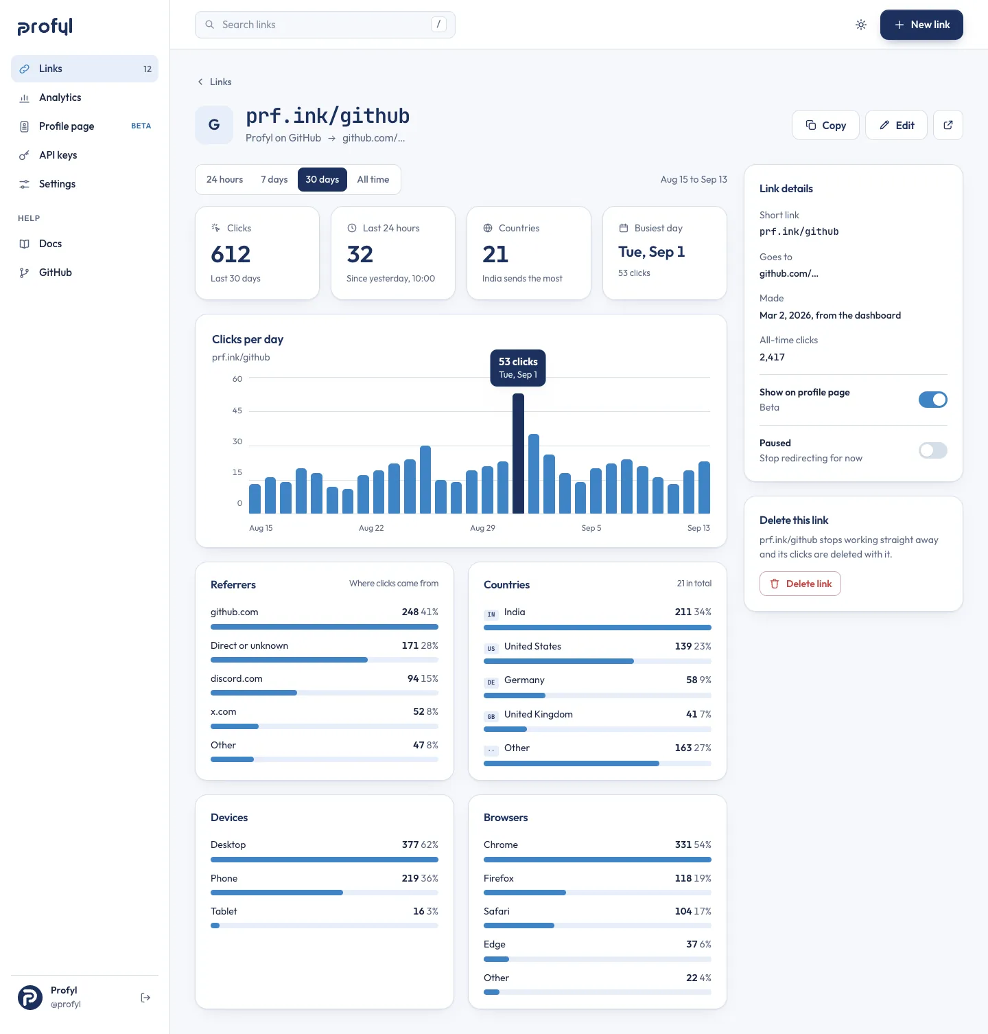
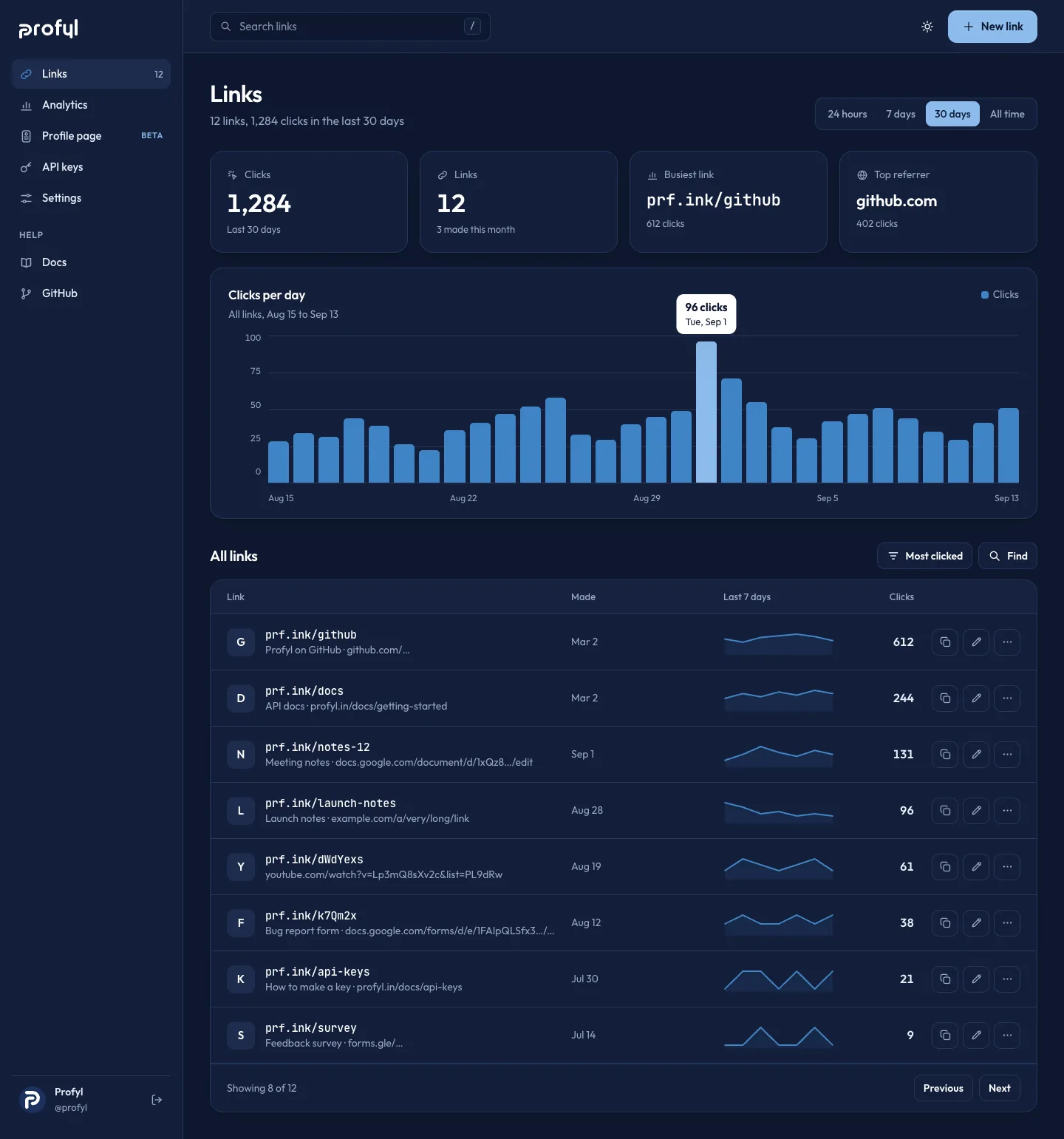
One link’s page, and the dashboard in the dark theme.
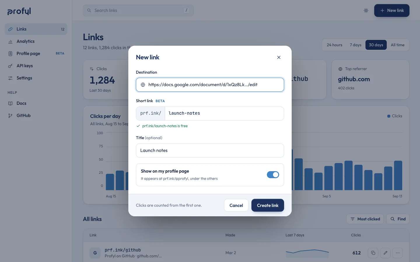
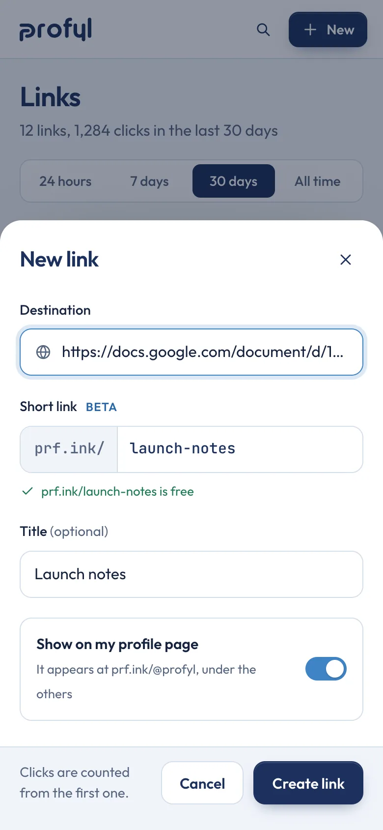
New link, as a sheet
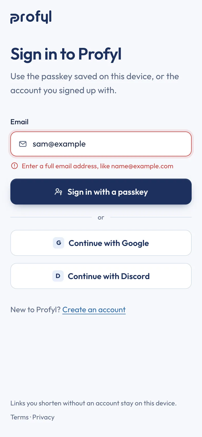
Sign in, with an error
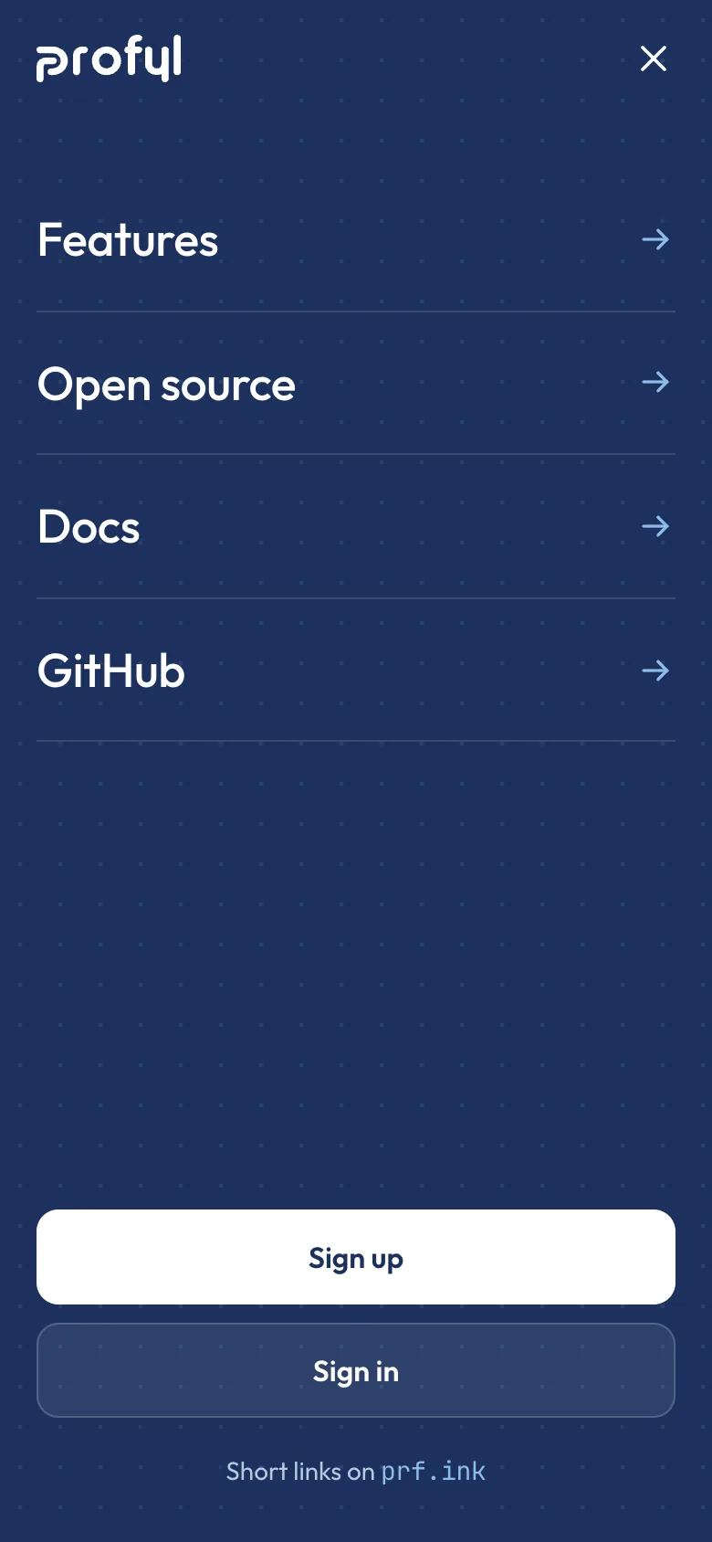
The menu
Credits
- Client
- Profyl
- Industry
- Link shortener (open source)
- Year
- 2023–26
- Services
- Logo refinement
- Wordmark
- Identity system
- Icons and illustration
- Website design
- Product UI design
- What we made
- The P redrawn, with a small cut for favicons
- A lowercase wordmark in the same pen, with horizontal and stacked lockups
- Colour, type, 43 icons and six spot illustrations
- App icon, favicon, avatar, link and repository previews, a post and stickers
- Website: home, features, open source, docs, sign-in and sign-up with their errors, a missing-link page
- App: links, each link’s clicks, new link, settings, a profile page and a dark theme, for desktop and phone
- Notes
- Profyl is free and open source, and the brief, the P and the first screens came from its own Figma file. The numbers in the screens are samples, not Profyl’s traffic. Custom short links and profile pages are in beta. Where the screens describe how Profyl works, from the API reference and the settings to what each click records, how the code is laid out and how to run your own copy, that is our design of how it could work, to check against the code before it ships.